Generate a new design based on this screen using your own content.
Thank you! Your submission has been received!
Oops! Something went wrong while submitting the form.
# Design from Reference: Linear Integrations Page
Create an original, high-fidelity visual design inspired by the reference. Prioritize composition, typography, colors, spacing, and component styling over technical implementation.
## Reference
- **Product:** Linear
- **Category:** Integrations Page
- **Screenshot:** https://cdn.prod.website-files.com/5e9dc792e1210c5325f7ebbc/6acadabbd5603a17eba7e6d7_6acada4c6cd44b3ad4d8cbee_cms-50703a7a581216f280b07243.webp
Analyze the screenshot first. If inaccessible, request it rather than guessing.
## Content
{{content.instructions}}
{{content.data}}
Preserve essential messaging and factual accuracy. Adapt structure and copy length for visual balance; never invent product claims.
## Visual Design
Use this context to reproduce the reference's visual language: layout, typography, colors, spacing, borders, radii, and distinctive elements. The screenshot takes priority if descriptions conflict.
## Direction
{{preferences.fidelityInstructions}}
## Output
{{output.instructions}}
Deliver a polished, cohesive design with precise alignment, hierarchy, and spacing. Produce the requested visual artifact, not just a description. If unsupported, explain the limitation.
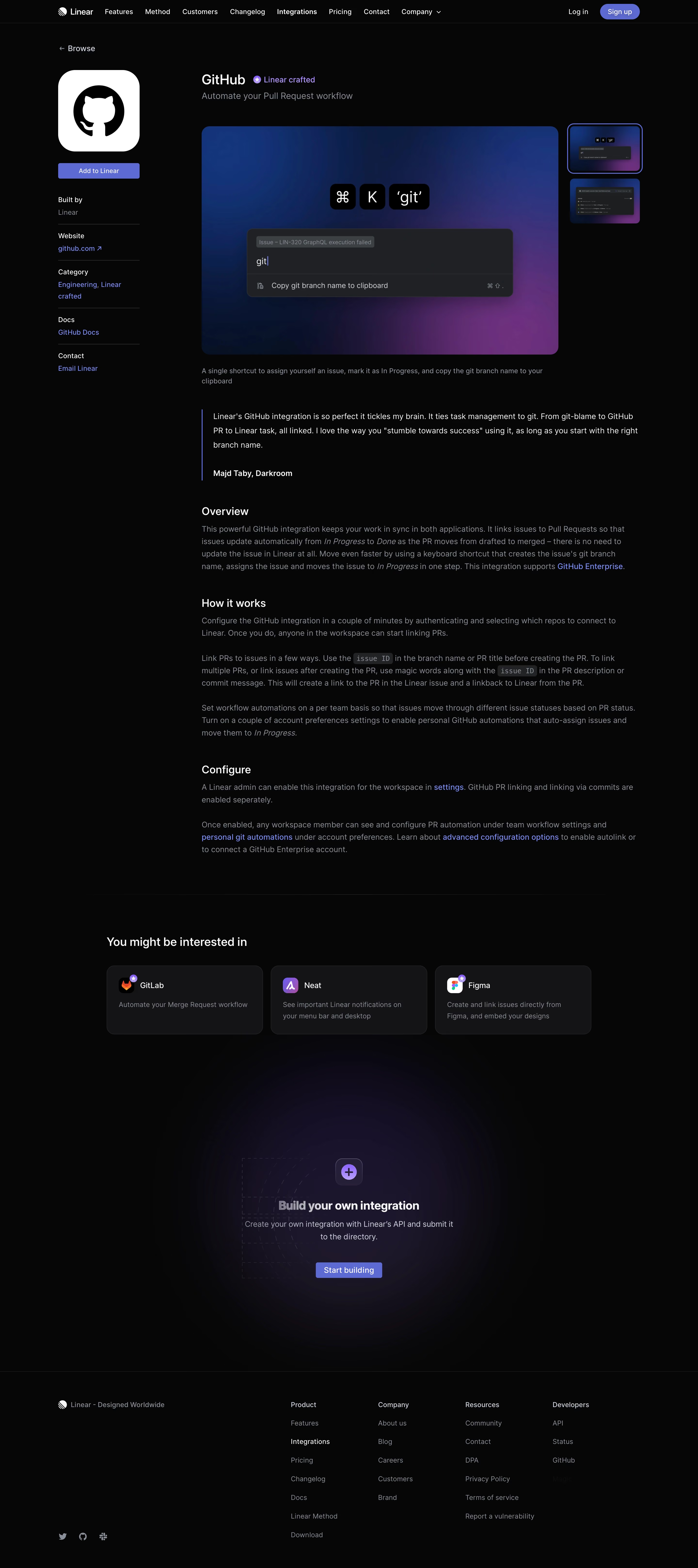
The Linear GitHub Integrations page channels a distinctly minimalist, modern aesthetic with a strong focus on clarity and functionality. White space dominates, lending an airy, uncluttered feel that immedately suggests professionalism and technical sophistication. Every element serves a clear purpose, reflecting a design ethos that values restraint and intention over decorative excess.
Layout and Structure
The layout employs a classic inverted pyramid structure. A concise hero section introduces the integration, supported visually by a polished product mockup. Below, the features section uses well-paced spacing—each capability is presented in clearly separated content blocks, making information digestible at a glance. There are no complex testimonial or pricing sections here; the focus remains granular and use-case driven. A slim, unobtrusive footer grounds the page with essential links and legal information.
Visual Elements
Sleek custom illustrations—animated in subtle, refreshing ways—effectively explain how Linear and GitHub work together. Branded SVG icons accompany each feature, harmonizing with the broader visual language. Animations are understated, providing polish without distraction.
Color Palette and Typography
A monochrome palette with strategic accent colors (notably Linear's signature purple) brings focus and signals interactivity. Headings stand out with a bold sans-serif font, while body text uses a lighter, readable variant. Hierarchy is consistently enforced through weight, size, and color differences, guiding users seamlessly.
User Experience Patterns
Navigation is frictionless and sparse, relying on sticky headers and primary CTA buttons that consistently invite action (“Connect Linear and GitHub”). Scroll interactions are smooth, with anchor links and in-page cues propelling engagement. There are no invasive forms; everything is geared toward learning and conversion.
Unique Design Choices and Tone
Distinctive microinteractions—such as icon hover effects and subtle background gradients—inject personality while preserving a sense of calm innovation. The entire experience feels thoughtfully engineered, balancing approachability and technical depth—ideal inspiration for SaaS teams seeking a blend of trustworthiness and forward-thinking design.