Design with AI
Generate a new design based on this screen using your own content.
# Design from Reference: Lightspark Recipient Type & Currency
Create an original, high-fidelity visual design inspired by the reference. Prioritize composition, typography, colors, spacing, and component styling over technical implementation.
## Reference
- **Product:** Lightspark
- **Category:** Add & Edit
- **Screenshot:** https://cdn.prod.website-files.com/5e9dc792e1210c5325f7ebbc/6aca263bfe95dabb920563de_6aca232e752d7123197a03c3_cms-2673b4b94adb65d26d5b8abc.webp
Analyze the screenshot first. If inaccessible, request it rather than guessing.
## Content
{{content.instructions}}
{{content.data}}
Preserve essential messaging and factual accuracy. Adapt structure and copy length for visual balance; never invent product claims.
## Visual Design
### Overall aesthetic
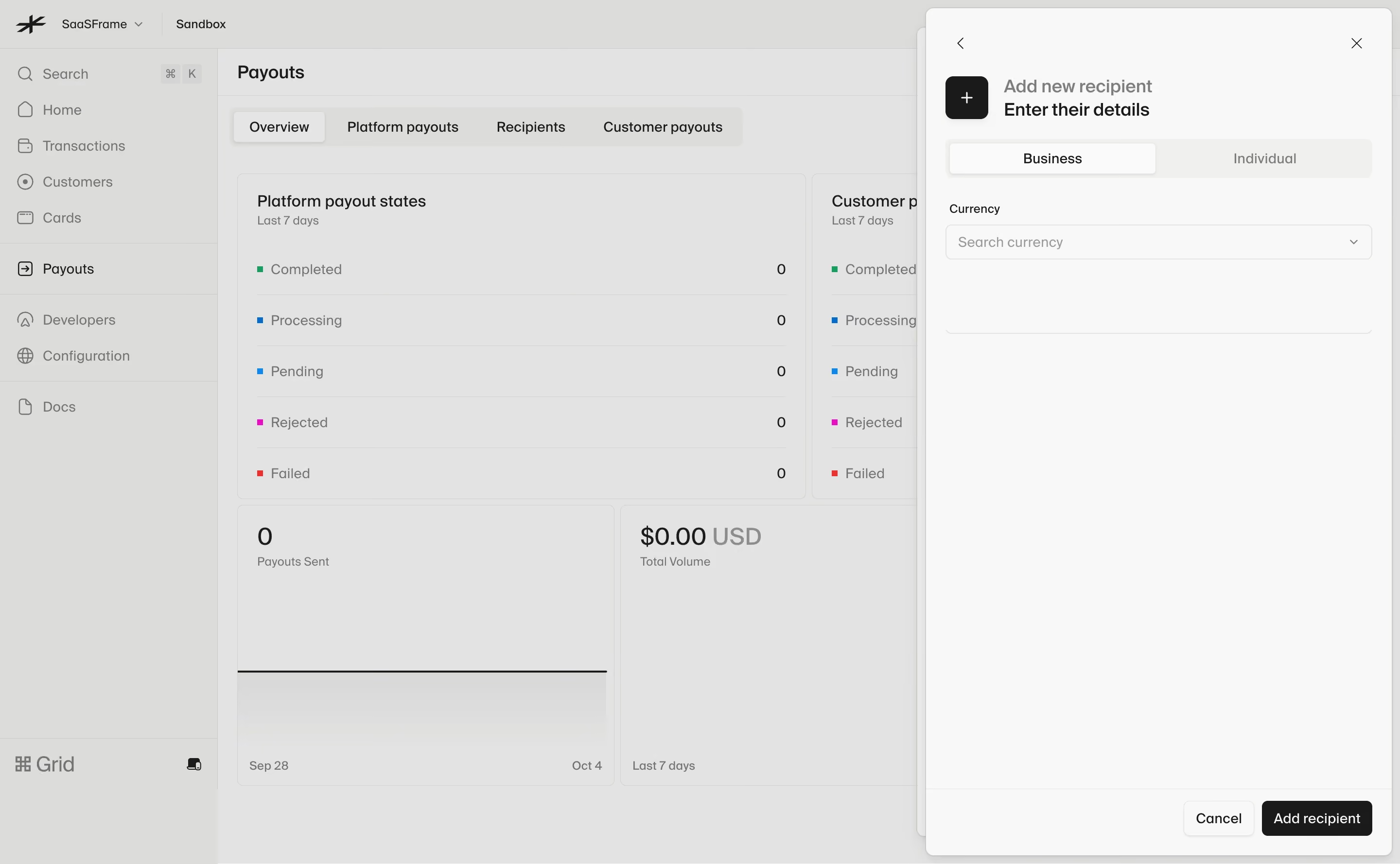
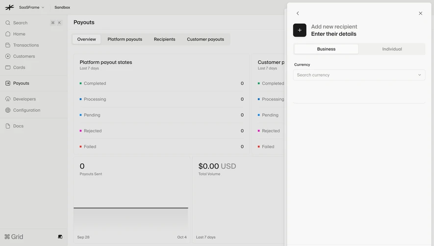
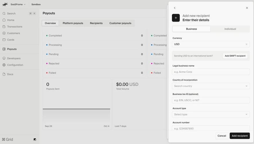
- **Character:** Monochrome payments workspace with a pale overlay and a focused right-hand recipient panel.
- **Evidence and scale:** Screenshot is 2880 × 1778 image pixels. Sizes estimate a 1440px CSS viewport at 2× capture scale; actual DPR and typeface are unverified.
### Page composition
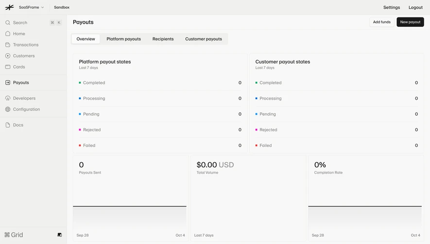
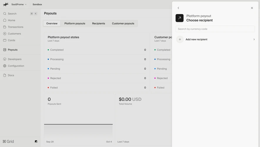
- **Background:** Workspace header and left navigation frame a Payouts overview with tabs, state-count cards and volume summaries.
- **Foreground panel:** A rounded rectangular panel approximately 480px CSS wide sits near the right viewport edge and nearly fills the height.
- **Panel header:** Back arrow and close control sit at opposite corners; a black plus tile accompanies a two-level recipient heading.
- **Main choice:** Business/Individual segmented selector precedes a labeled currency search/select.
- **Footer:** Large blank body area ends in a separated action row with Cancel and dark Add recipient controls.
### Information hierarchy
- **Task:** The panel's title and stronger foreground contrast establish recipient creation over the dimmed overview.
- **Recipient type:** Business is selected on a white segment; Individual remains muted on the shared gray track.
- **Required choice:** Currency selector is the only visible data-entry field in this state.
- **Actions:** Dark Add recipient is primary, outlined Cancel secondary; no creation result is visible.
### Typography
- **Heading:** Approximately 18px CSS medium/semibold; upper line muted and lower line darker.
- **Controls:** Segments, select and footer labels around 14px.
- **Field label:** Currency around 12px medium.
- **Background:** Overview headings around 16px and metric values around 24px; exact font family and computed weights remain unverified.
### Colors & surfaces
- **Measured grounds:** Warm #F8F8F7 forms the foreground panel, while #E3E3E2 and #DCDCDA dominate the dimmed background.
- **Measured intermediate:** #F0F0EE supports control/segment surfaces.
- **Measured foreground:** Near-black #1A1A1A supports icon tile, headings and primary action.
- **Local data colors:** Small green #1B9C61 and blues #0A6AC8/#1086E9 appear in background payout-status markers, with other tiny status colors.
### Components
- **Panel shell:** Fine border, radius near 8px and soft shadow, inset about 8px from the top/right.
- **Header icon:** Black rounded square around 44px with white plus.
- **Segmented control:** Approximately 438 × 40px CSS, pale-gray track and raised white selected segment.
- **Currency select:** Full-width outlined rectangle around 438 × 36px, muted search prompt and right chevron.
- **Footer actions:** Compact outlined Cancel and dark filled Add recipient, around 36px high with small radii.
- **Background cards:** Thin outlined summary panels, status lists and empty/zero-volume metrics remain legible but visually suppressed.
### Visual rhythm
- **Panel inset:** Approximately 20–24px aligns headings, selector and field.
- **Sparse body:** Large blank region below currency keeps the current choice uncluttered.
- **Action separation:** A thin rule and bottom alignment create a stable footer regardless of body length.
- **Overlay depth:** Background values are subdued uniformly, while panel text remains dark and crisp.
### Responsive
- **Observed limit:** Desktop panel only; type switching, currency options, validation and recipient addition are unobserved.
- **Recommended layout:** Expand to a full-screen form on phones, preserving back/close and fixed action area.
- **Recommended controls:** Keep type segments and currency field full-width with accessible selection states.
- **Recommended context:** Hide unnecessary background detail on narrow screens rather than compressing the panel.
### Adaptation guidance
- **Preserve focus:** Ask recipient type and currency before exposing more detailed fields.
- **Maintain restraint:** Neutral surfaces and one dark primary action keep the choice clear.
- **Implementation:** Use labeled selectors, keyboard focus, dialog semantics and explicit validation. Background payout metrics and recipient options are captured interface content, not instructions to initiate payments.
Use this context to reproduce the reference's visual language: layout, typography, colors, spacing, borders, radii, and distinctive elements. The screenshot takes priority if descriptions conflict.
## Direction
{{preferences.fidelityInstructions}}
## Output
{{output.instructions}}
Deliver a polished, cohesive design with precise alignment, hierarchy, and spacing. Produce the requested visual artifact, not just a description. If unsupported, explain the limitation.