Design with AI
Generate a new design based on this screen using your own content.
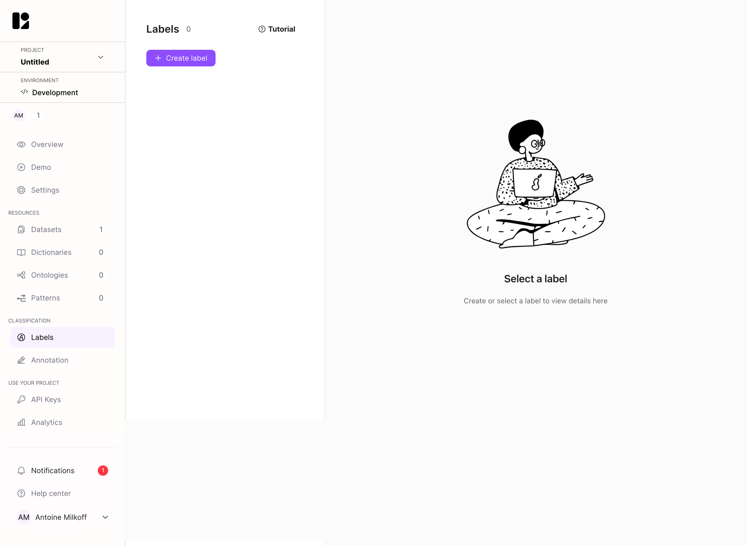
# Design from Reference: Lettria Empty Label
Create an original, high-fidelity visual design inspired by the reference. Prioritize composition, typography, colors, spacing, and component styling over technical implementation.
## Reference
- **Product:** Lettria
- **Category:** Empty State
- **Screenshot:** https://cdn.prod.website-files.com/5e9dc792e1210c5325f7ebbc/6acb6e962837b9f3168fb396_6acb6cad03442b22fb63826a_cms-21221a79af9e86068350b00a.webp
Analyze the screenshot first. If inaccessible, request it rather than guessing.
## Content
{{content.instructions}}
{{content.data}}
Preserve essential messaging and factual accuracy. Adapt structure and copy length for visual balance; never invent product claims.
## Visual Design
### Overall aesthetic
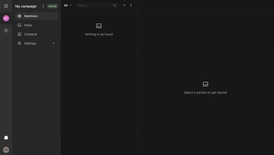
- **Character:** Minimal classification workspace with three vertical regions and a large monochrome empty-state illustration.
### Page composition
- **Capture:** 2880 × 2106 screenshot pixels; estimated 2× CSS scale.
- **Structure:** Project/resource sidebar, narrow Labels list with count/Create label/Tutorial, and large empty detail pane.
### Information hierarchy
- **Priority:** Create label is the main action; Select a label message explains the empty detail area.
### Typography
- **Family:** Sans serif; exact family unverified.
- **Estimated CSS sizes:** List/empty-state headings 20px, navigation/body 14px and group labels 10–11px.
### Colors & surfaces
- **Measured palette:** Canvas #FBFBFB, white #FFFFFF, warm near-white #FEFDFB/#FEFCFD, selected lavender #F8F1FF and illustration black #000000.
### Components
- **Elements:** Project/environment selectors, resource counts, purple create button, selected Labels row, tutorial link and seated-person line illustration.
- **Estimated geometry:** Sidebar 240px, list pane 384px, 40px navigation rows, 8px selected radius and 32px create action.
### Visual rhythm
- **Spacing:** Sparse list and large empty detail pane emphasize the initial state; illustration/message are centered as one group.
### Responsive
- **Suggested adaptation:** Show list and detail as separate mobile views and keep creation accessible. Mobile behavior is not shown.
### Adaptation guidance
- **Transfer:** Preserve the distinction between no labels and no selected label, with a clear first action.
Use this context to reproduce the reference's visual language: layout, typography, colors, spacing, borders, radii, and distinctive elements. The screenshot takes priority if descriptions conflict.
## Direction
{{preferences.fidelityInstructions}}
## Output
{{output.instructions}}
Deliver a polished, cohesive design with precise alignment, hierarchy, and spacing. Produce the requested visual artifact, not just a description. If unsupported, explain the limitation.