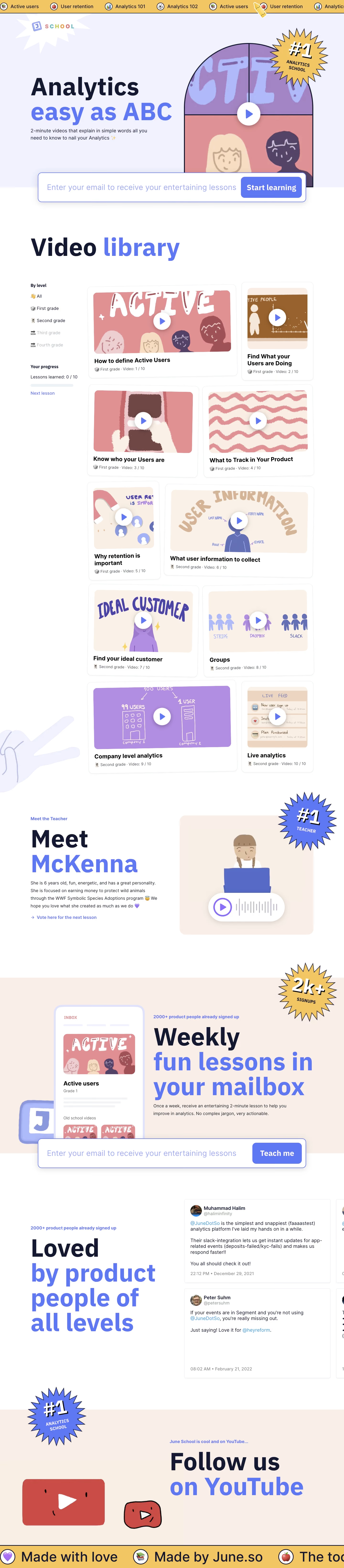
Overall Style and Aesthetic
June School’s website masterfully exemplifies modern minimalism, blending a crisp white foundation with expressive pastel gradients. The playful, welcoming atmosphere is complemented by a sense of professionalism, making it approachable for both tech enthusiasts and SaaS founders. Layout and Structure
The page leads with a vibrant hero section that introduces the “School” concept using conversational copy and an inviting primary call-to-action. Scrolling downward, the layout divides content into rich, easy-to-scan chunks—highlighting topics, instructor profiles, and community testimonials—before wrapping with an understated footer that keeps focus on core navigation. Visual Elements
Original, hand-drawn-style illustrations—such as friendly avatars and whimsical doodles—create a distinct personality while reinforcing the learning theme. Subtle animations draw the eye to CTAs without overwhelming the content. There’s sparing use of photography, favoring illustration to maintain a cohesive, memorable look. Color Palette and Typography
A fresh palette combines white space with bursts of gentle blues, corals, and lavenders, energizing the aesthetic without distracting from content. Modern sans-serif fonts, thoughtfully sized and weighted, drive clarity and hierarchy—from bold headlines to lighter, conversational body text. User Experience Patterns
Streamlined navigation sits atop, reducing cognitive load, while prominent and persistent CTAs (“Enroll now,” “Learn more”) encourage action. Interactive scroll effects, such as gentle fade-ins, make browsing feel dynamic yet frictionless. Forms are short, approachable, and user-centric. Unique and Notable Design Choices
June School stands out by ditching conventional “edtech” tropes—opting for a friendly “classroom” motif with playful visuals that build emotional connection. Micro-interactions and personable copy humanize the brand, fostering a sense of genuine innovation and trust.