Design with AI
Generate a new design based on this screen using your own content.
# Design from Reference: Intercom Welcome Email
Create an original, high-fidelity visual design inspired by the reference. Prioritize composition, typography, colors, spacing, and component styling over technical implementation.
## Reference
- **Product:** Intercom
- **Category:** Welcome Email
- **Screenshot:** https://cdn.prod.website-files.com/5e9dc792e1210c5325f7ebbc/6acbd6ea4dc759c085b0ee70_6acbd57a92b5993c29a745cf_cms-c5da216394889b939c35dcf3.webp
Analyze the screenshot first. If inaccessible, request it rather than guessing.
## Content
{{content.instructions}}
{{content.data}}
Preserve essential messaging and factual accuracy. Adapt structure and copy length for visual balance; never invent product claims.
## Visual Design
### Overall aesthetic
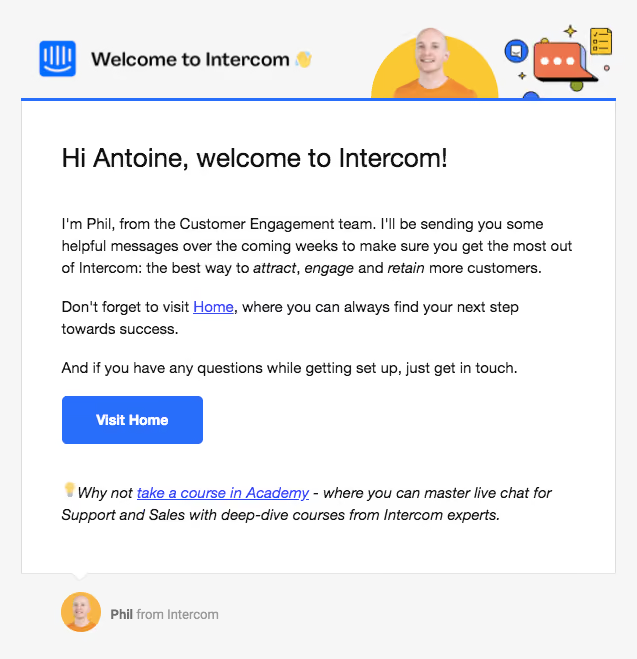
- **Character:** A friendly welcome email with a pale-gray surround, white message panel and bright blue action. A compact illustrated header combines branding, a portrait and conversational artwork.
- **Image basis:** The 637 × 659 source was inspected at original size. Dimensions below are image-pixel estimates; email CSS scale and font identity are unverified.
### Page composition
- **Header:** A roughly 594 px wide illustrated banner sits above a thin blue rule.
- **Message panel:** A white bordered region spans approximately x21–615, with content inset about 40 px.
- **Content:** A large greeting leads into three short paragraphs, one filled blue action and an italic academy recommendation.
- **Sender footer:** A small portrait and attribution sit below the panel, beside a tiny speech-tail shape.
### Information hierarchy
- **Greeting:** The approximately 26 px opening is the strongest message text.
- **Guidance:** Body copy introduces support and points toward the product home destination.
- **Action:** Visit Home is the only filled button; inline home/academy links provide secondary routes.
- **State:** Static email content is shown. No activated link, onboarding progress or confirmation is visible.
### Typography
- **Greeting:** Approximately 26 px regular sans-serif.
- **Body:** Around 15 px with 22 px line-height, with selective italic emphasis.
- **Action:** Around 14 px bold white text.
- **Footer:** Approximately 13 px muted attribution. Exact typeface and CSS metrics are unverified.
### Colors & surfaces
- **Measured base:** White #FFFFFF and pale gray #F6F6F6 define the layout.
- **Measured accent:** Blue #286EFA fills the action and header rule.
- **Measured text/art:** Near-black #111111 and #262626 appear in text; yellow #F9C833 and coral #ED764F appear in header artwork.
- **Boundary:** Gray #DDDDDD provides the fine message-panel outline.
### Components
- **Banner:** Brand icon and welcome text align left; a portrait on a yellow circle and illustrated chat elements align right.
- **Message panel:** Sharp rectangular border with a small lower speech-tail detail.
- **Primary action:** Approximately 141 × 48 px, roughly 5 px corners and centered label.
- **Recommendation:** A lightbulb emoji leads an italic two-line note with a blue underlined link.
- **Sender row:** A roughly 40 px circular portrait sits beside bold name and muted organization text.
### Visual rhythm
- **Alignment:** Greeting, paragraphs, button and recommendation share one left edge.
- **Spacing:** Large gaps separate greeting, body and recommendation; body paragraphs remain compact.
- **Contrast:** Blue control and illustrated banner punctuate otherwise plain reading content.
- **Width:** A bounded narrow panel supports comfortable email line length.
### Responsive
- **Evidence limit:** Only this email capture is observed.
- **Recommended panel:** Use a fluid container and reduce inner padding on narrow screens.
- **Recommended artwork:** Scale the banner proportionally while preserving readable real message text.
- **Recommended action:** Retain a touch-friendly button and clear underlined links.
### Adaptation guidance
- **Preserve:** Keep personal greeting, concise guidance, one strong home action and human attribution.
- **Build:** Use robust email-compatible text, image and button elements.
- **Privacy:** Substitute appropriate recipient/sender details when adapting.
- **Validate:** Test client rendering, image-disabled readability and link contrast.
Use this context to reproduce the reference's visual language: layout, typography, colors, spacing, borders, radii, and distinctive elements. The screenshot takes priority if descriptions conflict.
## Direction
{{preferences.fidelityInstructions}}
## Output
{{output.instructions}}
Deliver a polished, cohesive design with precise alignment, hierarchy, and spacing. Produce the requested visual artifact, not just a description. If unsupported, explain the limitation.