Generate a new design based on this screen using your own content.
Thank you! Your submission has been received!
Oops! Something went wrong while submitting the form.
# Design from Reference: Intercom Automation Workflow
Create an original, high-fidelity visual design inspired by the reference. Prioritize composition, typography, colors, spacing, and component styling over technical implementation.
## Reference
- **Product:** Intercom
- **Category:** Flowchart
- **Screenshot:** https://cdn.prod.website-files.com/5e9dc792e1210c5325f7ebbc/6acad61dfef6904ce0090cea_6acad59e3ce5f4104ebe5e81_cms-1077c23370ed55719e611929.webp
Analyze the screenshot first. If inaccessible, request it rather than guessing.
## Content
{{content.instructions}}
{{content.data}}
Preserve essential messaging and factual accuracy. Adapt structure and copy length for visual balance; never invent product claims.
## Visual Design
Use this context to reproduce the reference's visual language: layout, typography, colors, spacing, borders, radii, and distinctive elements. The screenshot takes priority if descriptions conflict.
## Direction
{{preferences.fidelityInstructions}}
## Output
{{output.instructions}}
Deliver a polished, cohesive design with precise alignment, hierarchy, and spacing. Produce the requested visual artifact, not just a description. If unsupported, explain the limitation.
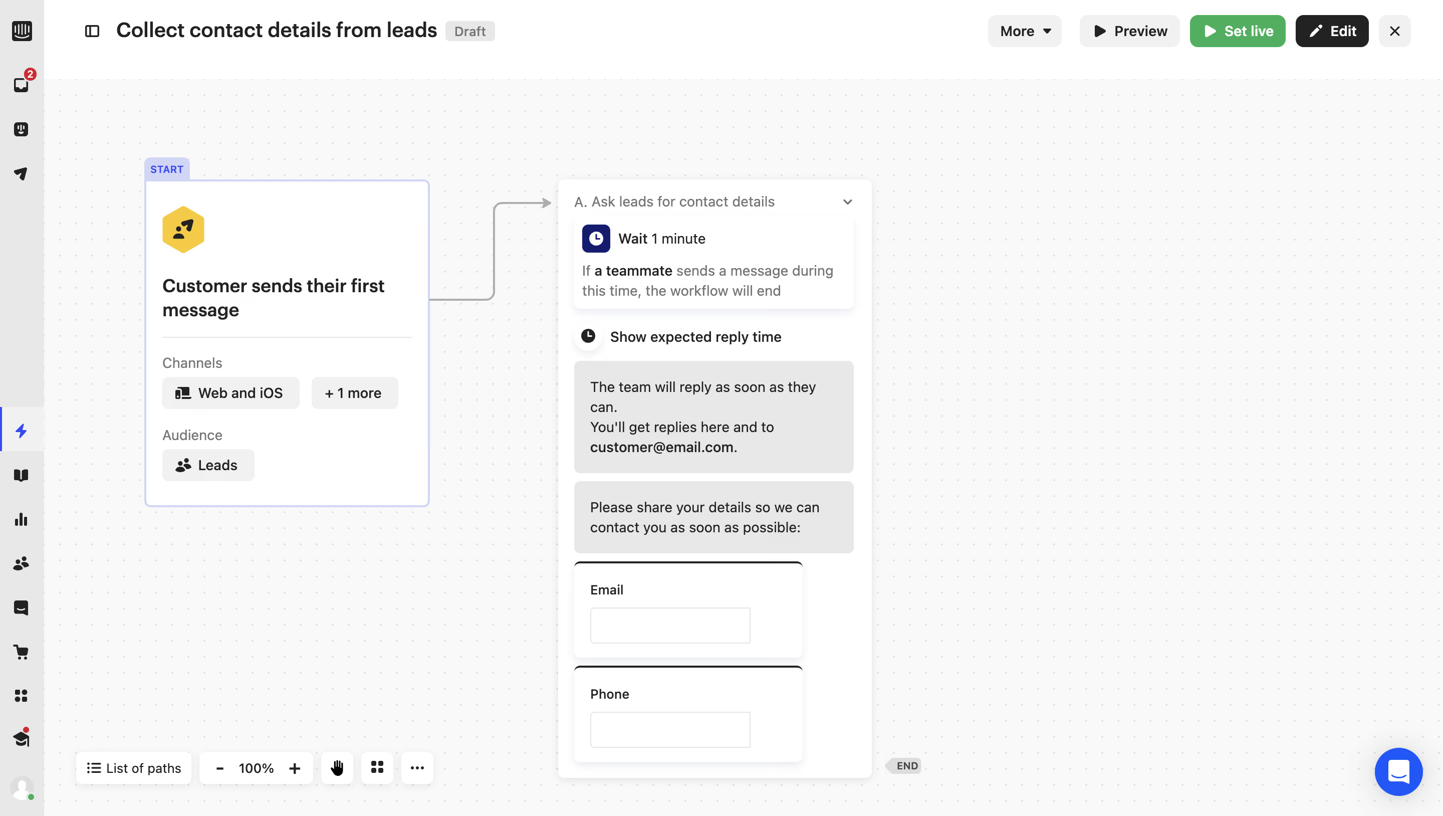
Intercom’s workflow automation page embraces a modern, minimalist aesthetic with a highly professional finish. The design is clean, leveraging ample white space to create an uncluttered environment that helps users focus on key tasks. Subtle animations and iconography lend a sense of dynamism without overpowering the interface, resulting in a refined yet approachable experience.
Layout and Structure
The layout is tailored for productivity and efficiency rather than marketing. Navigation sits prominently on the left as a collapsible sidebar, offering quick access to core functions. The central canvas is dedicated to building and visualizing workflows, using a modular, drag-and-drop interface. Clear separation of headers, toolbars, and workspace ensures information is easily digestible, with sticky elements that enhance usability.
Visual Elements
Custom icons and subtle illustrations guide users through workflow steps, giving form to abstract automation concepts. Interactive transitions highlight state changes and selections. Instead of photography or video, the visuals rely on crisp vector graphics that scale smoothly and fit the application's functional theme.
Color Palette and Typography
The palette features cool blues, muted grays, and splashes of green to draw attention to actionable elements, striking a balance between calm and actionable. Typography is sans-serif, clear, and consistent—large headings paired with lighter body text establish hierarchy while supporting accessibility.
User Experience Patterns
A sticky sidebar enables seamless multi-level navigation, complemented by floating action buttons for primary CTAs like “Create” or “Publish.” Form fields and inline validations ensure guidance without friction. Thoughtful tooltips and progress indicators help users stay confident as they build or modify workflows.
Unique or Notable Design Choices
A standout detail is the workflow visualization—the drag-and-drop editor is both aesthetically polished and intuitively interactive, making complex automations feel manageable. Microinteractions, such as animated transitions when connecting nodes, subtly reinforce feedback. The consistent, trustworthy tone aligns perfectly with the page’s purpose: empowering users to confidently automate business processes.