Design with AI
Generate a new design based on this screen using your own content.
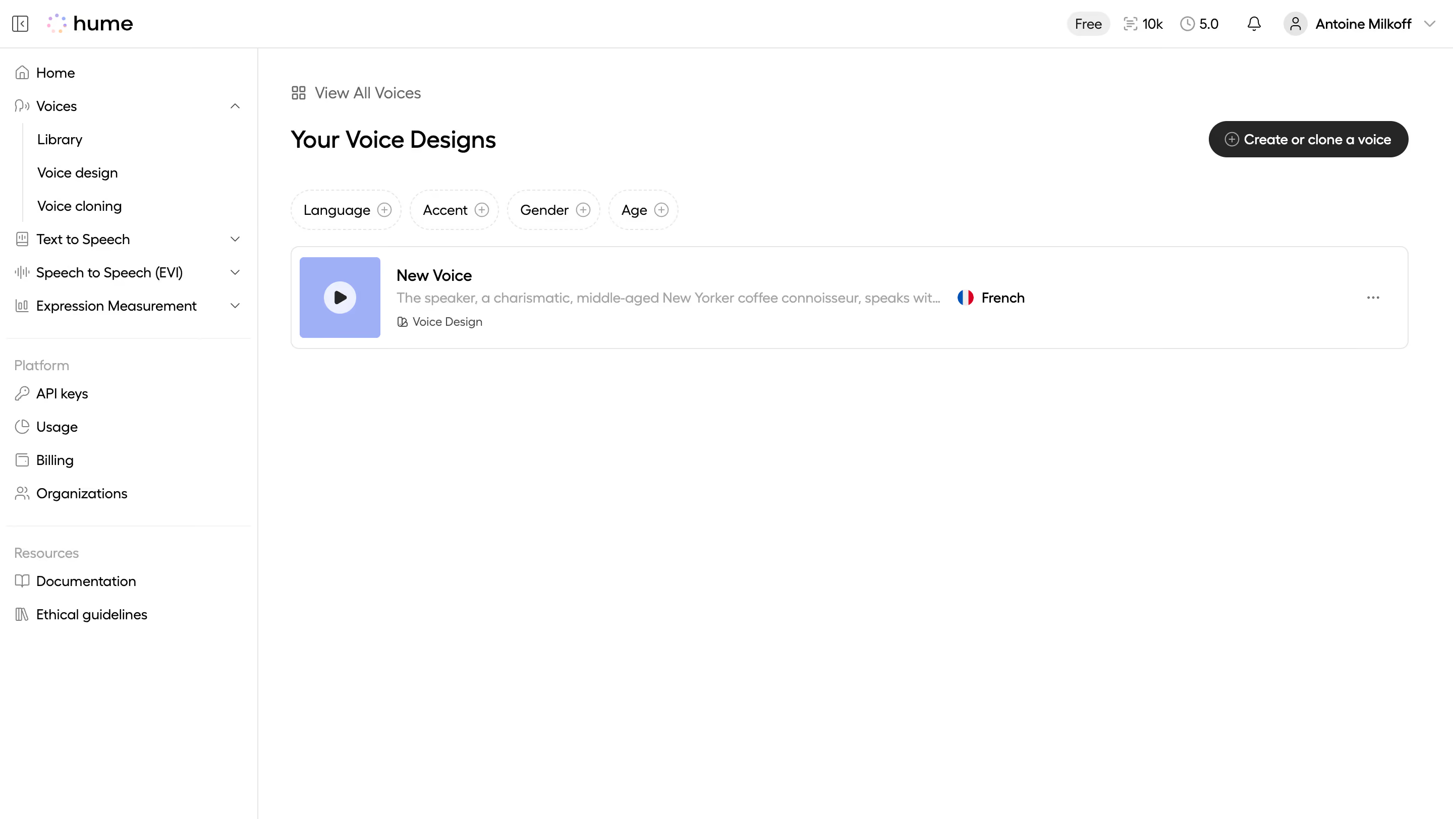
# Design from Reference: Hume AI Your Voice Design Library
Create an original, high-fidelity visual design inspired by the reference. Prioritize composition, typography, colors, spacing, and component styling over technical implementation.
## Reference
- **Product:** Hume AI
- **Category:** Empty
- **Screenshot:** https://cdn.prod.website-files.com/5e9dc792e1210c5325f7ebbc/6acad406c910b3adf9e48bb4_6acad193b3daa04f542671a2_cms-57e1bce917991a704a006e59.webp
Analyze the screenshot first. If inaccessible, request it rather than guessing.
## Content
{{content.instructions}}
{{content.data}}
Preserve essential messaging and factual accuracy. Adapt structure and copy length for visual balance; never invent product claims.
## Visual Design
### Overall aesthetic
- **Style:** A minimal voice-library workspace with a white shell, thin gray boundaries, and small lavender media accents.
- **Character:** Quiet and spacious, with one populated voice row and extensive empty workspace below.
### Page composition
- **Capture and scale:** 2880 × 1624 screenshot pixels, consistent with estimated 2× capture. Following sizes are estimated CSS pixels under that assumption.
- **Shell:** A roughly 255 px left sidebar sits beneath a shallow header. The header has brand left and plan/usage/notification/account controls right.
- **Content:** A back-to-all-voices link precedes the title and right-aligned creation pill. Four filter chips sit above one wide voice row.
### Information hierarchy
- **Primary content:** Voice name, truncated description, and type metadata form the row's reading order.
- **Actions:** A large play tile begins the row; language/flag and overflow appear farther right. Creation remains prominent in the header.
### Typography
- **Family:** Rounded sans serif; exact font unverified.
- **Roles:** Page title approximately 24 px semibold; row name 16 px medium; descriptions, filters, navigation, and metadata 13–14 px.
- **Truncation:** The long voice description is ellipsized to preserve the row layout.
### Colors & surfaces
- **Foundation:** Sampled sRGB #FFFFFF dominates; #E5E5E5 and #EEEEEE support thin boundaries.
- **Accents:** Sampled lavender #A0B0F6 fills the play tile; #ECEFFE supports its lighter details.
- **Ink:** Sampled #262626 and #000000 define text/actions, with #A3A3A3 secondary copy.
### Components
- **Voice row:** A thin-bordered rounded rectangle spans the content width, about 100 px high, with a roughly 80 px lavender play tile.
- **Filters:** Four small dashed-outline pills pair labels with circular plus icons.
- **Creation:** A dark rounded pill combines a circled plus and short creation/clone label.
- **Sidebar:** Indented voice subsections and separated Platform/Resources groups use small line icons and fine rules.
### Visual rhythm
- **Spacing:** Use approximately 24–32 px main padding and clear 25–35 px gaps between title, filters, and row.
- **Alignment:** Keep filter and row left edges aligned; preserve broad white space below the single item.
### Responsive
- **Observed state:** Desktop only.
- **Recommended reflow:** Collapse sidebar, wrap filters, and stack row metadata while keeping play and overflow accessible.
### Adaptation guidance
- **Preserve:** Retain the quiet shell, filter pills, media-led row, and dark creation action.
- **Adapt:** Use actual voice metadata and supported filter categories.
- **Avoid:** Do not infer playback state or hidden voice settings, and do not copy account identity.
Use this context to reproduce the reference's visual language: layout, typography, colors, spacing, borders, radii, and distinctive elements. The screenshot takes priority if descriptions conflict.
## Direction
{{preferences.fidelityInstructions}}
## Output
{{output.instructions}}
Deliver a polished, cohesive design with precise alignment, hierarchy, and spacing. Produce the requested visual artifact, not just a description. If unsupported, explain the limitation.