Generate a new design based on this screen using your own content.
Thank you! Your submission has been received!
Oops! Something went wrong while submitting the form.
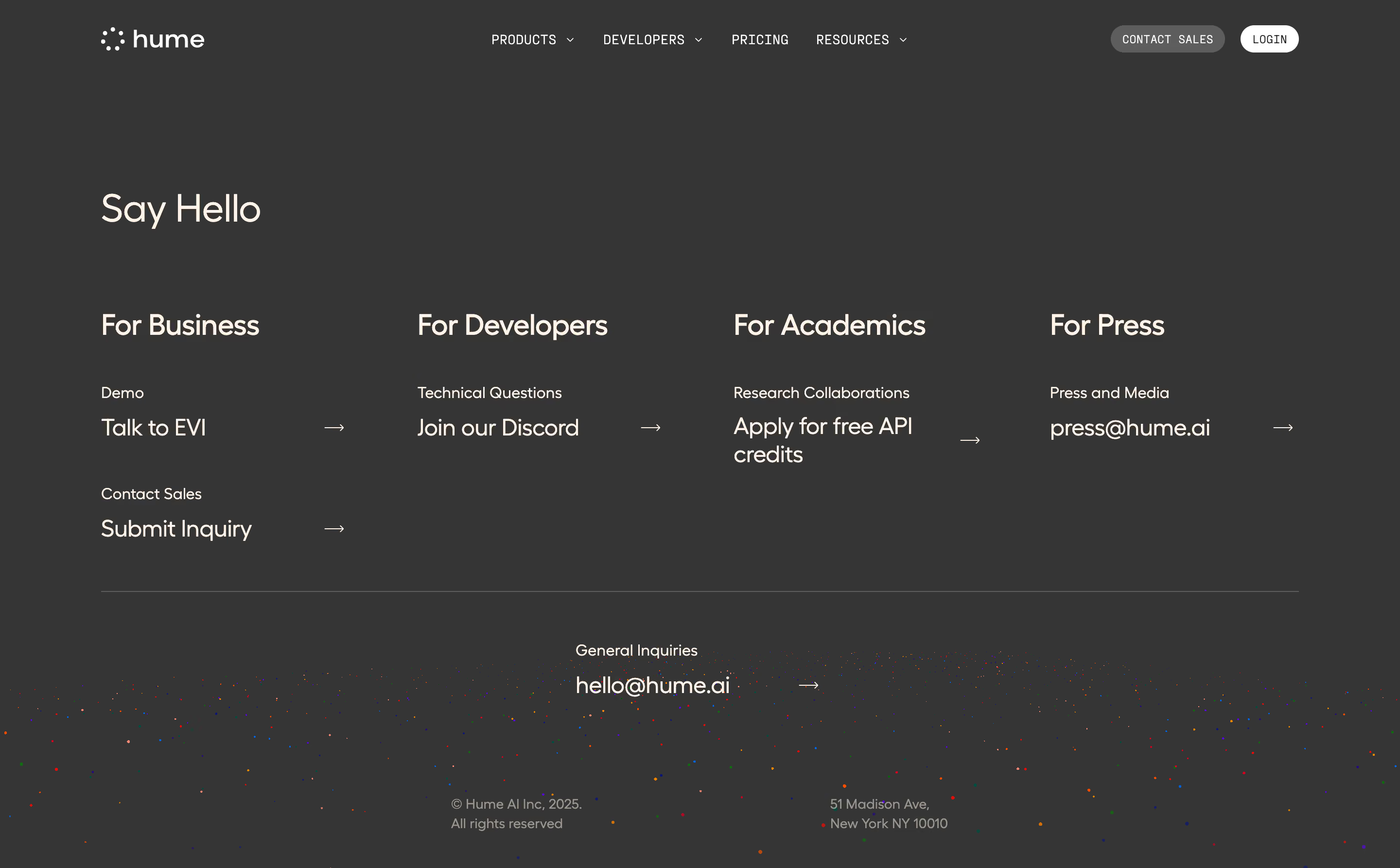
# Design from Reference: Hume AI Contact Page
Create an original, high-fidelity visual design inspired by the reference. Prioritize composition, typography, colors, spacing, and component styling over technical implementation.
## Reference
- **Product:** Hume AI
- **Category:** Contact Page
- **Screenshot:** https://cdn.prod.website-files.com/5e9dc792e1210c5325f7ebbc/6acad401c910b3adf9e48ae8_6acad18811963fdadfb4d860_cms-69826f1e7ec5a1891afefb16.webp
Analyze the screenshot first. If inaccessible, request it rather than guessing.
## Content
{{content.instructions}}
{{content.data}}
Preserve essential messaging and factual accuracy. Adapt structure and copy length for visual balance; never invent product claims.
## Visual Design
Use this context to reproduce the reference's visual language: layout, typography, colors, spacing, borders, radii, and distinctive elements. The screenshot takes priority if descriptions conflict.
## Direction
{{preferences.fidelityInstructions}}
## Output
{{output.instructions}}
Deliver a polished, cohesive design with precise alignment, hierarchy, and spacing. Produce the requested visual artifact, not just a description. If unsupported, explain the limitation.
Hume AI's "Say Hello" page does something smart. It takes what's usually a boring contact form and turns it into a structured directory. The dark charcoal background feels warm, not cold. That's hard to pull off.
Clear Routing, Zero Confusion
Four columns split the audience instantly: Business, Developers, Academics, Press. Each one gets a subtle label above the action link. "Talk to EVI" with an arrow. "Join our Discord" with an arrow. The pattern repeats and trains your eye fast. You know exactly where to click without reading everything. The hierarchy works because the category headers are bold and large while the sub-labels sit small and muted above each link.
Typography Does the Heavy Lifting
The serif "Say Hello" at the top contrasts beautifully with the sans-serif navigation and body text. It adds personality without feeling decorative. Arrow icons keep things minimal and consistent across every CTA.
The Confetti Footer
That scattered dot pattern at the bottom is unexpected. It adds a playful human touch to an otherwise restrained layout. Small detail, big impact.