Design with AI
Generate a new design based on this screen using your own content.
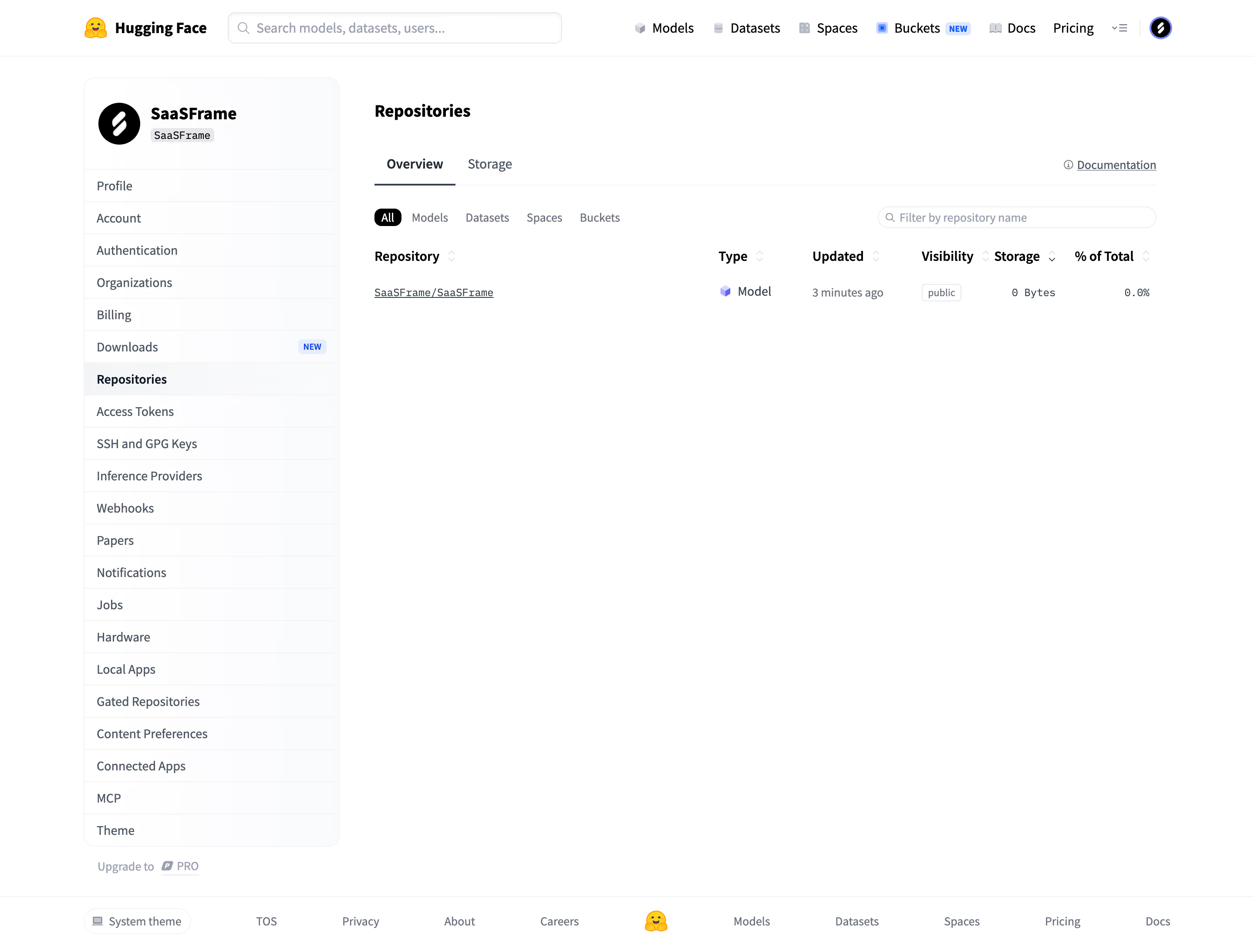
# Design from Reference: Hugging Face Repositories overview
Create an original, high-fidelity visual design inspired by the reference. Prioritize composition, typography, colors, spacing, and component styling over technical implementation.
## Reference
- **Product:** Hugging Face
- **Category:** Dashboard
- **Screenshot:** https://cdn.prod.website-files.com/5e9dc792e1210c5325f7ebbc/6acad332d5603a17eba5b529_6acad024857335a2ffbc939a_cms-341dbf71a441c3234b13cbd0.webp
Analyze the screenshot first. If inaccessible, request it rather than guessing.
## Content
{{content.instructions}}
{{content.data}}
Preserve essential messaging and factual accuracy. Adapt structure and copy length for visual balance; never invent product claims.
## Visual Design
### Overall aesthetic
- **Style:** Sparse repository-management page with white surfaces, pale account sidebar, small badges, and compact table.
### Page composition
- **Canvas:** 2880 × 2186 image px; CSS estimates assume an unverified 2× capture.
- **Header:** Brand, broad search, product navigation, and profile.
- **Sidebar:** Account identity and long vertical settings list, approximately 290 CSS px wide.
- **Main:** Repositories title, Overview/Storage tabs, type filters, name search, and one repository row.
- **Footer:** Theme control and horizontal product/legal links.
### Information hierarchy
- **Primary:** Repositories title and active Overview tab.
- **Data:** Repository name, type, updated time, visibility, storage, and percentage columns.
- **Filters:** All selected as dark pill; remaining types are quiet labels.
- **Navigation:** Repositories highlighted in account menu.
### Typography
- **Family:** Compact interface sans serif; exact identity unverified.
- **Title:** Approximately 20 CSS px, semibold.
- **Body/navigation:** Approximately 14px.
- **Column labels:** Approximately 14px, semibold.
- **Technical values:** Small monospace.
- **Precision:** Font values and assumed 2× are estimates.
### Colors & surfaces
- **Canvas:** #FFFFFF.
- **Pale sidebar:** #FAFBFC.
- **Selected/neutral surfaces:** #F3F4F6.
- **Dividers:** Very light cool gray.
- **Text:** Dark slate and muted blue-gray.
- **All filter:** Black fill, white label.
- **Precision:** White/neutral values sampled; exact text tokens unverified.
### Components
- **Sidebar card:** Rounded outline with identity header and divided rows.
- **Tabs:** Thin dark underline for active state.
- **Search:** Small pill-shaped outline.
- **Table:** Borderless body, compact sort chevrons, tiny visibility badge.
- **New badges:** Small pale-blue labels.
- **Footer:** Lightweight link row and small brand emoji.
### Visual rhythm
- **Whitespace:** Large empty area beneath the single row.
- **Alignment:** Table columns and filter/search row share main content width.
- **Density:** Compact sidebar rows contrast with sparse data area.
### Responsive
- **Observed:** Desktop only.
- **Recommendation:** Collapse account navigation, wrap filters, and scroll table horizontally.
- **Identifiers:** Allow repository names to wrap or truncate accessibly.
### Adaptation guidance
- **Preserve:** Account-navigation context, compact filters, clear metadata columns, and sparse table styling.
- **Privacy:** Replace account/repository identifiers.
- **Behavior:** Sorting, filtering, and storage tabs are visually present but unverified.
Use this context to reproduce the reference's visual language: layout, typography, colors, spacing, borders, radii, and distinctive elements. The screenshot takes priority if descriptions conflict.
## Direction
{{preferences.fidelityInstructions}}
## Output
{{output.instructions}}
Deliver a polished, cohesive design with precise alignment, hierarchy, and spacing. Produce the requested visual artifact, not just a description. If unsupported, explain the limitation.