Design with AI
Generate a new design based on this screen using your own content.
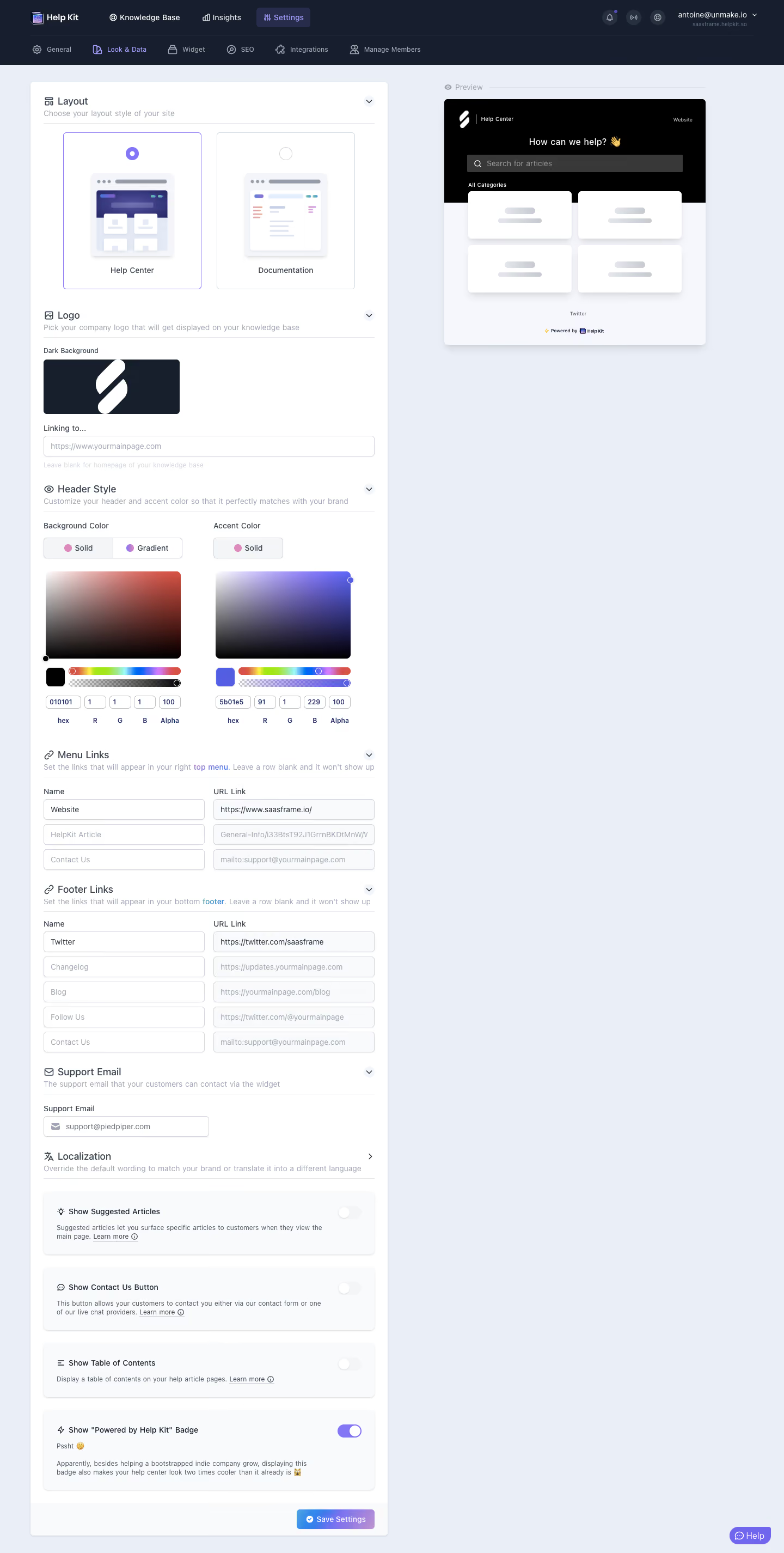
# Design from Reference: Help Kit Appearance Settings
Create an original, high-fidelity visual design inspired by the reference. Prioritize composition, typography, colors, spacing, and component styling over technical implementation.
## Reference
- **Product:** Help Kit
- **Category:** Appearance Customization
- **Screenshot:** https://cdn.prod.website-files.com/5e9dc792e1210c5325f7ebbc/6acbbb54151c40fa40745e45_6acb71b6289c14b2c19ec678_cms-aa76bc19812b30498b1985db.webp
Analyze the screenshot first. If inaccessible, request it rather than guessing.
## Content
{{content.instructions}}
{{content.data}}
Preserve essential messaging and factual accuracy. Adapt structure and copy length for visual balance; never invent product claims.
## Visual Design
### Overall aesthetic
- **Character:** Detailed appearance editor pairing modular settings with a live-style help-center preview.
### Page composition
- **Canvas:** 1440 × 2851 screenshot px. Dark two-row navigation, pale workspace, long white settings panel left, compact preview right.
### Information hierarchy
- **Priority:** Layout choice precedes logo, header colors, menu/footer links, support email, localization, feature toggles, and Save Settings.
### Typography
- **Scale:** Approximate screenshot headings 18 px, body 14 px, helper 12 px, color values 11 px. Sans serif family/CSS scale unverified.
### Colors & surfaces
- **Palette:** Sampled sRGB #EAEEF6, #FFFFFF, #F9FAFB, navy #171F2E, black #000000, and pale #F5F7FC. Violet accents identify selected controls; visible accent token is #5B01E5.
### Components
- **Details:** Outlined layout tiles/radios, logo preview, two color pickers with RGBA inputs, paired link fields, rounded toggle cards, and gradient save button. Corners mostly 4–8 screenshot px.
### Visual rhythm
- **Spacing:** Left panel about 660 screenshot px wide with 24 px padding; preview remains separated by a wide gutter.
### Responsive
- **Adaptation:** Mobile is not shown. Move preview above or into a separate tab and stack color/link columns.
### Adaptation guidance
- **Transfer:** Preserve configuration-to-preview relationship and grouped controls. Use actual theme tokens and editable settings.
Use this context to reproduce the reference's visual language: layout, typography, colors, spacing, borders, radii, and distinctive elements. The screenshot takes priority if descriptions conflict.
## Direction
{{preferences.fidelityInstructions}}
## Output
{{output.instructions}}
Deliver a polished, cohesive design with precise alignment, hierarchy, and spacing. Produce the requested visual artifact, not just a description. If unsupported, explain the limitation.