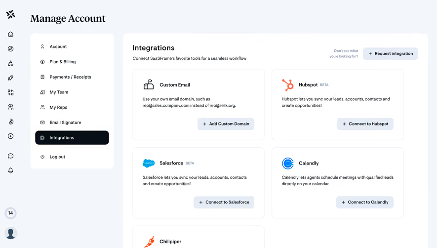
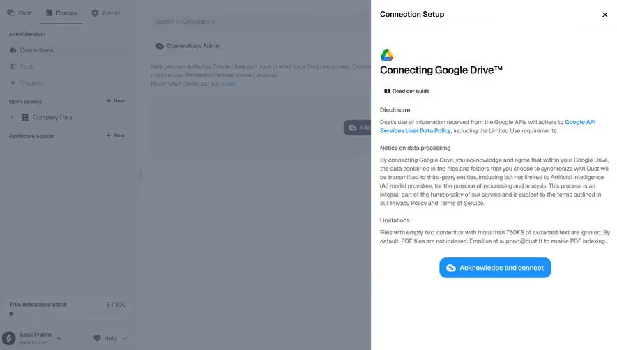
Generate a new design based on this screen using your own content.
Thank you! Your submission has been received!
Oops! Something went wrong while submitting the form.
# Design from Reference: Height Integrations
Create an original, high-fidelity visual design inspired by the reference. Prioritize composition, typography, colors, spacing, and component styling over technical implementation.
## Reference
- **Product:** Height
- **Category:** Integrations
- **Screenshot:** https://cdn.prod.website-files.com/5e9dc792e1210c5325f7ebbc/6acbba8bd01e36484765986c_6acbb9531f7b8c319e5b6094_cms-e1339c5588838a9cbd10bfdd.webp
Analyze the screenshot first. If inaccessible, request it rather than guessing.
## Content
{{content.instructions}}
{{content.data}}
Preserve essential messaging and factual accuracy. Adapt structure and copy length for visual balance; never invent product claims.
## Visual Design
Use this context to reproduce the reference's visual language: layout, typography, colors, spacing, borders, radii, and distinctive elements. The screenshot takes priority if descriptions conflict.
## Direction
{{preferences.fidelityInstructions}}
## Output
{{output.instructions}}
Deliver a polished, cohesive design with precise alignment, hierarchy, and spacing. Produce the requested visual artifact, not just a description. If unsupported, explain the limitation.
Height’s Integrations page embraces a polished, modern minimalism. The interface is airy, generously spaced, and bathed in fresh neutral backgrounds offset by vibrant accent colors. A sense of sleek professionalism is balanced with approachable, playful touches, making the brand feel trustworthy yet energetic.
Layout and Structure
The content follows a clean, logical flow. A prominent hero section immediately introduces the theme—integrations—through a smart visual paired with concise copy and a clear CTA. The main area is elegantly organized into grid-like tiles, each showcasing an integration with visual consistency. Breaks in the grid provide visual breathing room, while a sticky navigation sidebar aids deep exploration. There are no testimonials or pricing blocks, keeping the user squarely focused on integrations.
Visual Elements
Custom vector icons for each app maintain design cohesion and aid quick skimming. Micro-animations bolster interactivity (such as hover effects on integration cards), lending the page a refined dynamism. Clean, restrained line illustrations reinforce clarity over clutter.
Color Palette and Typography
A crisp white canvas hosts accents of violet, blue, and soft gradients, setting a tech-forward tone. Typography is highly readable, relying on geometric sans-serifs for headers and body, with clear weight hierarchy and excellent contrast throughout the UI.
User Experience Patterns
Navigation is frictionless: the sticky sidebar and back-to-overview CTA offer persistent orientation. Subtle animations guide attention without distraction, while clear, prominent buttons nudge users toward action. Every scroll interaction feels intentional and fluid.
Unique or Notable Design Choices
The interplay of spacious layout and consistent icon imagery gives the integrations a tangible, almost tactile, presence. Thoughtful micro-interactions and sidebar navigation create a focused, discovery-driven browsing experience—making both the brand and its ecosystem feel inviting and innovative.