Overall Style and Aesthetic
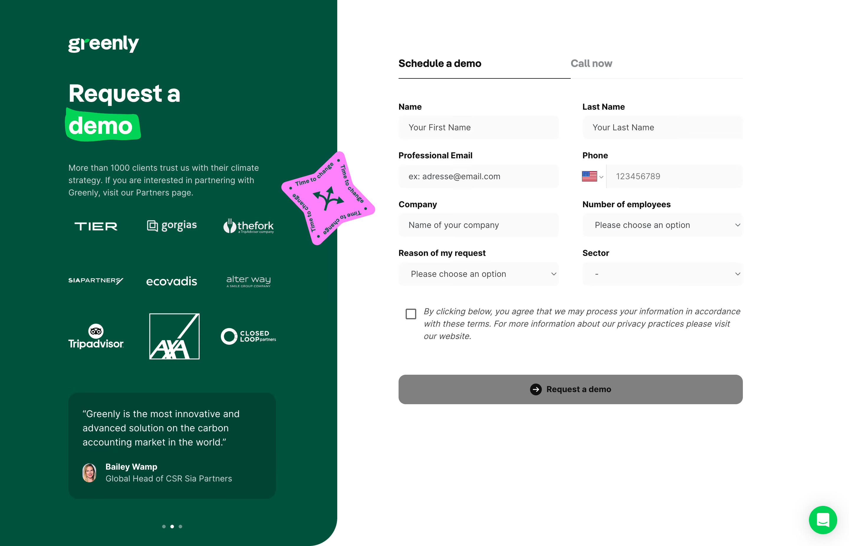
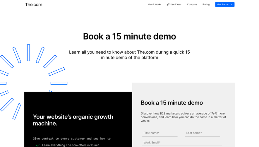
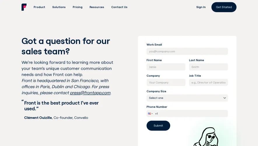
Greenly’s demo page embraces a modern, minimalist aesthetic, blending clean lines with soft, approachable visuals. The site feels professional yet accessible, using whitespace generously to reduce clutter and let content breathe. The overall vibe is trustworthy and progressive, perfectly matching the company’s sustainability focus. Layout and Structure
The structure follows a streamlined SaaS convention: a compelling hero section with a clear headline and prominent call-to-action, followed by succinct value propositions laid out in concise blocks. There are supporting elements like customer logos and trust signals near the top, and a well-organized footer with quick access to other resources. Each section subtly guides the visitor downward with balanced spacing and modular design. Visual Elements
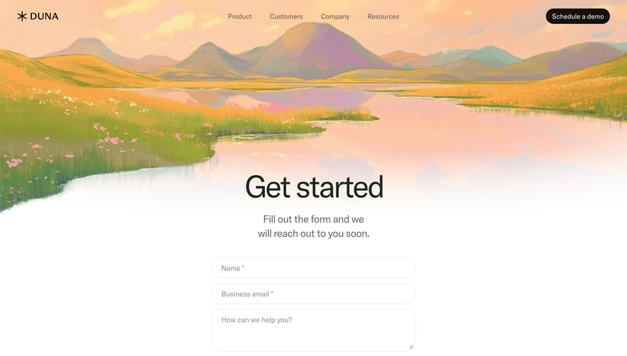
Illustrations are prominent—soft, eco-friendly graphics evoke the brand’s mission while adding visual interest without overwhelming. Subtle animations enliven scroll moments, such as icon fade-ins or gentle movement on illustrations. Video and photography are minimal, ensuring focus stays on the product value. Color Palette and Typography
A refined palette of fresh greens, calming blues, and crisp white forms the backdrop, reinforcing the eco-conscious theme. Typography is clean and contemporary: bold sans-serif headers create instant hierarchy, paired with legible body text for comfort in reading. Accent colors highlight key CTAs, ensuring they draw attention without being garish. User Experience Patterns
Navigation is sticky, minimal, and clear—large CTAs (“Book a demo”) use contrasting color blocks for immediate visibility. Interactive forms are simple, low-friction, and above the fold, reducing barriers to conversion. Micro-interactions on buttons and links provide satisfying tactile feedback. Unique or Notable Design Choices
Greenly stands out with its subtle “breathe” animation in the hero section, alluding to sustainability and a human touch. Customer trust logos are monochromatic, maintaining visual harmony. Overall, the page radiates clarity, reliability, and a forward-thinking ethos—delivering inspiration for any SaaS aiming for a balance of personality and professionalism.