
Thank you! Your submission has been received!
Oops! Something went wrong while submitting the form.
Get SaaSFrame Pro
Monthly
$18
Quarterly
$48
Yearly
$180
Upgrade to access this feature
Browse all screens & flows
Filter and search screens & flows
Access Figma files
Access mobile versions
Bookmark screens & flows
Join now
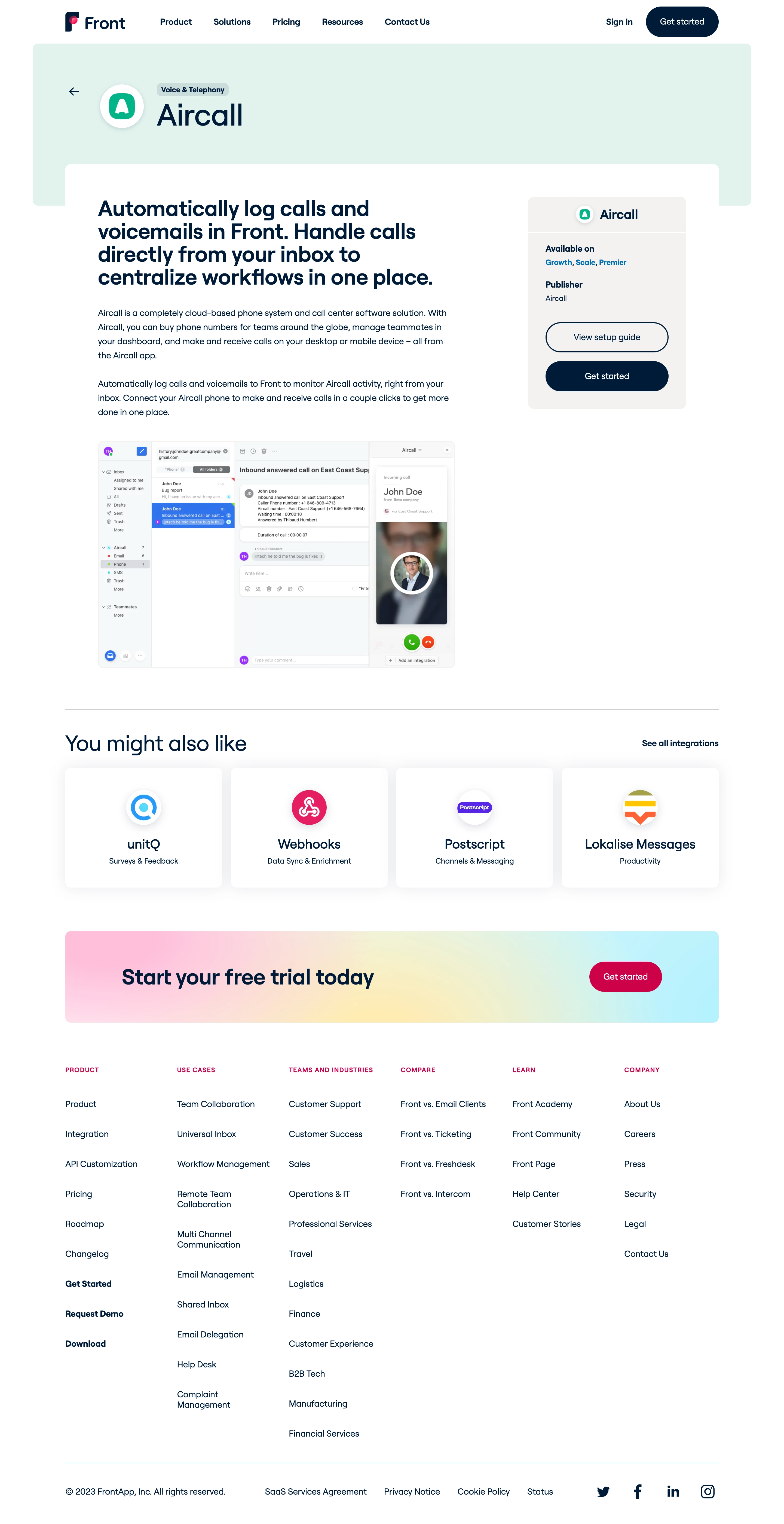

Front Integrations Page

Front
Email client
Designed by
No items found.

Bookmark
Bookmark

Design with AI
Thank you! Your submission has been received!
Oops! Something went wrong while submitting the form.
# Design from Reference: Front Integrations Page
Create an original, high-fidelity visual design inspired by the reference. Prioritize composition, typography, colors, spacing, and component styling over technical implementation.
## Reference
- **Product:** Front
- **Category:** Integrations Page
- **Screenshot:** https://cdn.prod.website-files.com/5e9dc792e1210c5325f7ebbc/6acb67f6c08cd859ff869332_6acb66d5994832179b55ecfd_cms-94bf1c1cb84bd1c6acb1b294.webp
Analyze the screenshot first. If inaccessible, request it rather than guessing.
## Content
{{content.instructions}}
{{content.data}}
Preserve essential messaging and factual accuracy. Adapt structure and copy length for visual balance; never invent product claims.
## Visual Design
### Overall aesthetic
- **Character:** Clean integration-detail marketing page with navy typography, pale mint hero band, white content and soft card shadows.
- **Accent:** A multicolor trial banner and vivid pink final action provide a brighter conversion moment.
- **Observed content:** The page is specifically an Aircall integration detail, not a general integrations directory.
- **Scale:** The image is 2880 × 5596 px. Dimensions below estimate a 1440 × 2798 CSS layout at 2× scale; device ratio and zoom are unverified.
### Page composition
- **Header:** Wordmark left, five navigation links centrally and sign-in/dark rounded action right.
- **Integration band:** An inset mint rectangle contains back arrow, circular app icon, small category badge and large Aircall name.
- **Main content:** A white panel overlaps the band. A broad left column holds a large benefit heading, two paragraphs and product screenshot; a narrower pale sidebar holds app/availability/publisher details and two actions.
- **Related items:** A divider precedes a heading and four equal integration cards with circular icons, names and categories.
- **Conversion/footer:** A horizontal pastel-gradient trial banner sits above six plain footer link columns and a lower legal/social strip.
### Information hierarchy
- **Identity:** Large integration name and category establish context before descriptive content.
- **Benefit:** A bold multiline heading explains call logging/inbox handling.
- **Setup:** Sidebar metadata leads to an outlined guide action and filled Get started action.
- **Proof:** A large screenshot illustrates inbox/call-panel integration; its controls are image content, not live actions.
- **Discovery:** Related cards and a see-all link offer secondary browsing.
- **Conversion:** The final gradient band repeats a strong trial action.
### Typography
- **Family:** Rounded geometric sans-serif; exact identity is unverified.
- **Integration name:** Approximately 54–58 CSS px at regular-to-medium weight.
- **Benefit heading:** Around 38–40 px bold with tight multiline leading.
- **Body:** Approximately 16 px with 26 px line-height, navy throughout.
- **Cards:** Names are around 24 px, categories around 14 px.
- **Footer:** Small pink uppercase group labels use tracking; links are around 15–16 px.
### Colors & surfaces
- **Measured base:** ICC-aware sRGB sampling yields #FFFFFF and pale mint #DDF4EE.
- **Measured foreground:** Navy #001C3A dominates text and filled actions.
- **Measured sidebar:** #F3F2F0 is a warm light-gray surface.
- **Measured secondary:** #F4F8FA appears in product imagery; #DF0045 marks pink accents.
- **Depth:** Circular app icons and related cards have soft shadows; the main body stays flat.
### Components
- **App identity:** Large circular white icon ground with shadow sits beside category chip and name.
- **Metadata card:** A pale rounded sidebar contains centered app header, availability/publisher labels and two pill actions.
- **Screenshot:** A wide rounded image shows inbox navigation, message content and a right-side call interface.
- **Related cards:** Four white rounded rectangles use centered circular icons, bold names and small categories.
- **Trial banner:** A broad rounded pink/yellow/cyan gradient pairs large navy text with a vivid pink pill.
- **Footer:** Six link groups use consistent column axes; social symbols align along the final row.
### Visual rhythm
- **Container:** Main sections share a centered approximately 1200 CSS px width.
- **Overlap:** White content rising over the mint band creates depth without a heavy border.
- **Spacing:** Large gaps distinguish narrative, related cards, trial banner and footer.
- **Alignment:** Left content and right metadata align at the top, while related cards form a uniform row.
### Responsive
- **Evidence limit:** Only desktop is shown; recommendations follow.
- **Header/band:** Collapse navigation and allow app identity to wrap.
- **Columns:** Move metadata/actions below the introductory copy or into a compact summary.
- **Cards/footer:** Reduce four related cards and six footer groups to fewer columns.
- **Figure:** Scale screenshot proportionally with a readable larger-view option.
### Adaptation guidance
- **Reusable pattern:** Combine app identity, benefit narrative, installation metadata, product evidence and related integrations.
- **Hierarchy:** Keep setup actions close to availability/publisher details.
- **Visual discipline:** Use a restrained neutral/mint base and reserve pink/gradient for conversion.
- **Accessibility:** Label back/social actions, provide screenshot alternatives and retain visible focus on setup links.
Use this context to reproduce the reference's visual language: layout, typography, colors, spacing, borders, radii, and distinctive elements. The screenshot takes priority if descriptions conflict.
## Direction
{{preferences.fidelityInstructions}}
## Output
{{output.instructions}}
Deliver a polished, cohesive design with precise alignment, hierarchy, and spacing. Produce the requested visual artifact, not just a description. If unsupported, explain the limitation.


Category
Patterns
No items found.


Added on
June 12, 2023
Similar screens
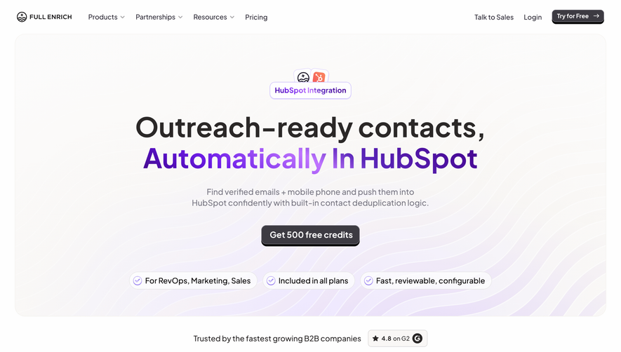


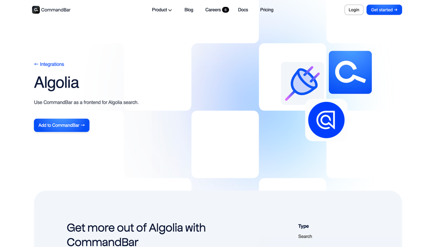

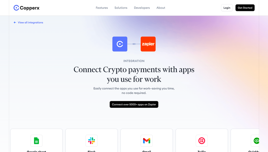

Upgrade to SaaSFrame Pro now to see similar examples.
Monthly
$18 /month
Billed $18 monthly
Browse all screens & flows
Filter and search screens & flows
Search text in screenshots
Access Figma files
Access mobile versions
Join now
Quarterly
$16 /month
Billed $48 quarterly
Browse all screens & flows
Filter and search screens & flows
Search text in screenshots
Access Figma files
Access mobile versions
Join now
Yearly
$15 /month
Billed $180 yearly
Browse all screens & flows
Filter and search screens & flows
Search text in screenshots
Access Figma files
Access mobile versions
Join now