
Thank you! Your submission has been received!
Oops! Something went wrong while submitting the form.
Get SaaSFrame Pro
Monthly
$18
Quarterly
$48
Yearly
$180
Upgrade to access this feature
Browse all screens & flows
Filter and search screens & flows
Access Figma files
Access mobile versions
Bookmark screens & flows
Join now


Front Changelog

Front
Email client
Designed by
No items found.

Bookmark
Bookmark

Design with AI
Thank you! Your submission has been received!
Oops! Something went wrong while submitting the form.
# Design from Reference: Front Changelog
Create an original, high-fidelity visual design inspired by the reference. Prioritize composition, typography, colors, spacing, and component styling over technical implementation.
## Reference
- **Product:** Front
- **Category:** Changelog
- **Screenshot:** https://cdn.prod.website-files.com/5e9dc792e1210c5325f7ebbc/62ec9c66b0a5d877dc75caba_1659621155044-screenshot-device-0a3aba8fde0a5b16d4898f5651d722d2-1659600058129.webp
Analyze the screenshot first. If inaccessible, request it rather than guessing.
## Content
{{content.instructions}}
{{content.data}}
Preserve essential messaging and factual accuracy. Adapt structure and copy length for visual balance; never invent product claims.
## Visual Design
### Overall aesthetic
- **Character:** A restrained chronological changelog uses a white canvas, narrow reading column, slate typography, black category pills, and product screenshots.
- **Evidence:** The source is 1440 × 8700 px, inspected across seven readable crops. Dimensions below are approximate source pixels; CSS scale is unverified.
- **Focus:** The design emphasizes sequential reading rather than a card-grid overview.
### Page composition
- **Header:** A thin blue top rule and compact brand/title/domain block sit above a faint horizontal divider.
- **Timeline:** Ten visible update entries form one central stack, with dates in a narrow left gutter and content in an approximately 560 px-wide column.
- **Entry anatomy:** Heading, category pill, one or more paragraphs, product image, and author line repeat.
- **Image variation:** Some entries show wide dashboard captures, others tall narrow chat/integration panels or an illustrated search state.
- **Ending:** A centered blue previous-updates link with chevron follows the final divider.
### Information hierarchy
- **Titles:** Semibold slate headings identify each change; longer titles wrap into two lines.
- **Categories:** Black pills distinguish Improvement and New without changing entry layout.
- **Body:** Muted slate paragraphs explain changes; blue inline links identify related resources.
- **Metadata:** Dates and author lines are lighter gray. Circular initial avatars precede author names and roles.
- **Screenshots:** Embedded product UI supplies evidence of each update but is separate from the changelog's own controls.
### Typography
- **Family:** A neutral sans serif is used; exact identity is unverified.
- **Entry headings:** Approximately 25–26 px semibold with 31 px line-height.
- **Body:** Around 15–16 px with 25 px leading.
- **Category pills:** Approximately 15 px white text.
- **Dates/authors:** Around 15–16 px, lighter gray; avatars contain single white initials.
- **Header:** Compact title around 16 px with smaller muted domain underneath.
### Colors & surfaces
- **Measured palette:** Source samples include white #FFFFFF, pale #F3F5F7, near-white #FEFEFE, gray #B2B2B2, #FDFFFF, and #F6F8FA.
- **Semantic use:** Slate-gray text contrasts with white; black pills provide the strongest repeated dark element.
- **Links:** Blue marks inline resources and the final pagination action.
- **Screenshots:** Product images contain their own blue, navy, gray, and colored controls; these are not universal changelog tokens.
- **Separators:** Very faint gray rules divide updates without enclosing cards.
### Components
- **Timeline layout:** Right-aligned date gutter approximately 100 px wide sits about 30 px before the content column.
- **Category pills:** Fully rounded black capsules around 28 px high with modest side padding.
- **Images:** Width varies up to the content measure; wide application captures and tall narrow panels retain distinct aspect ratios.
- **Author row:** A gray circular initial badge about 30 px precedes muted name/role text.
- **Dividers:** Thin horizontal lines span only the main content column.
- **Pagination:** Unfilled blue text action with a small downward chevron.
### Visual rhythm
- **Outer space:** Broad white side margins keep the long feed calm.
- **Entry cadence:** Heading/pill/body remain tightly grouped, followed by imagery and a larger author/divider pause.
- **Image density:** Tall captures create variable entry heights; the chronology does not force equal blocks.
- **Alignment:** Titles, prose, images, authors, and dividers share the same left edge.
### Responsive
- **Observed limit:** Only desktop is shown; actual pagination and mobile behavior are unverified.
- **Recommended timeline:** Move dates above titles on small screens, preserving chronological association.
- **Recommended imagery:** Scale screenshots proportionally and offer readable enlargement where appropriate.
- **Recommended text:** Use 20–24 CSS px gutters and retain comfortable body leading.
### Adaptation guidance
- **Preserve:** Keep the narrow editorial column, clear categories, repeated author treatment, and varied product evidence.
- **Build:** Use a reusable update component with date, title, category, rich text, image, and author fields.
- **Assets:** Treat embedded send/delete/search controls as image content rather than live page actions.
- **Accessibility:** Provide useful image alternatives, descriptive links, visible focus, and adequate metadata contrast.
- **Validate:** Confirm fonts, CSS sizing, date wrapping, image enlargement, and previous-update loading. Only the visible feed state is evidenced.
Use this context to reproduce the reference's visual language: layout, typography, colors, spacing, borders, radii, and distinctive elements. The screenshot takes priority if descriptions conflict.
## Direction
{{preferences.fidelityInstructions}}
## Output
{{output.instructions}}
Deliver a polished, cohesive design with precise alignment, hierarchy, and spacing. Produce the requested visual artifact, not just a description. If unsupported, explain the limitation.


Category
Patterns
No items found.


Added on
April 23, 2020
Similar screens
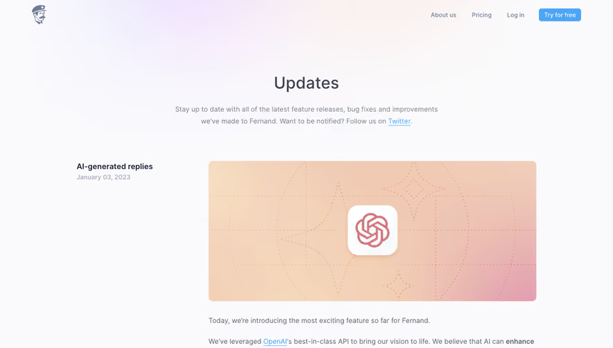


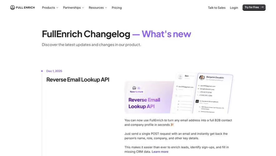



Upgrade to SaaSFrame Pro now to see similar examples.
Monthly
$18 /month
Billed $18 monthly
Browse all screens & flows
Filter and search screens & flows
Search text in screenshots
Access Figma files
Access mobile versions
Join now
Quarterly
$16 /month
Billed $48 quarterly
Browse all screens & flows
Filter and search screens & flows
Search text in screenshots
Access Figma files
Access mobile versions
Join now
Yearly
$15 /month
Billed $180 yearly
Browse all screens & flows
Filter and search screens & flows
Search text in screenshots
Access Figma files
Access mobile versions
Join now