
Thank you! Your submission has been received!
Oops! Something went wrong while submitting the form.
Get SaaSFrame Pro
Monthly
$18
Quarterly
$48
Yearly
$180
Upgrade to access this feature
Browse all screens & flows
Filter and search screens & flows
Access Figma files
Access mobile versions
Bookmark screens & flows
Join now
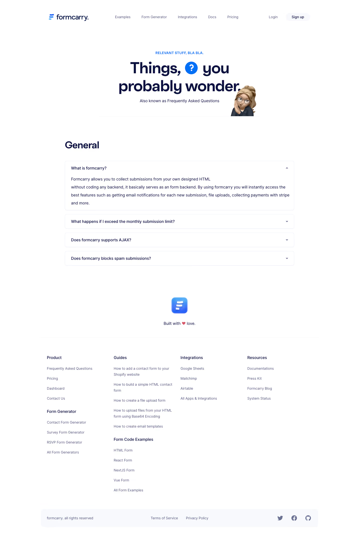

Formcarry FAQ

Formcarry
Form backend
Designed by


Bookmark
Bookmark

Design with AI
Thank you! Your submission has been received!
Oops! Something went wrong while submitting the form.
# Design from Reference: Formcarry FAQ
Create an original, high-fidelity visual design inspired by the reference. Prioritize composition, typography, colors, spacing, and component styling over technical implementation.
## Reference
- **Product:** Formcarry
- **Category:** FAQ Page
- **Screenshot:** https://cdn.prod.website-files.com/5e9dc792e1210c5325f7ebbc/6acbbe3d476aea3982e3fae9_6acbbd6fa4008ddb7476bff8_cms-31d60b45b3f3126d1f16e6e2.webp
Analyze the screenshot first. If inaccessible, request it rather than guessing.
## Content
{{content.instructions}}
{{content.data}}
Preserve essential messaging and factual accuracy. Adapt structure and copy length for visual balance; never invent product claims.
## Visual Design
### Overall aesthetic
- **Character:** A bright FAQ page pairs oversized navy typography with restrained blue accents and a playful avatar illustration.
- **Restraint:** Thin pale outlines, generous whitespace and a simple footer keep attention on questions and answers.
### Page composition
- **Capture:** The source is 1440 × 2178 image pixels, inspected throughout. Measurements approximate image pixels; CSS scale is unverified.
- **Header:** Brand sits left of a horizontal navigation group, with account links to the right.
- **Hero:** A small uppercase eyebrow precedes a centered two-line heading with an inline question-mark circle; subtitle and avatar illustration sit beneath/right.
- **Questions:** A General heading introduces four accordion items, with the first expanded.
- **Footer:** A centered app icon and short sign-off precede four navigation columns and a pale legal/social strip.
### Information hierarchy
- **Opening:** Large heading and question icon establish the FAQ theme.
- **Content:** The General section label leads to the expanded first question, whose answer remains fully visible.
- **Collapsed rows:** Three subsequent questions show only their titles and down indicators.
- **Footer:** Smaller muted link groups provide secondary navigation below a clear divider.
### Typography
- **Family:** Rounded modern sans serif forms appear throughout; exact identity is unverified.
- **Hero:** Approximately 64 pixels, bold with about 72-pixel leading.
- **Section:** General is around 40 pixels and bold.
- **Questions/body:** Approximately 16 pixels, with expanded answer leading around 32 pixels.
- **Utilities:** Eyebrow uses roughly 14-pixel uppercase blue text; footer links around 14 pixels.
### Colors & surfaces
- **Measured base:** White #FFFFFF dominates.
- **Measured ink:** Deep navy #09123C provides heading and question contrast.
- **Measured soft tones:** #F7F9FC supports subtle surfaces; #ECF0F9 contributes pale boundaries/background details.
- **Accent relationship:** Bright blue marks the question symbol, logo and eyebrow; a small heart adds pink to the sign-off.
### Components
- **Accordion panels:** Approximately 920 pixels wide, with thin pale borders, roughly 8-pixel radii and 24-pixel horizontal padding.
- **Expanded state:** The first panel includes a multiline answer and upward triangle; collapsed rows are around 58 pixels high with downward triangles.
- **Hero illustration:** A glasses-wearing avatar overlaps the lower-right of the heading area above a fine horizontal rule.
- **Signup control:** A pale rounded capsule sits at the right of the header.
- **Footer strip:** A wide pale rounded rectangle aligns copyright, legal links and three social icons.
### Visual rhythm
- **Container:** FAQ content uses a centered roughly 920-pixel column; header/footer extend wider.
- **Accordion spacing:** Approximately 16-pixel gaps separate items.
- **Section pauses:** Large vertical gaps separate hero, questions, sign-off and footer navigation.
- **Text cadence:** The expanded answer uses unusually spacious leading, contrasting with compact collapsed rows.
### Responsive
- **Observed state:** Only desktop layout is supplied; mobile behavior is unverified.
- **Recommended flow:** Make the FAQ column fluid, reduce hero type and reposition the avatar to avoid overlap with text.
- **Recommended navigation:** Collapse header links and stack footer columns while keeping accordion controls reachable.
### Adaptation guidance
- **Preserve the tone:** Keep navy type, blue question motif and light outlines.
- **State fidelity:** Retain one expanded and three collapsed questions without inventing hidden answers.
- **Content resilience:** Let expanded panels grow naturally with text and avoid fixed-height answer containers.
- **Accessibility:** Use semantic accordion buttons with expanded state and associate answers with their questions.
Use this context to reproduce the reference's visual language: layout, typography, colors, spacing, borders, radii, and distinctive elements. The screenshot takes priority if descriptions conflict.
## Direction
{{preferences.fidelityInstructions}}
## Output
{{output.instructions}}
Deliver a polished, cohesive design with precise alignment, hierarchy, and spacing. Produce the requested visual artifact, not just a description. If unsupported, explain the limitation.


Category
Patterns
No items found.
Tech Stack


Added on
February 5, 2023
Similar screens
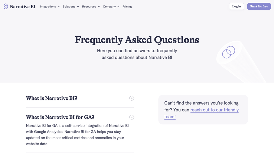




Upgrade to SaaSFrame Pro now to see similar examples.
Monthly
$18 /month
Billed $18 monthly
Browse all screens & flows
Filter and search screens & flows
Search text in screenshots
Access Figma files
Access mobile versions
Join now
Quarterly
$16 /month
Billed $48 quarterly
Browse all screens & flows
Filter and search screens & flows
Search text in screenshots
Access Figma files
Access mobile versions
Join now
Yearly
$15 /month
Billed $180 yearly
Browse all screens & flows
Filter and search screens & flows
Search text in screenshots
Access Figma files
Access mobile versions
Join now