Overall Style and Aesthetic
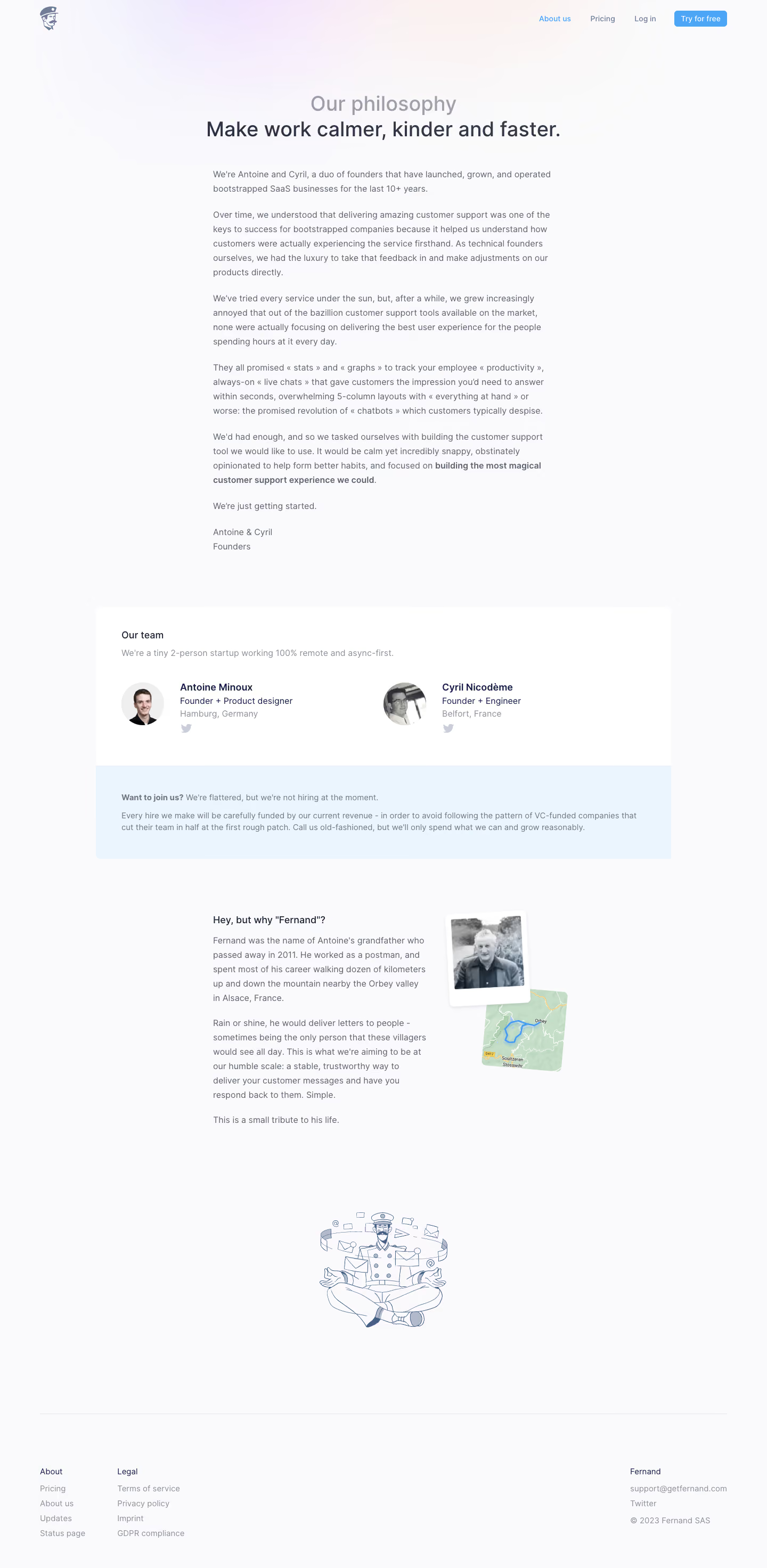
Fernand’s About Us page radiates a crisp, modern minimalism, blending a professional yet approachable vibe. The design eschews visual clutter in favor of spacious layouts, soft gradients, and an inviting color scheme, making the brand feel both trustworthy and forward-thinking. Layout and Structure
The page unfolds with a prominent hero section featuring a concise mission statement and emotive team illustration, immediately establishing the brand’s personality. Content is divided into digestible sections—story, team, values—each segmented by generous white space for easy skimming. There’s no overcrowding; each message gets room to breathe. Visual Elements
Custom illustrations and playful character art infuse the page with warmth and personality, setting it apart from generic SaaS layouts. There are no stock photos; instead, a lively mascot and staff caricatures reinforce brand accessibility. Minimal animations add subtle energy without distracting from the message. Color Palette and Typography
A fresh pastel-driven palette—featuring light blues, purples, and accents of coral—evokes calm confidence. Typography is led by a soft, rounded sans-serif for headings, contrasted with a legible body font. Visual hierarchy is clear, with bold headlines and lighter subtext guiding the reader’s eye. User Experience Patterns
Navigation is clean and persistent, ensuring users never lose their way. CTAs are prominent yet unobtrusive, integrated into the flow rather than forced. Smooth scrolling and sticky navigation support a seamless, engaging browsing experience. Unique or Notable Design Choices
The standout use of quirky, on-brand illustrations as storytelling elements adds a memorable, delightful touch. Overall, the tone feels energetic and human-centric, balancing professionalism with a relatable warmth, offering a masterclass in approachable SaaS branding.