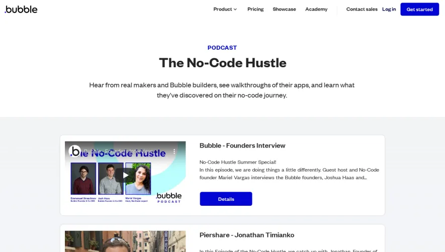
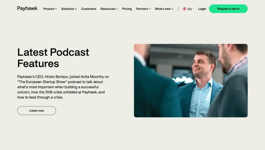
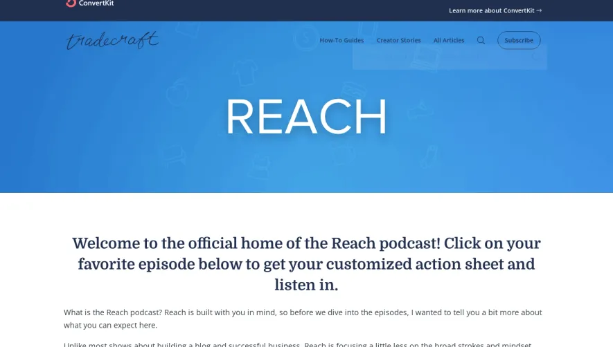
Generate a new design based on this screen using your own content.
Thank you! Your submission has been received!
Oops! Something went wrong while submitting the form.
# Design from Reference: Fellow Podcast Page
Create an original, high-fidelity visual design inspired by the reference. Prioritize composition, typography, colors, spacing, and component styling over technical implementation.
## Reference
- **Product:** Fellow
- **Category:** Podcast Pages
- **Screenshot:** https://cdn.prod.website-files.com/5e9dc792e1210c5325f7ebbc/62ecad9e3da29ecca0f61833_1659676609189-5eccdab72c6a90b37eb3ae66_screencapture-fellow-app-supermanagers-2020-05-26-10_59_59.webp
Analyze the screenshot first. If inaccessible, request it rather than guessing.
## Content
{{content.instructions}}
{{content.data}}
Preserve essential messaging and factual accuracy. Adapt structure and copy length for visual balance; never invent product claims.
## Visual Design
Use this context to reproduce the reference's visual language: layout, typography, colors, spacing, borders, radii, and distinctive elements. The screenshot takes priority if descriptions conflict.
## Direction
{{preferences.fidelityInstructions}}
## Output
{{output.instructions}}
Deliver a polished, cohesive design with precise alignment, hierarchy, and spacing. Produce the requested visual artifact, not just a description. If unsupported, explain the limitation.
Fellow’s Supermanagers page embodies a crisp, modern design with subtle pops of color and meticulously balanced whitespace. The look is unmistakably professional, yet the use of warm gradients and playful illustrations imbues the site with an approachable, energetic character. The aesthetic conveys both innovation and trust, ideal for a SaaS brand targeting growth-minded leaders.
Layout and Structure
The layout is built around a strong linear progression—an engaging hero section with a focused headline and supporting visuals, followed by concise content blocks showcasing podcast episodes, guest highlights, and host details. The flow is intuitive: primary content takes precedence, while supplementary sections—like newsletter sign-up and listening platforms—are relegated to smartly organized panels and a structured footer.
Visual Elements
Illustrative portraits, podcast artwork, and custom iconography provide visual interest, avoiding reliance on generic stock imagery. Minimalist animations (such as hover effects) add interactivity without distraction. The media grid and embedded podcast player are both functional and visually cohesive, harmonizing the site’s content-heavy nature with strong aesthetics.
Color Palette and Typography
A sophisticated color palette—dominated by deep blues and emerald greens, with coral accents—creates a sense of depth and vibrancy. Bold headers and clean sans-serif fonts, set in varied weights, establish clear hierarchy and direct the user’s eye seamlessly through each section.
User Experience and Unique Features
Navigation is streamlined through a sticky, uncluttered header and frequent, purpose-driven CTAs (“Listen Now”, “Subscribe”). Notable design choices include prominent episode cards with snappy summaries and platform badges for instant access. The overall tone is inviting and credible, blending strategic content architecture with memorable visual storytelling—ideal for users seeking SaaS inspiration that balances clarity, personality, and polish.