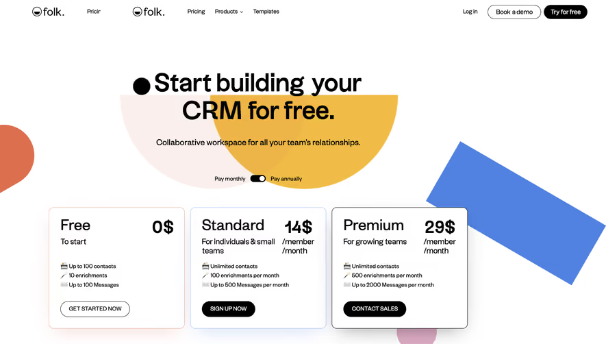
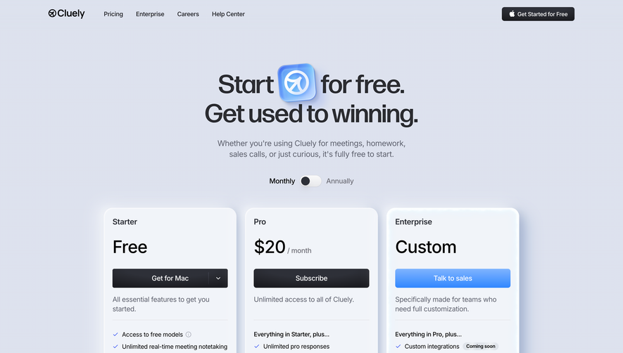
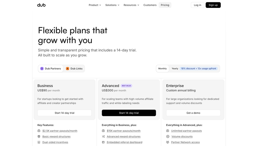
Overall Style and Aesthetic
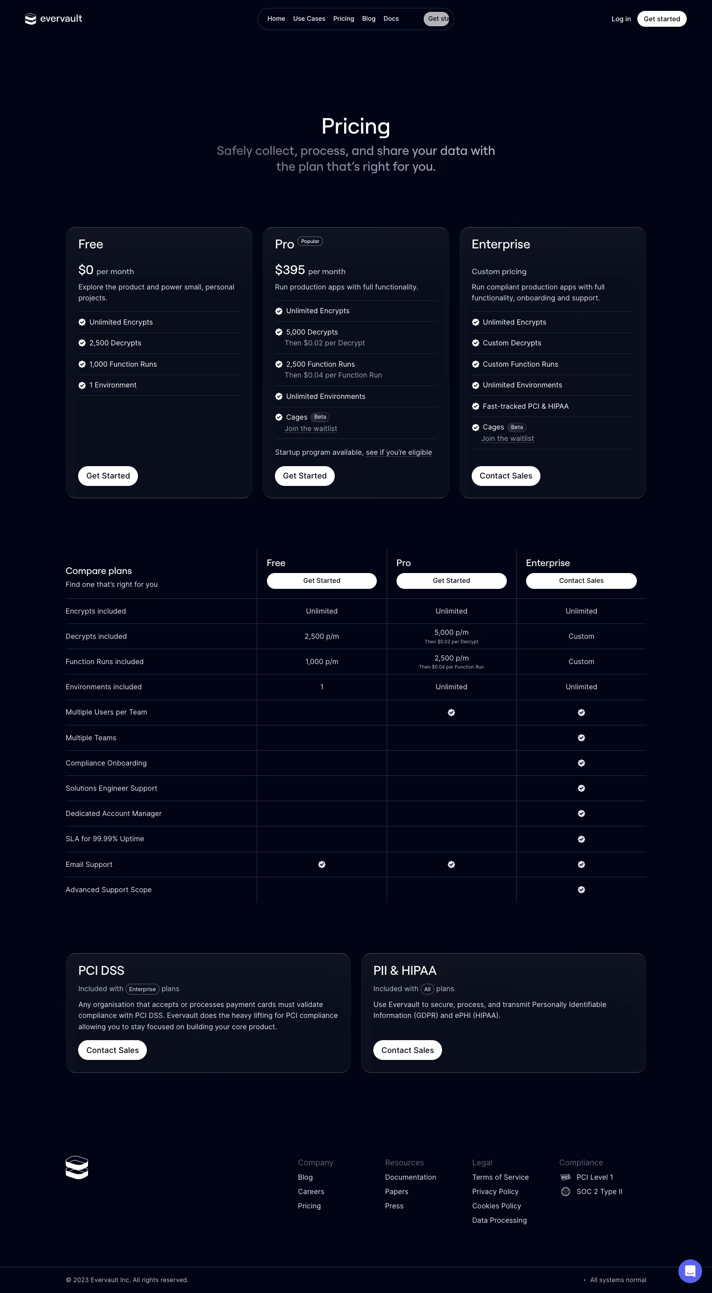
Evervault’s pricing page radiates a hyper-modern, minimalist vibe. The aesthetic is clean yet highly sophisticated, with plenty of whitespace, subtle gradients, and sleek UI elements that keep the focus on the content. It strikes a professional yet approachable tone, suggesting a brand that blends technical rigor with accessibility. Layout and Structure
The structure is laser-focused on clarity and conversion. The top begins with a concise explainer and transitions directly into clearly distinguished pricing cards. There are no superfluous sections; information is distilled down to essentials. Compact feature comparisons are embedded in the pricing grid itself, avoiding unnecessary scrolling. The footer anchors the page, offering secondary navigation and legal links in a tidy, unobtrusive format. Visual Elements
Distinctive geometric icons and animated glyphs punctuate the page, emphasizing key features and creating visual interest without overwhelming. Feature lists employ crisp checkmarks and badges, while plan highlights receive subtle color backgrounds. Micro-interactions—like hover states and smooth transitions—add polish and responsiveness, elevating the experience. Color Palette and Typography
The palette is understated and tech-forward: cool neutrals, slate grays, and deep navy, accented with pops of cyan and emerald for CTAs and highlights. Typography is set in geometric sans-serif fonts, with bold headings and clear hierarchy, ensuring instant legibility and scanning ease. User Experience Patterns
Navigation remains accessible but unobtrusive, with persistent top links. Primary CTAs (like “Get Started”) are visually prominent. Scroll is efficient, and all pricing and feature details are compactly accessible above the fold. Plan selection is reinforced with clear, actionable buttons and immediate, transparent feature disclosure. Unique or Notable Design Choices
Noteworthy are the subtle, on-brand animations and interactive plan toggles—engaging without distraction. The overall tone communicates trustworthiness and innovation, making complex security tooling feel digestible for decision-makers and tech leads alike.