Design with AI
Generate a new design based on this screen using your own content.
# Design from Reference: Drip Signup Page
Create an original, high-fidelity visual design inspired by the reference. Prioritize composition, typography, colors, spacing, and component styling over technical implementation.
## Reference
- **Product:** Drip
- **Category:** Signup
- **Screenshot:** https://cdn.prod.website-files.com/5e9dc792e1210c5325f7ebbc/6acbceb075891049b1840110_6acbcd16d6be908889c90696_cms-ddd7f3b21027be1cd10b3152.webp
Analyze the screenshot first. If inaccessible, request it rather than guessing.
## Content
{{content.instructions}}
{{content.data}}
Preserve essential messaging and factual accuracy. Adapt structure and copy length for visual balance; never invent product claims.
## Visual Design
### Overall aesthetic
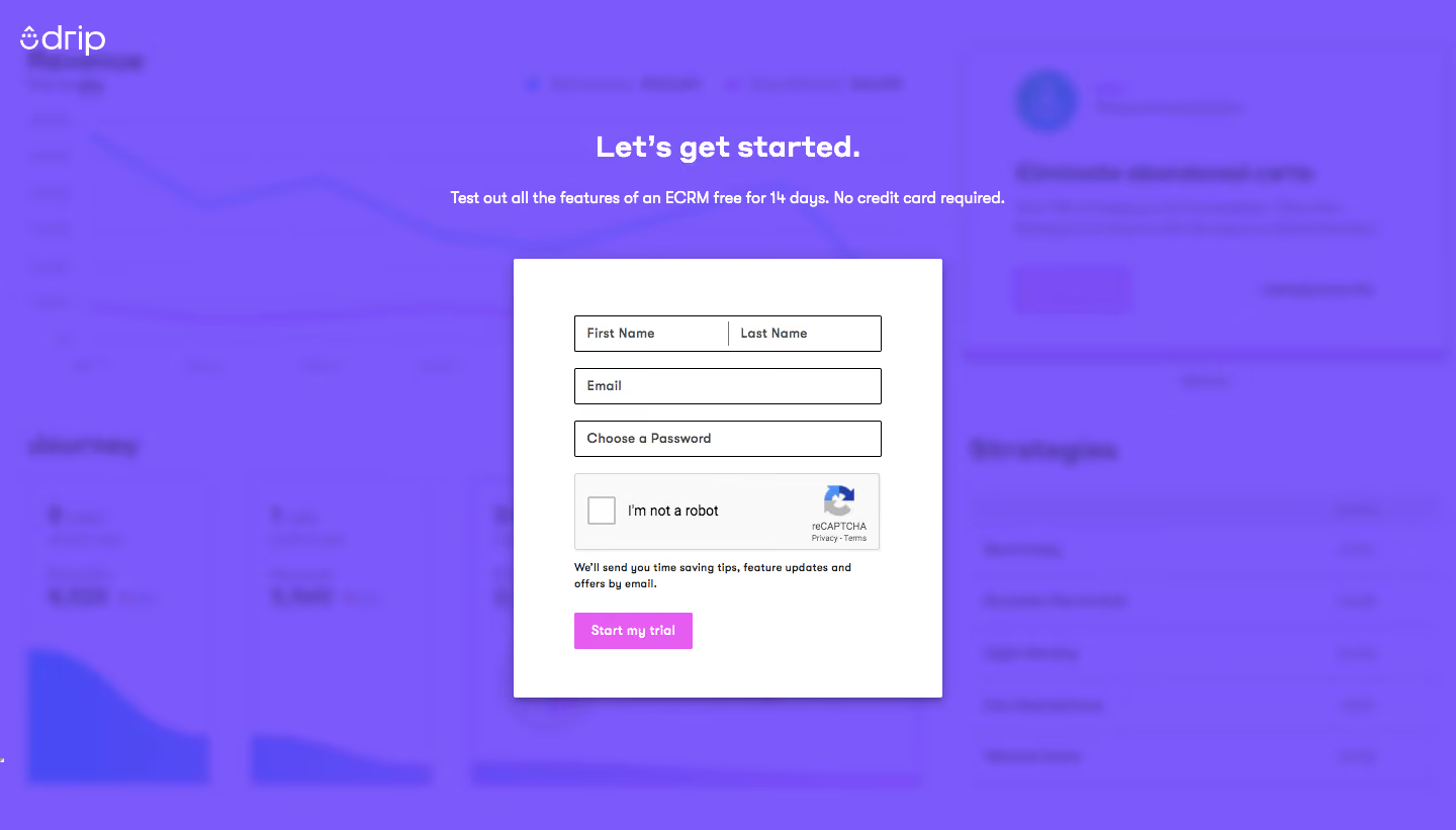
- **Character:** Saturated violet signup overlay with a blurred product backdrop, centered white form and small pink action.
- **Evidence and scale:** Screenshot is 1440 × 821 image pixels. Sizes describe captured pixels with plausible 1× CSS scale; actual DPR and font identity are unverified.
### Page composition
- **Backdrop:** Blurred dashboard-like imagery is covered by a strong violet layer; white brand sits upper-left.
- **Intro:** Centered bold heading and single-line trial statement sit above the form.
- **Form card:** Approximately 424 × 434px white rectangle contains split name fields, email, password, CAPTCHA, email-updates note and trial action.
- **Frame:** Broad colored margins isolate the signup task; no separate footer appears.
### Information hierarchy
- **Task:** White heading and trial copy introduce the form.
- **Fields:** Name pair precedes email/password.
- **Verification:** Large CAPTCHA widget sits between fields and the action.
- **Action:** Pink Start my trial control contrasts with white card and violet backdrop; no completed verification/signup is visible.
### Typography
- **Heading:** Approximately 30px captured size bold sans-serif.
- **Intro:** Around 16px bold-to-medium.
- **Fields/action:** Around 12–14px; small explanatory note around 11px with 16px leading.
- **Family:** Rounded/geometric-looking sans-serif, exact identity and computed values unverified.
### Colors & surfaces
- **Measured backdrop:** Violet #7C59FB dominates, with related #7B58FA/#7A57F9/#7A58F7.
- **Measured form:** White #FFFFFF and near-white #F9F9F9.
- **Foreground:** Dark field outlines/text; pink-magenta action supplies a localized secondary accent.
- **Depth:** Soft card shadow and blurred imagery separate the active form from background context.
### Components
- **White shell:** Small-radius rectangle with roughly 60px horizontal padding and subtle lower shadow.
- **Inputs:** Approximately 304 × 36px, thin dark outlines and nearly square corners. Name row divides into equal halves with a central rule.
- **CAPTCHA:** Pale rectangular widget with unchecked square, label and provider logo/legal detail.
- **Trial action:** Small content-width pink rectangle, white bold label and minimal radius.
- **Backdrop imagery:** Indistinct charts/cards remain decorative; exact dashboard details cannot be established.
### Visual rhythm
- **Intro spacing:** Large gap before the card, with heading/subtitle closely paired.
- **Field cadence:** Short 16px gaps connect outlined inputs.
- **Task sequence:** CAPTCHA, note and action form a compact lower stack.
- **Contrast:** White form is the only crisp large surface within the saturated blur.
### Responsive
- **Observed limit:** Desktop signup only; CAPTCHA interaction, validation and mobile layout are unobserved.
- **Recommended sizing:** Use fluid card margins, reduce padding and stack names when needed.
- **Recommended widget:** Ensure CAPTCHA fits without horizontal clipping.
- **Recommended controls:** Preserve persistent labels and comfortable touch targets rather than copying small captured control heights.
### Adaptation guidance
- **Preserve focus:** Blur product context behind one clear signup task.
- **Use color carefully:** One strong violet background and small contrasting action are sufficient.
- **Implementation:** Provide accessible labels, verification alternatives, focus and validation. Trial duration and email-update wording are historical captured copy requiring separate verification.
Use this context to reproduce the reference's visual language: layout, typography, colors, spacing, borders, radii, and distinctive elements. The screenshot takes priority if descriptions conflict.
## Direction
{{preferences.fidelityInstructions}}
## Output
{{output.instructions}}
Deliver a polished, cohesive design with precise alignment, hierarchy, and spacing. Produce the requested visual artifact, not just a description. If unsupported, explain the limitation.