
Thank you! Your submission has been received!
Oops! Something went wrong while submitting the form.
Get SaaSFrame Pro
Monthly
$18
Quarterly
$48
Yearly
$180
Upgrade to access this feature
Browse all screens & flows
Filter and search screens & flows
Access Figma files
Access mobile versions
Bookmark screens & flows
Join now

Cycle Early Access Page

Cycle
Ship stuff people need.
Designed by
No items found.

Bookmark
Bookmark

Design with AI
Thank you! Your submission has been received!
Oops! Something went wrong while submitting the form.
# Design from Reference: Cycle Early Access Page
Create an original, high-fidelity visual design inspired by the reference. Prioritize composition, typography, colors, spacing, and component styling over technical implementation.
## Reference
- **Product:** Cycle
- **Category:** Early Access Page
- **Screenshot:** https://cdn.prod.website-files.com/5e9dc792e1210c5325f7ebbc/62ec9c62c09ba354520bffbb_1659620623382-screenshot-device-ef4b0cc9778490bdadfd58756ac488e9-1659598765895.webp
Analyze the screenshot first. If inaccessible, request it rather than guessing.
## Content
{{content.instructions}}
{{content.data}}
Preserve essential messaging and factual accuracy. Adapt structure and copy length for visual balance; never invent product claims.
## Visual Design
### Overall aesthetic
- **Character:** A playful early-access landing page combines warm off-white surfaces, bold black typography and saturated blue/green/yellow/pink graphics.
- **Visual identity:** Thin outlined geometric structures, soft 3D characters and small tactile interface objects create a distinctive illustrated product story.
### Page composition
- **Capture:** The source measures 1440 × 7724 image pixels. Observed dimensions below approximate CSS only under an unverified 1× capture assumption.
- **Hero:** A sparse header precedes a Product Hunt badge, centered two-line headline, explanatory paragraph and paired waitlist/video actions. Large geometric artwork frames the sides and bottom.
- **Product hub:** A centered heading, subtitle and Without/With Cycle switch lead into a hub-and-spoke integration diagram.
- **Integration catalogue:** A broad warm rounded panel contains two labeled groups of app marks, Sources and Collaboration.
- **Lifecycle:** A centered introduction precedes four wide outlined accordion-like stages. Capture is expanded with horizontal feature cards; Connect, Collaborate and Close the loop are collapsed.
- **Product and details:** A split customer-data feature row leads into an asymmetric grid of ten small product-detail cards.
- **Closing:** A saturated blue waitlist band with geometric decorations ends above a rounded white copyright/social footer.
### Information hierarchy
- **Hero emphasis:** The final headline word is green with a matching highlight/underline treatment.
- **Section titles:** Large centered bold headings establish each narrative chapter.
- **Lifecycle stages:** Broad row labels and colored circular progress motifs create a clear four-part sequence.
- **Detail grid:** Short bold titles and compact descriptions explain individual interface conveniences.
- **Conversion:** Waitlist actions recur in the header, hero and final blue band.
### Typography
- **Family:** A rounded geometric-looking sans serif is visible; exact identity is unverified.
- **Hero/section headings:** Approximately 58–64 px in the source, bold, with tight tracking and compact leading.
- **Subtitles:** Approximately 23–24 px, regular, in medium gray.
- **Card titles:** Approximately 22–26 px, bold; lifecycle stage labels are larger, around 36 px.
- **Body and controls:** Approximately 16–18 px with 24–28 px leading, using medium-weight button labels.
### Colors & surfaces
- **Measured foundation:** ICC-aware sRGB sampling yields white #FFFFFF and warm #FFFAF5.
- **Measured primary:** Blue #2A44E6 fills actions and the closing band, with related #2B44DF in graphic regions.
- **Measured accents:** Green #2AC978, yellow #FED230 and pink #F3BBFB appear across illustrations.
- **Measured text:** Near-black #161618 anchors headings; medium gray supports descriptions.
- **Surface treatment:** Thin dark outlines define cards and geometric artwork; soft shadows are concentrated on 3D objects rather than large panels.
### Components
- **Waitlist pills:** Blue filled and white outlined actions use fully rounded ends; the video action includes a circular play icon.
- **Hero artwork:** Arches, blocks, circles, a pencil, socket/plug and floating character forms create a connected visual frame.
- **Hub diagram:** A large blue Cycle mark connects through thin curved lines to eight app tiles, with small character accents nearby.
- **Integration grid:** Two groups of twelve rounded icon tiles use solid outlines for emphasized marks and dashed outlines for quieter ones.
- **Lifecycle rows:** Large outlined rounded containers use right-side ring motifs. The expanded stage shows colorful visual cards and an overlaid directional arrow.
- **Product screenshot:** A blue-edged app window shows navigation and a customer table beside a text block.
- **Detail mosaic:** Cards cover cover images, previews, pinning, search, themes, bulk actions, shortcuts, collaboration, incognito and clapping, using varied spans and consistent thin outlines.
- **Footer:** A white rounded-top strip contains small ownership text and three outlined circular social controls.
### Visual rhythm
- **Chapter spacing:** Large gaps distinguish hero, hub, integrations, lifecycle and detail sections.
- **Geometric repetition:** Circles, rounded tiles and thin connecting lines unify different illustrations.
- **Grid variation:** The regular integration grid contrasts with the asymmetric detail mosaic.
- **Color pacing:** Warm/white sections lead into a final uninterrupted blue conversion region.
- **Alignment:** Centered display headings alternate with left-aligned feature copy and card descriptions.
### Responsive
- **Evidence boundary:** Only a desktop capture is shown; responsive behaviors are recommendations.
- **Hero scaling:** Reduce decorative side artwork and display type while preserving the central message/actions.
- **Diagram access:** Reflow integration tiles and provide textual equivalents for the hub relationships.
- **Lifecycle/grid:** Stack feature cards and simplify the asymmetric mosaic into fewer columns.
- **Conversion/footer:** Keep waitlist controls prominent and social targets comfortably sized.
### Adaptation guidance
- **Product narrative:** Reuse a clear promise, connected-tool diagram, lifecycle stages and small delight-focused details.
- **Illustration consistency:** Preserve the mix of thin outlines, geometric blocks and soft 3D accents without crowding text.
- **Accessible interactions:** Define switch, accordion and video-control states with keyboard support; only the captured static states are verified.
- **Content separation:** Treat integration availability and early-access claims as captured content rather than current facts.
- **Scale calibration:** Validate observed image pixels against the target CSS viewport before implementing dimensions.
Use this context to reproduce the reference's visual language: layout, typography, colors, spacing, borders, radii, and distinctive elements. The screenshot takes priority if descriptions conflict.
## Direction
{{preferences.fidelityInstructions}}
## Output
{{output.instructions}}
Deliver a polished, cohesive design with precise alignment, hierarchy, and spacing. Produce the requested visual artifact, not just a description. If unsupported, explain the limitation.


Category
Patterns
No items found.
Tech Stack

Added on
May 15, 2020
Similar screens
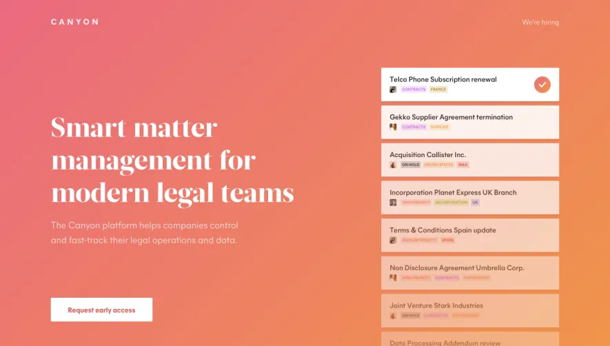


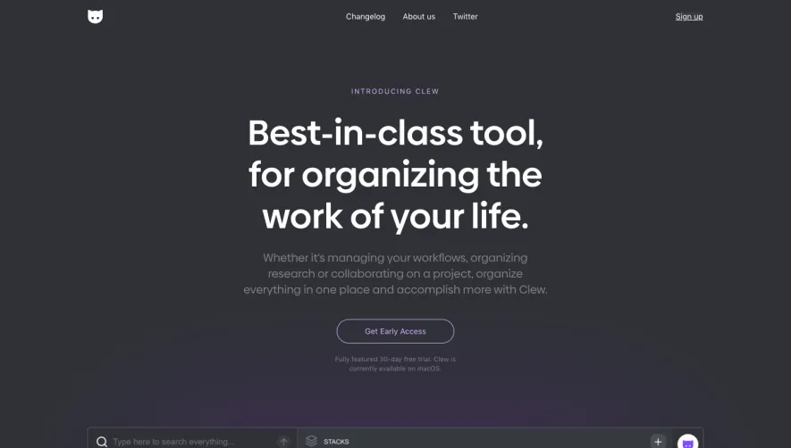

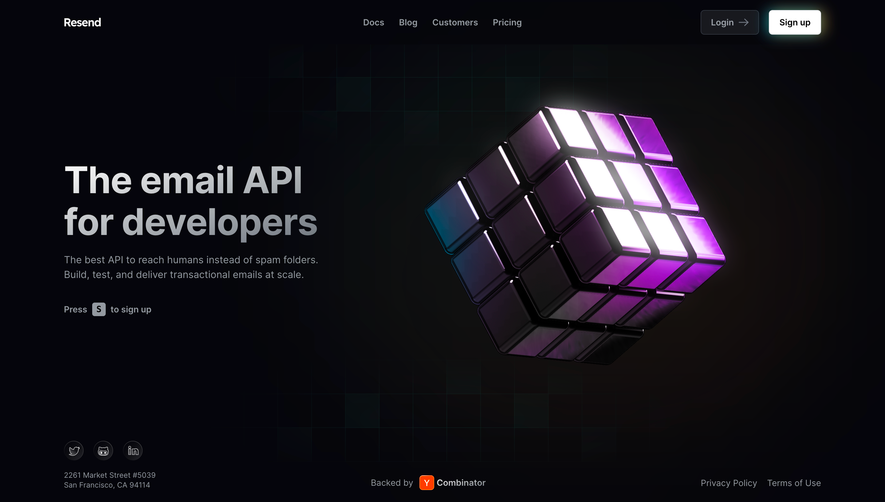

Upgrade to SaaSFrame Pro now to see similar examples.
Monthly
$18 /month
Billed $18 monthly
Browse all screens & flows
Filter and search screens & flows
Search text in screenshots
Access Figma files
Access mobile versions
Join now
Quarterly
$16 /month
Billed $48 quarterly
Browse all screens & flows
Filter and search screens & flows
Search text in screenshots
Access Figma files
Access mobile versions
Join now
Yearly
$15 /month
Billed $180 yearly
Browse all screens & flows
Filter and search screens & flows
Search text in screenshots
Access Figma files
Access mobile versions
Join now