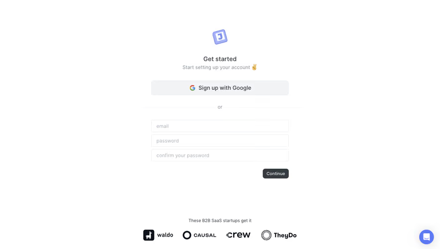
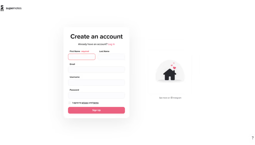
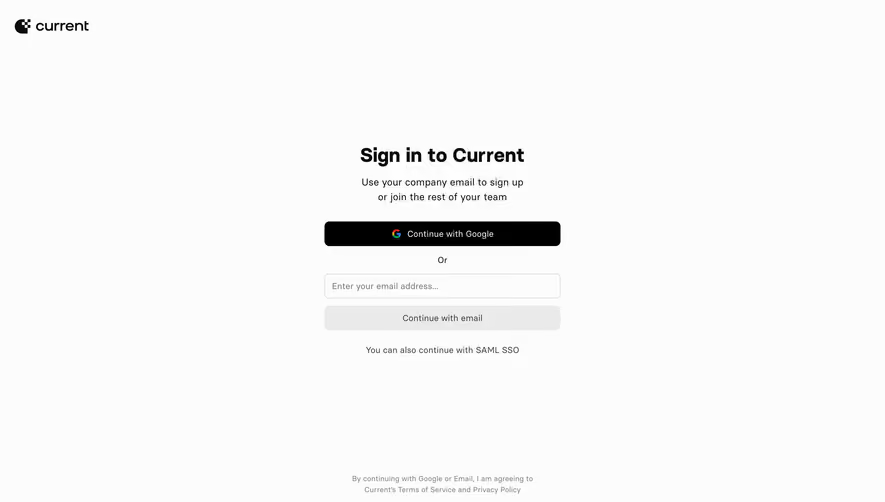
Generate a new design based on this screen using your own content.
Thank you! Your submission has been received!
Oops! Something went wrong while submitting the form.
# Design from Reference: Customer.io Create Account
Create an original, high-fidelity visual design inspired by the reference. Prioritize composition, typography, colors, spacing, and component styling over technical implementation.
## Reference
- **Product:** Customer.io
- **Category:** Signup
- **Screenshot:** https://cdn.prod.website-files.com/5e9dc792e1210c5325f7ebbc/6acad471886583e9d96b7047_6acad3780c49d10a7abdf8a0_cms-2e1a80dfecf0fa772d32bc3c.webp
Analyze the screenshot first. If inaccessible, request it rather than guessing.
## Content
{{content.instructions}}
{{content.data}}
Preserve essential messaging and factual accuracy. Adapt structure and copy length for visual balance; never invent product claims.
## Visual Design
Use this context to reproduce the reference's visual language: layout, typography, colors, spacing, borders, radii, and distinctive elements. The screenshot takes priority if descriptions conflict.
## Direction
{{preferences.fidelityInstructions}}
## Output
{{output.instructions}}
Deliver a polished, cohesive design with precise alignment, hierarchy, and spacing. Produce the requested visual artifact, not just a description. If unsupported, explain the limitation.
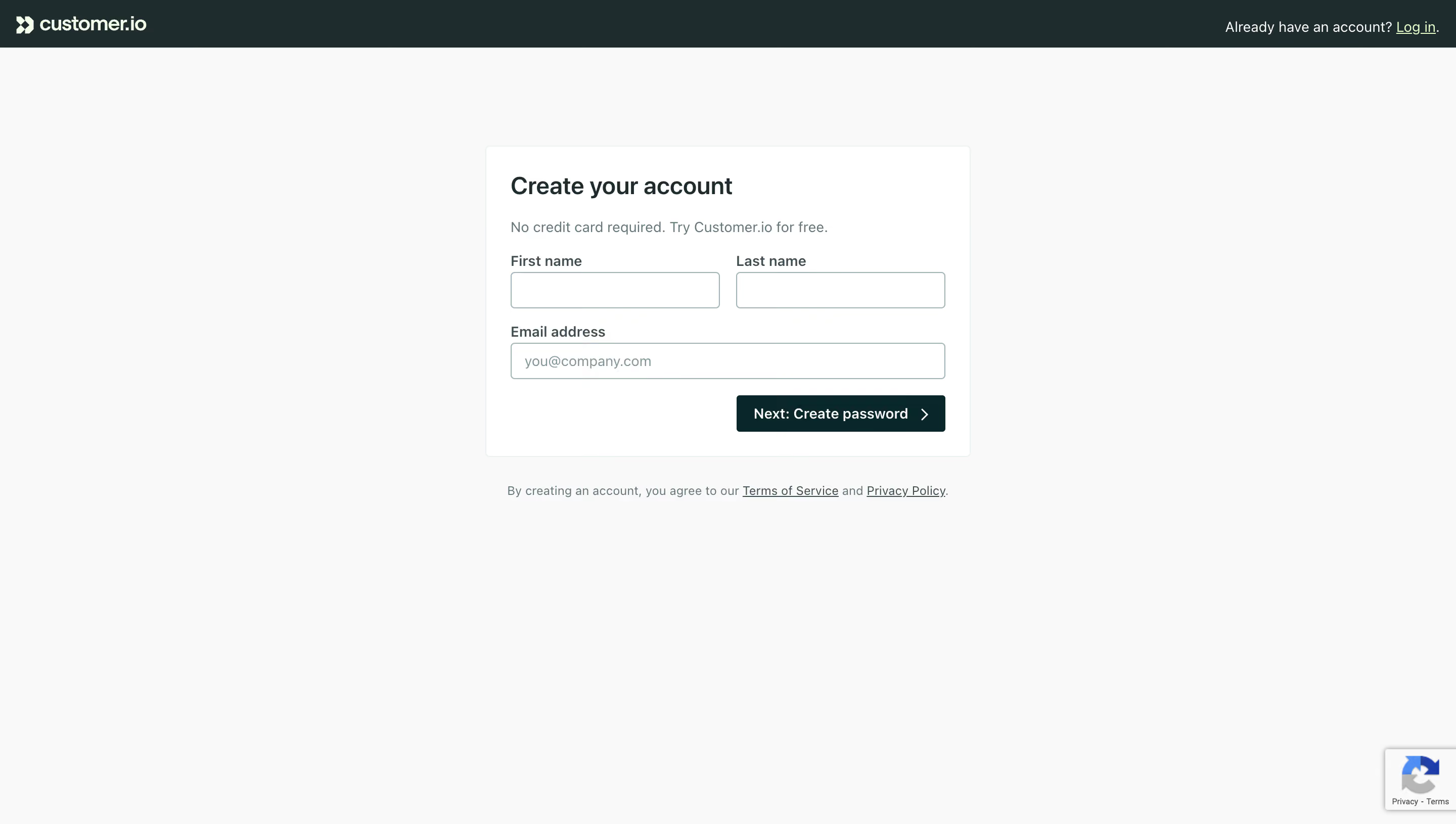
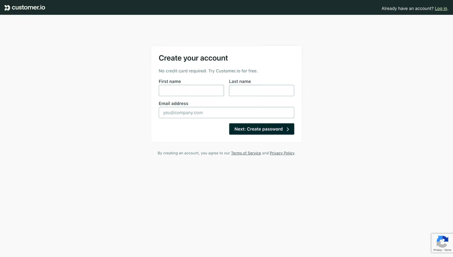
Customer.io's signup page strips everything back to what matters. Three fields. One button. No distractions. The "Create your account" heading is bold and direct, sitting above a reassuring subtitle that kills hesitation: "No credit card required. Try Customer.io for free." That's doing real work.
Layout That Breathes
The form lives in a centered card with generous whitespace on all sides. First name and last name sit side by side, email gets its own row. It feels effortless to scan. The dark teal "Next: Create password" button anchors the bottom with a right-facing chevron that subtly pulls you forward. Smart detail.
Typography and Color Keep It Grounded
The palette is almost monochrome. Warm off-white background, dark charcoal text, that single deep teal accent on the CTA. No gradients, no illustrations, no noise. The type is clean sans-serif with good hierarchy between heading, body, and labels. The "Log in" link in the top right catches returning users without competing for attention. This is restraint done well.