





1. The page begins with a header section that includes the Copy.ai logo, a search bar, and a navigation bar. 2. Below the header section, there is a section that introduces the purpose of the page, which is to provide alternative AI writing tools to Copy.ai. 3. The main section of the page is divided into multiple accordions, each accordion providing information about one alternative tool. Each accordion has a header that includes the name of the tool and a button to learn more about it. 4. When an accordion is clicked, it expands to reveal additional information about the alternative tool, including a brief description, features, pricing, and a link to the tool's website. 5. At the bottom of the page, there is a section for users to suggest other AI writing tools that are not already listed on the page. 6. The page includes a footer section that includes links to the company's social media accounts, a link to their blog, and a copyright notice. In summary, the page has a simple yet effective design that focuses on providing users with relevant information about alternative AI writing tools. The use of accordions to present information about each tool in a concise and organized manner makes it easy for users to compare and choose the alternative tool that best fits their needs. The suggestion section at the bottom also demonstrates the company's commitment to gathering feedback from their users and constantly improving their service.

Thank you! Your submission has been received!
Oops! Something went wrong while submitting the form.
Get SaaSFrame Pro
Monthly
$18
Quarterly
$48
Yearly
$180
Upgrade to access this feature
Browse all screens & flows
Filter and search screens & flows
Access Figma files
Access mobile versions
Bookmark screens & flows
Join now
Copy.ai Comparison Page

Copy.ai
Say ‘goodbye’ to the blank page for good
Designed by
No items found.

Bookmark
Bookmark
Design with AI
Thank you! Your submission has been received!
Oops! Something went wrong while submitting the form.
# Design from Reference: Copy.ai Comparison Page
Create an original, high-fidelity visual design inspired by the reference. Prioritize composition, typography, colors, spacing, and component styling over technical implementation.
## Reference
- **Product:** Copy.ai
- **Category:** Comparison Page
- **Screenshot:** https://cdn.prod.website-files.com/5e9dc792e1210c5325f7ebbc/6ac6127d848730a1e2429dfa_6ac61120fcec85d15f17724f_copy-ai-comparison-page-desktop-compressed.avif
Analyze the screenshot first. If inaccessible, request it rather than guessing.
## Content
{{content.instructions}}
{{content.data}}
Preserve essential messaging and factual accuracy. Adapt structure and copy length for visual balance; never invent product claims.
## Visual Design
### Overall aesthetic
- **Character:** Long editorial comparison article with a pale mint-white canvas, deep purple text, turquoise links and a soft rounded title banner.
- **Brand expression:** A large gradient-highlighted headline and pill-shaped turquoise calls to action provide marketing emphasis; the article itself remains a plain reading column.
- **Capture:** The complete image is 1440 × 16951 pixels and was inspected in eleven readable portions. Image dimensions are observed; equivalence to CSS pixels is unverified.
### Page composition
- **Navigation:** A roughly 100 px-high header places the wordmark and a small hiring pill left, menu links centrally and login plus a large rounded signup button right.
- **Hero:** An inset pale-mint banner spans nearly the viewport width with about 30 px outer margins, roughly 320 px height and approximately 36 px rounded corners. Its large centered two-line headline highlights the second line in a turquoise-to-yellow gradient.
- **Reading column:** The article occupies approximately 960 px, centered with about 240 px side margins. It begins with two introductory paragraphs and a section introducing three primary alternatives.
- **Article structure:** Three detailed reviews use numbered headings, pros, cons and pricing subheads. A second group covers seven additional alternatives with shorter review blocks. Each review includes a large embedded pricing screenshot and a centered source caption.
- **Closing content:** A section about Copy.ai includes another embedded product illustration and pricing comparison. Two final text sections discuss free options and signup before a divider introduces a centered conversion area.
- **Footer:** Four evenly spaced link columns precede a final brand/legal row with social icons on the right. The same pale background continues throughout.
### Information hierarchy
- **Headline:** The oversized title is the strongest element and announces a list-style comparison. It has no adjacent hero photograph or form.
- **Article levels:** Large group headings divide the first three alternatives, the remaining seven, the publisher's own product and closing guidance. Numbered review headings sit below these; bold inline labels organize detailed reasoning.
- **Scanning:** Bold lead-ins identify individual pros and cons. Turquoise inline links stand out within dark paragraphs without separate buttons.
- **Evidence imagery:** Wide pricing screenshots punctuate text and make the article more visually varied; their internal controls are image content rather than demonstrated page interactions.
- **Conversion:** The concluding large headline, short centered paragraph, filled signup pill and three checkmarked assurances create a distinct final action zone.
### Typography
- **Family:** Rounded geometric sans-serif appears in the host page; exact font identity is unverified. Embedded screenshots contain their own heterogeneous type systems.
- **Hero title:** Approximately 68–72 image px with bold weight, tight tracking and about 74 px line-height. The two lines are centered with generous surrounding space.
- **Article headings:** Group headings are approximately 32–34 px, bold, with 40 px leading. Numbered alternative headings are about 23–25 px; minor labels use approximately 18–20 px bold text.
- **Body:** About 17–18 image px with roughly 26 px line-height. Paragraphs are left aligned, with bold inline prefixes and conventional indented bullet lists.
- **Captions and navigation:** Source captions and top navigation are about 14–16 px. Footer links are larger than their muted small group captions.
- **Closing action:** The conversion heading is approximately 54–58 px, while its button and assurance labels are comparatively compact. All CSS size translations remain estimates.
### Colors & surfaces
- **Measured host surfaces:** ICC-aware sRGB sampling yields #F8FCFB for the dominant canvas, #EDF8F4 for pale mint areas and #FFFFFF for many embedded image surfaces.
- **Measured host accents:** Deep purple #160647 appears in the host typography; turquoise #47BEBA and #45BEB9 occur in links and action treatments.
- **Gradient:** The hero's second line transitions from turquoise through muted green to pale yellow. It is a text fill, not a large background gradient.
- **Embedded image colors:** Sampled #CCFCFF, #FFDFF6, #FF60D2 and #3E7FFE belong to comparison/product screenshots; they should not be mistaken for the host page's core palette.
- **Surface treatment:** The host article has almost no enclosing cards or shadows. Pricing panels retain their original captured borders, backgrounds and occasional shadows as raster content.
### Components
- **Header CTA:** A wide turquoise pill approximately 230 × 54 image px uses centered white text. A much smaller deep-purple hiring badge sits beside the logo.
- **Article blocks:** Numbered headings, explanatory paragraphs, bold pros/cons/pricing labels and occasional bullet lists repeat down the same column without boxed containers.
- **Pricing figures:** Screenshots fill approximately 960 px width and vary in height. They show two to five pricing columns, diverse colored headers and buttons, but their specific pricing claims are merely captured content.
- **Figure captions:** A small centered source line sits directly beneath each pricing image, with a dark label followed by a turquoise destination.
- **Product example:** A large four-step draft-generation illustration appears within the Copy.ai section, using circled numbers and a dark full-width action in the image.
- **Final CTA:** A turquoise pill with a right arrow sits below centered copy. Three small outlined check circles and short assurance labels form a horizontal row underneath.
- **Footer:** Four plain link groups have small muted headings; the bottom row combines the wordmark, copyright/legal text and three circular outlined social links.
### Visual rhythm
- **Reading cadence:** Body paragraphs use approximately 18–24 px bottom spacing. Review headings and major group changes receive much larger gaps, around 60–90 image px.
- **Figure rhythm:** Pricing screenshots occupy the full text width and are followed by compact captions and a substantial pause before the next review.
- **Consistency:** Nearly all article text, figures and headings share the same left/right boundaries, giving an exceptionally long page a stable reading axis.
- **Macro contrast:** The wide rounded hero and spacious centered closing CTA interrupt the dense single-column article; the footer opens into a broader four-column grid.
- **Density:** Bold labels and colored inline links provide emphasis without introducing decorative elements between every paragraph.
### Responsive
- **Evidence limit:** Only the desktop page is shown; the following are recommendations rather than observed mobile behavior.
- **Navigation and title:** Collapse the wide menu, reduce the oversized title fluidly and retain sensible line breaks without clipping the gradient text.
- **Article:** Use a comfortable single column with 20–24 px margins, readable body text and naturally wrapping inline links.
- **Figures:** Scale raster figures proportionally and offer access to larger readable versions; do not shrink multi-column pricing tables until their text becomes the only source of information.
- **Footer and assurances:** Stack or wrap the checkmarked assurances and reduce footer columns to two or one as space requires.
### Adaptation guidance
- **Reusable structure:** Pair a bold editorial title band with a disciplined long-form column, repeated comparison sections, full-width figures and concise captions.
- **Content clarity:** Keep comparison categories and heading levels consistent. Treat captured price panels as dated visual evidence rather than automatically current product facts.
- **Brand restraint:** Reserve turquoise for links/actions and deep purple for text; allow embedded images to contribute secondary color without spreading those colors into the host interface.
- **Navigation improvement:** For a similarly long article, consider an accessible table of contents and anchor links. These are recommendations and are not visible in this capture.
- **Accessibility:** Preserve semantic lists and headings, descriptive figure alternatives, visible keyboard focus and sufficient contrast for turquoise links and gradient text.
Use this context to reproduce the reference's visual language: layout, typography, colors, spacing, borders, radii, and distinctive elements. The screenshot takes priority if descriptions conflict.
## Direction
{{preferences.fidelityInstructions}}
## Output
{{output.instructions}}
Deliver a polished, cohesive design with precise alignment, hierarchy, and spacing. Produce the requested visual artifact, not just a description. If unsupported, explain the limitation.
Category
Patterns
No items found.
Tech Stack
Added on
August 10, 2022
Similar screens
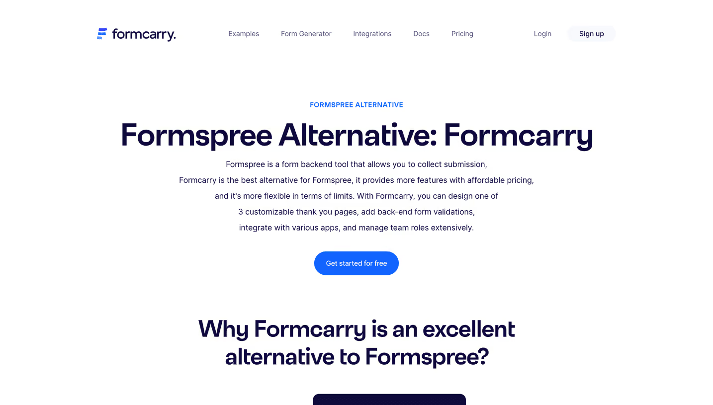


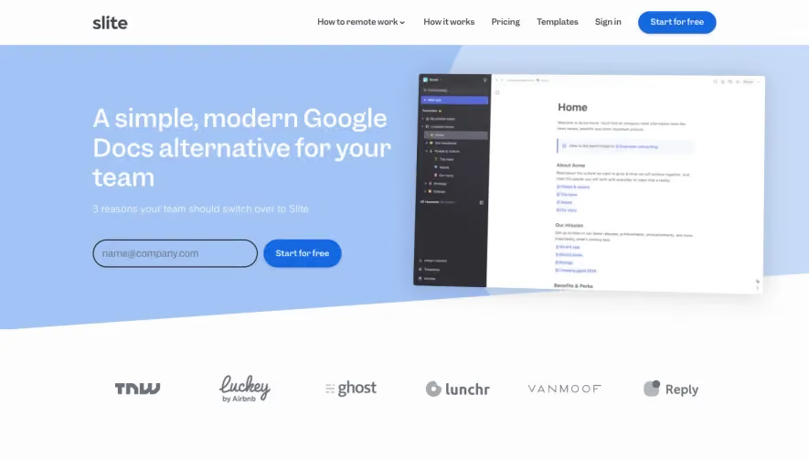

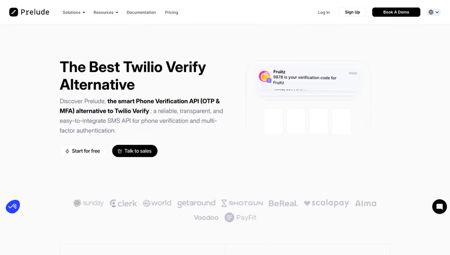

Upgrade to SaaSFrame Pro now to see similar examples.
Monthly
$18 /month
Billed $18 monthly
Browse all screens & flows
Filter and search screens & flows
Search text in screenshots
Access Figma files
Access mobile versions
Join now
Quarterly
$16 /month
Billed $48 quarterly
Browse all screens & flows
Filter and search screens & flows
Search text in screenshots
Access Figma files
Access mobile versions
Join now
Yearly
$15 /month
Billed $180 yearly
Browse all screens & flows
Filter and search screens & flows
Search text in screenshots
Access Figma files
Access mobile versions
Join now