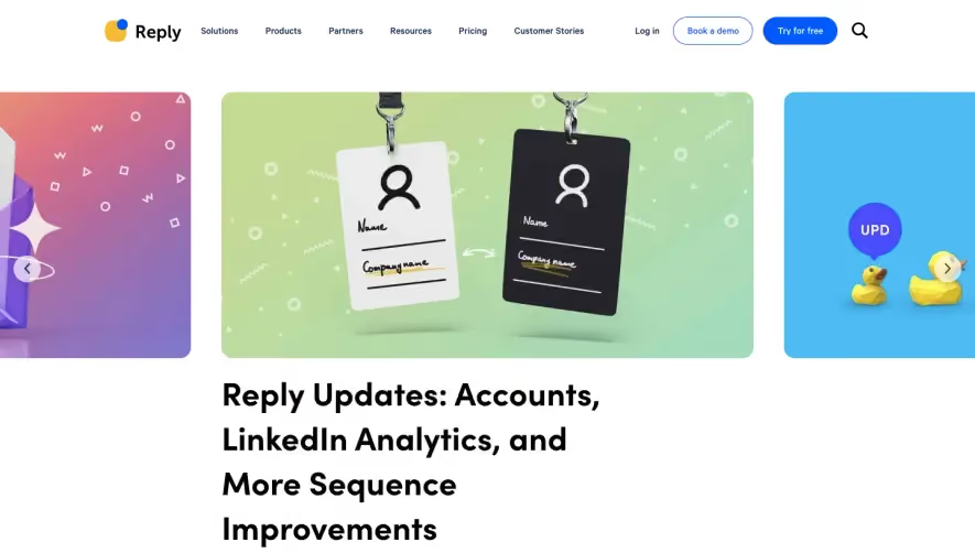
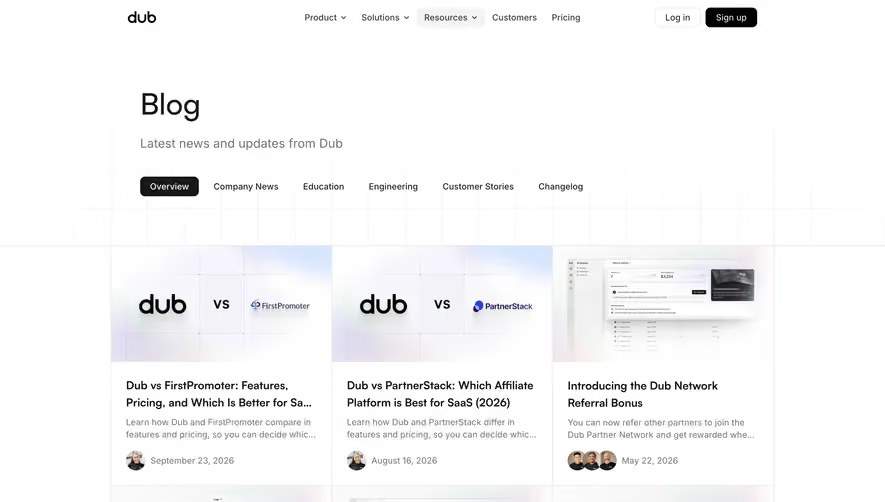
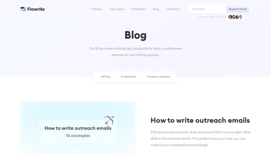
Generate a new design based on this screen using your own content.
Thank you! Your submission has been received!
Oops! Something went wrong while submitting the form.
# Design from Reference: Copy.ai Blog Feed
Create an original, high-fidelity visual design inspired by the reference. Prioritize composition, typography, colors, spacing, and component styling over technical implementation.
## Reference
- **Product:** Copy.ai
- **Category:** Blog Feed
- **Screenshot:** https://cdn.prod.website-files.com/5e9dc792e1210c5325f7ebbc/62f3cce150d80113f75de6a9_1660143339681-blog-1660142972450.webp
Analyze the screenshot first. If inaccessible, request it rather than guessing.
## Content
{{content.instructions}}
{{content.data}}
Preserve essential messaging and factual accuracy. Adapt structure and copy length for visual balance; never invent product claims.
## Visual Design
Use this context to reproduce the reference's visual language: layout, typography, colors, spacing, borders, radii, and distinctive elements. The screenshot takes priority if descriptions conflict.
## Direction
{{preferences.fidelityInstructions}}
## Output
{{output.instructions}}
Deliver a polished, cohesive design with precise alignment, hierarchy, and spacing. Produce the requested visual artifact, not just a description. If unsupported, explain the limitation.
The Copy.ai blog page exemplifies a sleek, modern SaaS aesthetic, balancing white space with playful brand accents. It harnesses a minimalist, professional feel, keeping distractions low and readability high, while injecting energy through soft gradients and vibrant color highlights.
Layout and Structure
Structured for content discovery, the layout starts with a concise branded header, followed by a prominent hero section that introduces the blog’s value proposition. Clean content cards organize articles into an intuitive grid, aiding scan-ability. A sticky navigation bar ensures seamless movement, while a compact footer offers quick access to core resources and social channels.
Visual Elements
Subtle illustrations and geometric motifs punctuate the design, adding visual interest without overloading the page. Custom icons support post categories, and minimalistic blog thumbnails enhance content differentiation. There’s a clear absence of clutter – photographic elements are used sparingly for clarity and focus.
Color Palette and Typography
The palette employs crisp white backgrounds, deep charcoal text, and brand greens and blues as energetic accents—lending both freshness and trust. Typography features a humanistic sans-serif for headlines and a clean, legible font for body text, showcasing clear hierarchy with ample vertical rhythm.
User Experience Patterns
Sticky, accessible navigation and prominent CTAs (“Subscribe,” “Read more”) streamline engagement. Hover states provide tactile feedback on interactive elements, while post-filtering offers personalized content discovery. Smooth scrolling and tight spacing amplify ease-of-use.
Unique or Notable Design Choices
Notably, the site cleverly merges a content-heavy blog with a distinctly SaaS brand feel, using modular cards and micro-animations to keep the experience lively yet efficient. The overall tone is polished yet approachable, exuding both authority and warmth—ideal for inspiring SaaS UX and web design.