Design with AI
Generate a new design based on this screen using your own content.
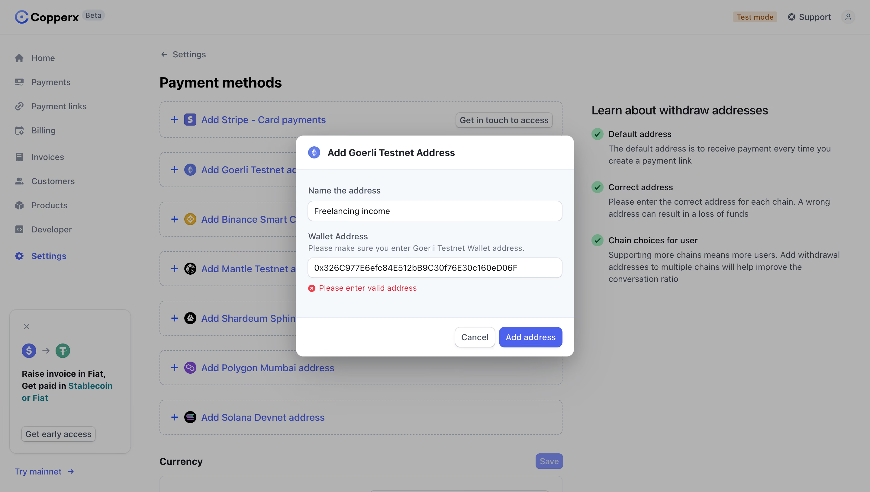
# Design from Reference: Copperx Add Crypto Address Error
Create an original, high-fidelity visual design inspired by the reference. Prioritize composition, typography, colors, spacing, and component styling over technical implementation.
## Reference
- **Product:** Copperx
- **Category:** Empty
- **Screenshot:** https://cdn.prod.website-files.com/5e9dc792e1210c5325f7ebbc/6acad8a2d05a3f53c0a74c73_6acad815f4cee3729f62eb24_cms-21f7c34c13a367a9a2fbc4d2.webp
Analyze the screenshot first. If inaccessible, request it rather than guessing.
## Content
{{content.instructions}}
{{content.data}}
Preserve essential messaging and factual accuracy. Adapt structure and copy length for visual balance; never invent product claims.
## Visual Design
### Overall aesthetic
- **Character:** A payment-settings dashboard is dimmed behind a centered address-entry modal, with blue actions and a clear red validation message.
- **Tone:** Rounded controls, pale cool surfaces and thin borders create a practical administrative interface.
### Page composition
- **Capture scale:** The source measures 2880 × 1630 image pixels. CSS estimates below assume a 2× capture; device-pixel ratio is unverified.
- **Background:** A top brand/utility bar, narrow left navigation and main settings content remain visible beneath the overlay.
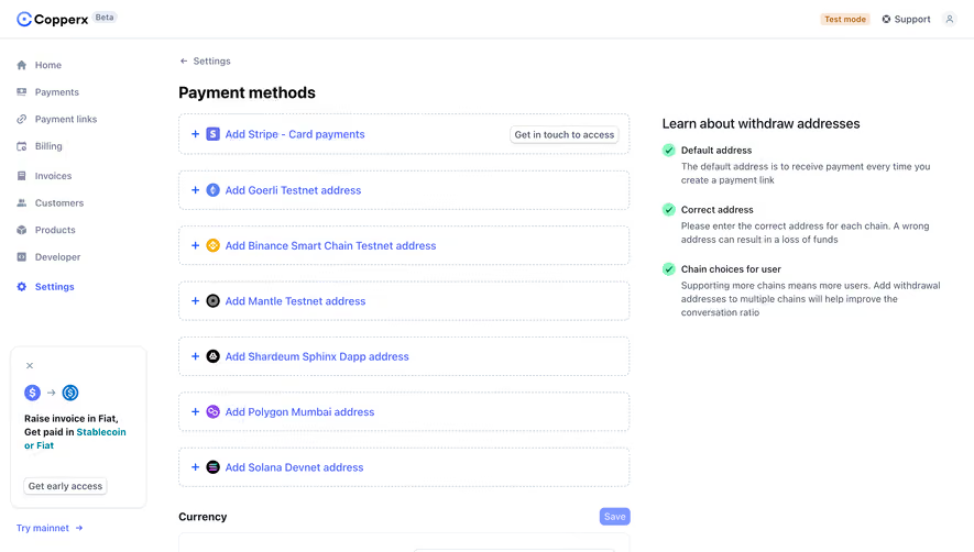
- **Settings layout:** Dashed payment-method rows occupy the central column; a right-hand explanatory column contains three checkmarked guidance blocks.
- **Modal:** A roughly 460 × 365 px CSS dialog is centered on the viewport, divided into white header, pale form body and white action footer.
- **Form sequence:** A populated address-name field precedes a wallet-address label, helper sentence, populated field and validation message.
### Information hierarchy
- **Dialog title:** A chain icon and semibold address-creation title establish the active task.
- **Field guidance:** Labels sit above their inputs; the wallet helper explains the expected network-specific format.
- **Error:** A small red circular cross and explicit invalid-address message appear directly below the second input.
- **Actions:** Cancel is secondary and outlined; Add address is filled blue at the bottom right.
### Typography
- **Family:** A neutral sans serif is visible throughout; exact font identity is unverified.
- **Dialog title:** Approximately 16 px CSS, semibold, with 22 px leading.
- **Fields:** Labels and values are around 14 px; helper and error text are around 13 px.
- **Background hierarchy:** The settings heading is approximately 24 px and bold; payment rows use medium blue text.
### Colors & surfaces
- **Measured foundation:** ICC-aware sRGB sampling yields #FFFFFF and pale #F5F9FC in the modal.
- **Measured backdrop:** The overlay-dimmed white workspace is dominated by gray #B2B2B2, with nearby tonal variations.
- **Actions and states:** Blue-violet fills the primary action; bright red marks the invalid-address state. Green checks remain visible in background guidance.
- **Depth:** A broad soft shadow separates the dialog from the muted page.
### Components
- **Dialog shell:** Rounded corners around 12 px, a compact header and separated footer contain the form.
- **Inputs:** Full-width fields are approximately 34 px CSS high, with white fills, cool-gray borders and approximately 8 px corners.
- **Validation row:** A red error icon and text sit on one line below the wallet field; the field remains populated.
- **Footer buttons:** Compact rounded controls align right with a narrow gap; Cancel has a subtle shadow and Add address a blue fill.
- **Background method rows:** Large dashed-outline rectangles combine plus signs, chain/provider icons and link-style text.
### Visual rhythm
- **Form alignment:** Labels, helper copy, inputs and error share a consistent approximately 20 px dialog inset.
- **Field spacing:** A modest gap separates the first input from the wallet label, while helper text stays close to its field.
- **Layer focus:** The crisp bright modal contrasts strongly with the uniform dimmed page.
- **Footer separation:** A generous pause and surface boundary distinguish editing from confirmation actions.
### Responsive
- **Evidence boundary:** Only a desktop state is shown; responsive behaviors are recommendations.
- **Dialog width:** Use a fluid max-width modal with safe side gutters on small screens.
- **Long values:** Allow address fields to scroll horizontally without expanding the dialog.
- **Keyboard access:** Keep the error and action footer reachable when a virtual keyboard is open.
### Adaptation guidance
- **Validation pattern:** Pair a network-specific helper with explicit inline error text, preserving the user's entered value.
- **Accessible modal:** Manage focus, label the dialog and associate the error with its input.
- **State boundaries:** Only an invalid populated state is visible; successful addition and network validation behavior are not verified.
- **Data handling:** Use replaceable example values rather than copying the screenshot's wallet address or account details.
- **Scale calibration:** Validate the assumed 2× scale before assigning CSS dimensions.
Use this context to reproduce the reference's visual language: layout, typography, colors, spacing, borders, radii, and distinctive elements. The screenshot takes priority if descriptions conflict.
## Direction
{{preferences.fidelityInstructions}}
## Output
{{output.instructions}}
Deliver a polished, cohesive design with precise alignment, hierarchy, and spacing. Produce the requested visual artifact, not just a description. If unsupported, explain the limitation.