Design with AI
Generate a new design based on this screen using your own content.
# Design from Reference: Conduktor Flowchart
Create an original, high-fidelity visual design inspired by the reference. Prioritize composition, typography, colors, spacing, and component styling over technical implementation.
## Reference
- **Product:** Conduktor
- **Category:** Flowchart
- **Screenshot:** https://cdn.prod.website-files.com/5e9dc792e1210c5325f7ebbc/6acb6765994832179b56068c_6acb657f93f403582dfd07ed_cms-65dd87d90fbe0d8f0972a9de.webp
Analyze the screenshot first. If inaccessible, request it rather than guessing.
## Content
{{content.instructions}}
{{content.data}}
Preserve essential messaging and factual accuracy. Adapt structure and copy length for visual balance; never invent product claims.
## Visual Design
### Overall aesthetic
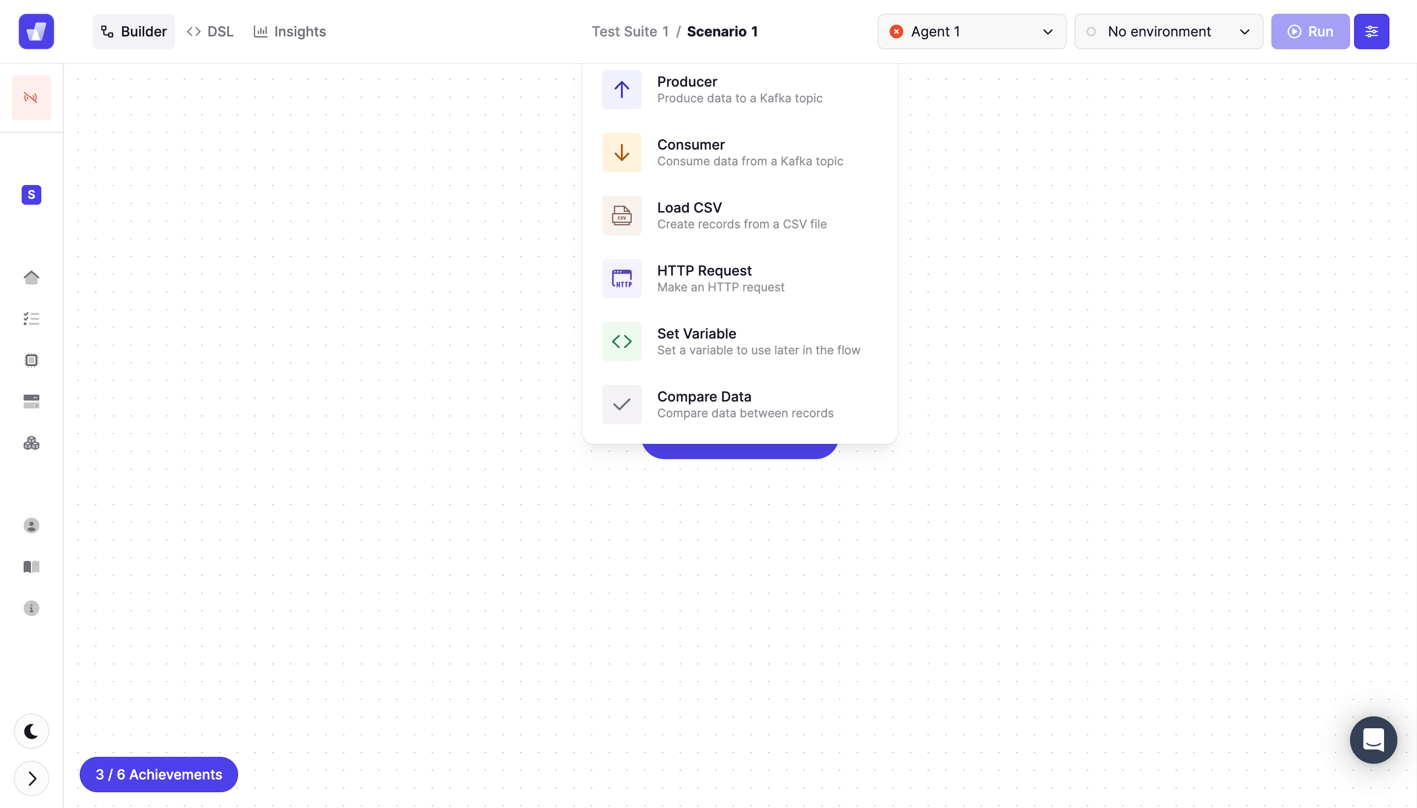
- **Style:** Technical flow builder with a white dotted canvas, compact toolbar, narrow icon rail and a floating action-type chooser.
- **Scale:** Source 2880 × 1642px; sizes estimate a 1440px-wide CSS viewport at 2× capture scale.
### Page composition
- **Toolbar:** Builder, DSL and Insights appear left; suite/scenario breadcrumbs sit center; agent, environment, Run and settings controls align right.
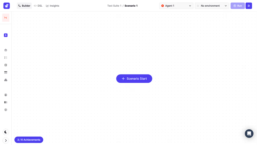
- **Canvas:** A roughly 64px left icon rail borders a large near-empty dotted-grid workspace.
- **Chooser:** A white menu approximately 320px wide hangs near the upper center, overlapping a partially hidden purple canvas control.
- **Utilities:** An achievements pill sits lower left; theme/collapse controls sit at the rail bottom and chat at lower right.
### Information hierarchy
- **Current mode:** Builder is selected; Test Suite 1 / Scenario 1 identifies the current editing context.
- **Action types:** Six visible menu items offer Producer, Consumer, Load CSV, HTTP Request, Set Variable and Compare Data, each with a description and colored icon.
- **Execution context:** Agent 1 has a red status indicator and No environment is selected. No connected flow nodes or results are visible.
### Typography
- **Family:** Compact sans-serif; exact font identity is unverified.
- **Roles:** Estimated toolbar/menu titles 14px medium, descriptions 12px/16px and utility labels 14px.
- **Contrast:** Dark titles sit above muted gray descriptions, keeping the action names easy to scan.
### Colors & surfaces
- **Sampled palette:** ICC-aware sRGB samples include white #FFFFFF, pale #F9F8F9 and #F3F2F4, and saturated violet #4E3FF1.
- **Menu accents:** Lavender, orange, tan, green and gray icon backplates distinguish action types.
- **Boundaries:** Very pale rules divide toolbar/rail from canvas; a subtle shadow lifts the floating chooser.
### Components
- **Action menu:** Rounded white container with roughly 14px corners, six vertically stacked rows and generous horizontal padding.
- **Menu rows:** Small approximately 40px tinted icon squares sit beside title/description pairs; rows repeat on about 64px centers.
- **Execution controls:** Compact outlined agent/environment selects, lavender Run button and saturated-violet square settings action.
- **Canvas utilities:** Tiny evenly spaced dots support spatial placement. Bottom achievement pill reads 3 / 6 Achievements.
### Visual rhythm
- **Density:** A compact top toolbar and menu contrast with the expansive blank canvas.
- **Alignment:** Menu text and icons form consistent columns; the toolbar keeps selectors and actions on one baseline.
### Responsive
- **Recommended adaptation:** Only desktop is observed. Keep the canvas pannable, collapse the icon rail and move overflow toolbar items into a menu.
- **Chooser:** Anchor the action chooser within viewport bounds and maintain readable descriptions and touch targets.
### Adaptation guidance
- **Preserve:** Keep editing mode, scenario context, execution configuration and action insertion clearly separated.
- **Adapt:** Use actual supported node types and runtime states. Do not invent flow connections or execution results from this empty canvas.
Use this context to reproduce the reference's visual language: layout, typography, colors, spacing, borders, radii, and distinctive elements. The screenshot takes priority if descriptions conflict.
## Direction
{{preferences.fidelityInstructions}}
## Output
{{output.instructions}}
Deliver a polished, cohesive design with precise alignment, hierarchy, and spacing. Produce the requested visual artifact, not just a description. If unsupported, explain the limitation.