Design with AI
Generate a new design based on this screen using your own content.
# Design from Reference: Conduktor Dashboard
Create an original, high-fidelity visual design inspired by the reference. Prioritize composition, typography, colors, spacing, and component styling over technical implementation.
## Reference
- **Product:** Conduktor
- **Category:** Dashboard
- **Screenshot:** https://cdn.prod.website-files.com/5e9dc792e1210c5325f7ebbc/6acb6763994832179b56063c_6acb657b37c9ce1b57c0677d_cms-576b3cd61eb92da4ea35f374.webp
Analyze the screenshot first. If inaccessible, request it rather than guessing.
## Content
{{content.instructions}}
{{content.data}}
Preserve essential messaging and factual accuracy. Adapt structure and copy length for visual balance; never invent product claims.
## Visual Design
### Overall aesthetic
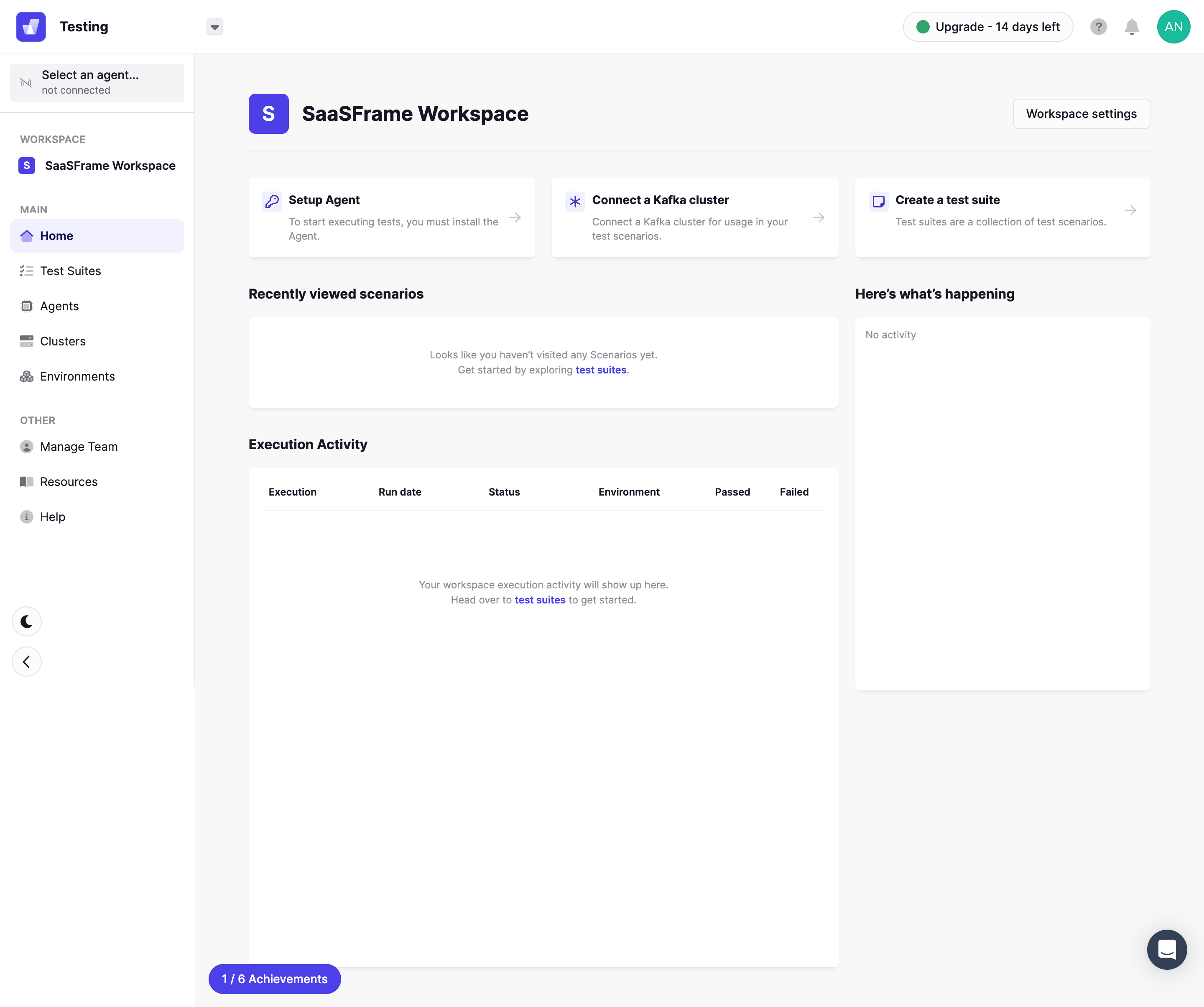
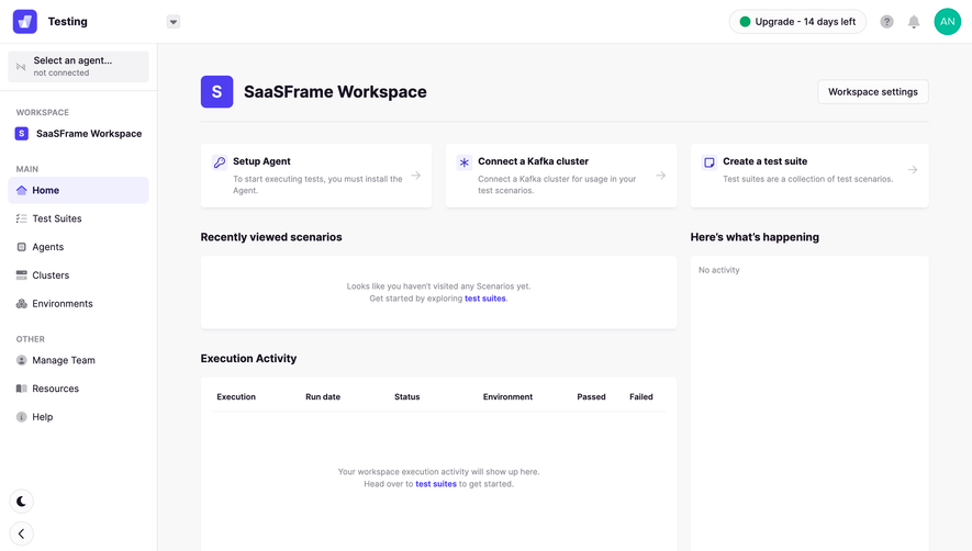
- **Character:** Light developer-testing dashboard with violet accents, onboarding shortcuts and explicit empty activity states.
### Page composition
- **Canvas:** 2880 × 2408 screenshot pixels; CSS estimates assume approximately 2× scale.
- **Structure:** White global header/sidebar and pale main workspace. Workspace heading/settings precede three setup cards, a wide recent-scenarios block, execution table and narrower activity rail.
### Information hierarchy
- **Priority:** Setup Agent, connect cluster and create test suite form a three-step action row.
- **States:** Recent scenarios, execution activity and right activity panel are empty; links direct users toward test suites.
### Typography
- **Family:** Neutral sans-serif; exact font is unverified.
- **Scale:** Estimated CSS workspace title 26px bold, section headings 16–18px, body/navigation 14px and table labels 12px.
### Colors & surfaces
- **Sampled palette:** White #FFFFFF; pale background #F9F8F9; dark ink #1B1524; muted surface #F3F2F4; lavender selection #F1F0FF.
- **Accents:** Violet brand/icons/links and achievements pill; green status dot and avatar provide secondary color.
### Components
- **Panels:** White rounded cards with soft shadows, small icon tiles and right arrows; estimated 6px radii and 20px padding.
- **Table:** Compact six-column header above a tall empty body.
- **Utilities:** Agent selector in sidebar, upgrade/trial badge in header, chat launcher and bottom achievements control.
### Visual rhythm
- **Spacing:** Regular 20–24px gutters and broad empty panels keep a setup-focused dashboard calm.
### Responsive
- **Guidance:** Mobile is not shown. Stack setup cards and activity panels, with readable execution data on overflow.
### Adaptation guidance
- **Transfer:** Preserve actionable empty states and setup sequence. Adapt testing concepts and progress indicators to the target workspace.
Use this context to reproduce the reference's visual language: layout, typography, colors, spacing, borders, radii, and distinctive elements. The screenshot takes priority if descriptions conflict.
## Direction
{{preferences.fidelityInstructions}}
## Output
{{output.instructions}}
Deliver a polished, cohesive design with precise alignment, hierarchy, and spacing. Produce the requested visual artifact, not just a description. If unsupported, explain the limitation.