Overall Style & Aesthetic
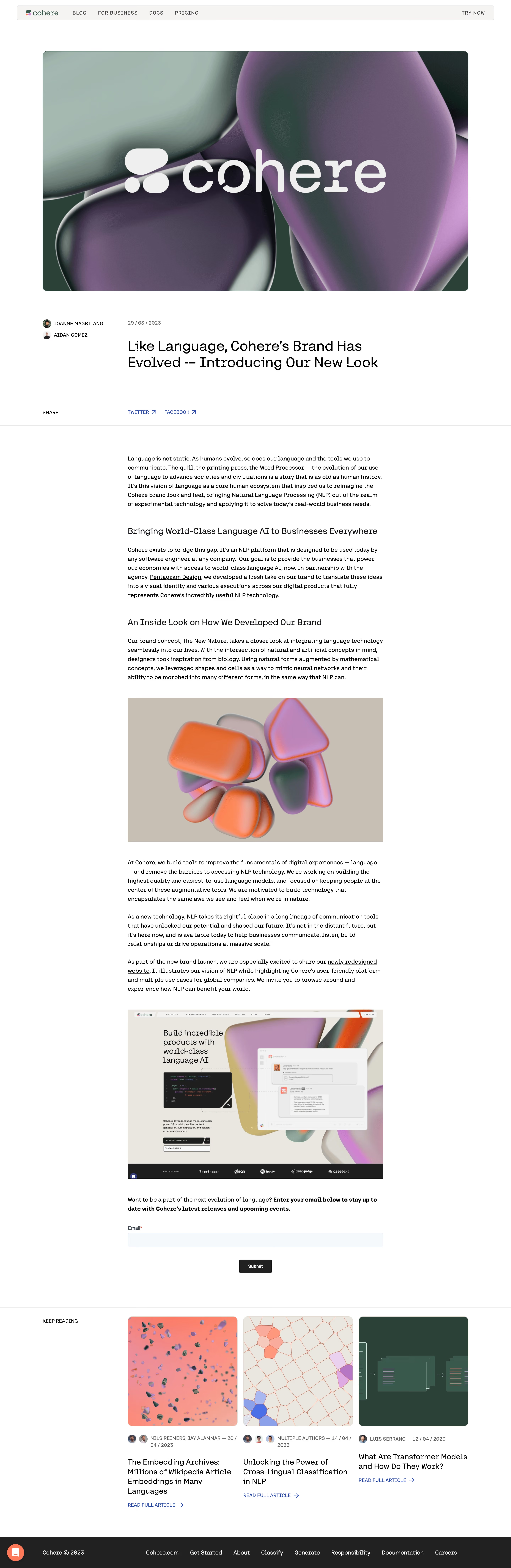
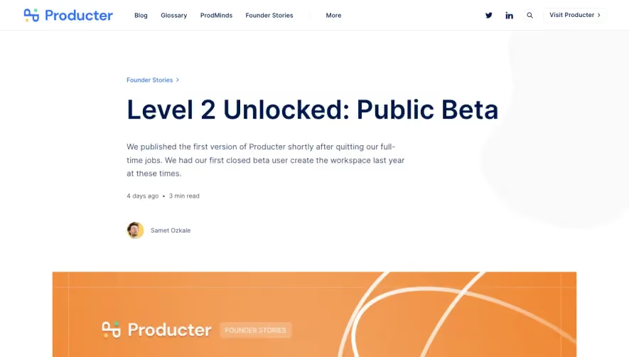
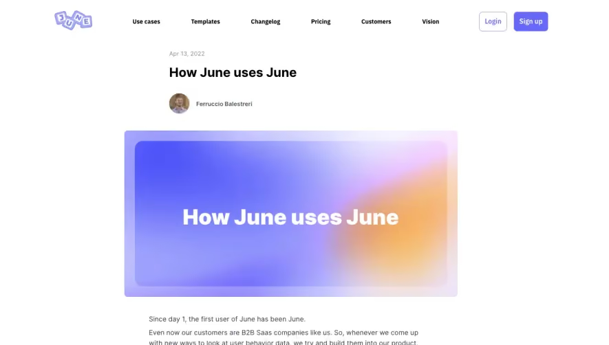
Cohere’s reimagined brand page exudes a sophisticated, modern minimalism. The interface is exceptionally clean, leveraging whitespace to let content "breathe" while reinforcing a feeling of professionalism and quiet innovation. The subtlety in its visual polish projects confidence and restraint, steering away from clutter in favor of clarity. Layout & Structure
The structure is intuitively linear, beginning with a striking hero section featuring a powerful headline and a subtle looping background animation. Scroll further to discover clearly segmented areas: overview, features, brand philosophy, and a call to action—each visually demarcated but seamlessly integrated for smooth narrative flow. Visual Elements
A blend of simple, abstract 3D animations and minimalist geometric illustrations elevates the interface without distraction. Icons are consistently styled: rounded, friendly, and line-based, reinforcing harmony. There’s little photography; instead, motion and illustrated metaphors carry the visual storytelling. Color Palette & Typography
Cohere uses a refined palette anchored by deep indigo, crisp whites, and accent gradients with violets and subtle neons. The typographic hierarchy is pronounced: bold, modern sans-serif headings (GSans or similar) contrast elegantly with legible text, making content easy to scan and digest. User Experience Patterns
Navigation is frictionless. A fixed top nav bar provides crisp access to content, with prominent, clearly marked CTAs inviting engagement throughout the journey. Smooth scrolling effects and animated highlights maintain attention, while forms (where present) are short and unobtrusive. Unique & Notable Choices
The live, animated text and floating geometric “particles” in the hero impart a futuristic, energetic feel, instantly setting the brand apart. The page’s narrative is cohesive, using animation as a storytelling tool rather than eye-candy—a masterclass in restrained, purposeful web animation. Tone & Feel
This site feels visionary and trustworthy, combining technical artistry with human-centric warmth. For SaaS designers seeking inspiration, it demonstrates how to balance bold imagery with simplicity and guide users through an engaging, elegantly constructed story.