Generate a new design based on this screen using your own content.
Thank you! Your submission has been received!
Oops! Something went wrong while submitting the form.
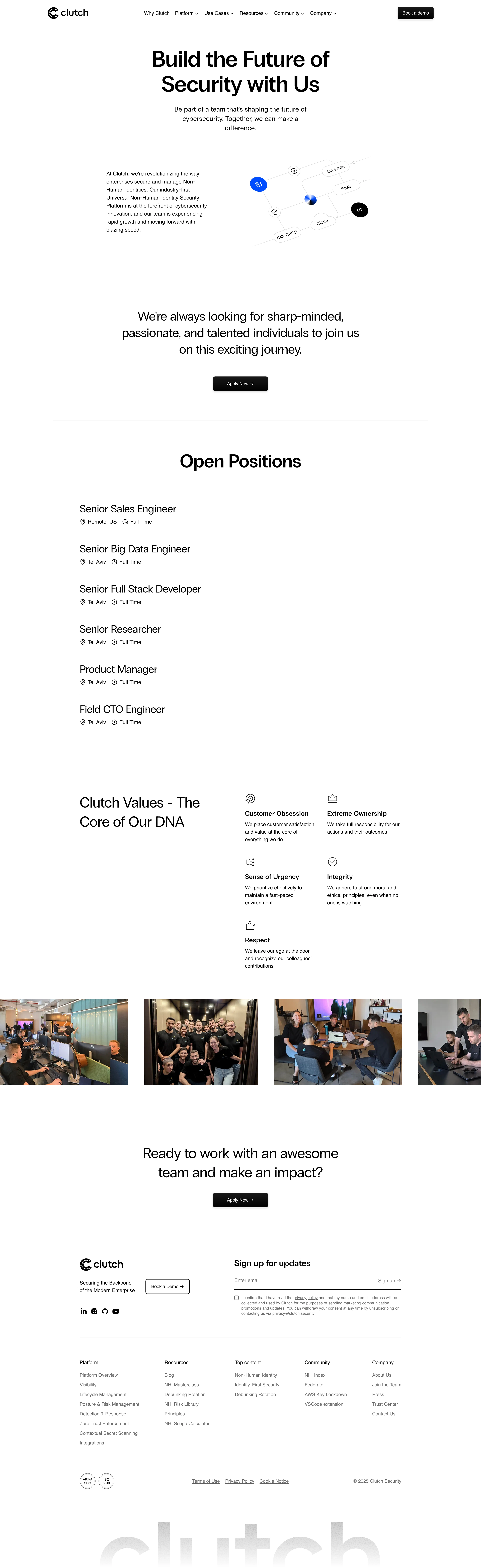
# Design from Reference: Clutch Careers Page
Create an original, high-fidelity visual design inspired by the reference. Prioritize composition, typography, colors, spacing, and component styling over technical implementation.
## Reference
- **Product:** Clutch
- **Category:** Careers Page
- **Screenshot:** https://cdn.prod.website-files.com/5e9dc792e1210c5325f7ebbc/6acad417c910b3adf9e48e9d_6acad2fab2165b6c7f005613_cms-0d4294e471d8fb2267ab6280.webp
Analyze the screenshot first. If inaccessible, request it rather than guessing.
## Content
{{content.instructions}}
{{content.data}}
Preserve essential messaging and factual accuracy. Adapt structure and copy length for visual balance; never invent product claims.
## Visual Design
Use this context to reproduce the reference's visual language: layout, typography, colors, spacing, borders, radii, and distinctive elements. The screenshot takes priority if descriptions conflict.
## Direction
{{preferences.fidelityInstructions}}
## Output
{{output.instructions}}
Deliver a polished, cohesive design with precise alignment, hierarchy, and spacing. Produce the requested visual artifact, not just a description. If unsupported, explain the limitation.
Clutch’s “Join” page embodies a crisp, modern minimalism with an unmistakably professional edge. White space is skillfully used to create a sense of openness and calm, letting the content breathe while naturally drawing the eye to what matters. Splashes of bold color—primarily navy, indigo, and lively teal—inject energy without overwhelming the simplicity, cultivating a vibe that balances security with approachability.
Layout and Structure
The page flows intuitively from a spacious hero section—complete with a friendly yet direct call to action—into a succinct value proposition. There’s a focused form section, followed by concise trust-building copy and a prominent assurance of privacy. The navigation remains persistent and uncluttered, enhancing orientation, while the succinct footer gracefully rounds off the user journey.
Visual Elements
Gentle geometric illustrations and vibrant iconography replace generic stock imagery, adding personality and reinforcing brand identity. Subtle gradients and fine line art give the design a dynamic, forward-thinking appeal. The visual rhythm keeps users engaged without distracting from primary actions.
Color Palette and Typography
Anchored by deep blues and clean whites, the palette signals trustworthiness and clarity. Accent colors—teal and bright highlights—signal interactivity and guide attention to CTAs. Typography is contemporary and well-hierarchized, pairing a bold, rounded sans-serif for headings with straightforward body copy for effortless scanning.
User Experience Patterns and Notable Choices
Quick-access CTAs, an ultra-lean sign-up form, and subtle loading animations enhance flow and reduce friction. Privacy and community assurances are visually reinforced, imparting confidence and optimism. Overall, the page’s confident, human-centric tone and fluid composition make it a compelling source of inspiration for SaaS designers prioritizing clarity and engagement.