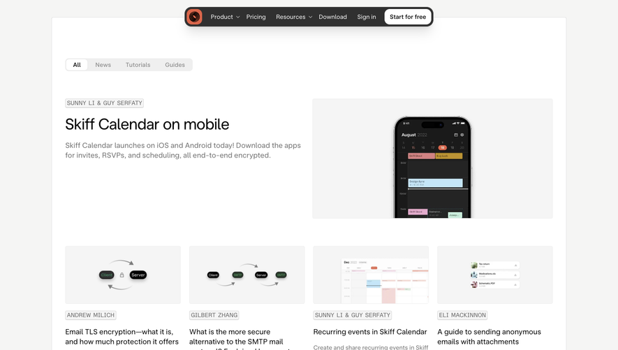
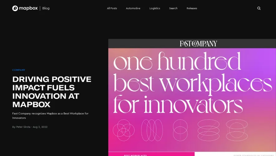
Generate a new design based on this screen using your own content.
Thank you! Your submission has been received!
Oops! Something went wrong while submitting the form.
# Design from Reference: Close Blog Feed
Create an original, high-fidelity visual design inspired by the reference. Prioritize composition, typography, colors, spacing, and component styling over technical implementation.
## Reference
- **Product:** Close
- **Category:** Blog Feed
- **Screenshot:** https://cdn.prod.website-files.com/5e9dc792e1210c5325f7ebbc/62f272d655b33f3bf9b6a37f_1660054840140-a316815d-4567-4bd3-b961-87cce38fafe0-name%3DCloseBlogFeed.webp
Analyze the screenshot first. If inaccessible, request it rather than guessing.
## Content
{{content.instructions}}
{{content.data}}
Preserve essential messaging and factual accuracy. Adapt structure and copy length for visual balance; never invent product claims.
## Visual Design
Use this context to reproduce the reference's visual language: layout, typography, colors, spacing, borders, radii, and distinctive elements. The screenshot takes priority if descriptions conflict.
## Direction
{{preferences.fidelityInstructions}}
## Output
{{output.instructions}}
Deliver a polished, cohesive design with precise alignment, hierarchy, and spacing. Produce the requested visual artifact, not just a description. If unsupported, explain the limitation.
Close.com's blog page adopts a clean, professional, and modern look, striking the right balance between functionality and personality. The visual approach is minimalist—ample white space provides breathing room, while bold accent colors inject energy without overwhelming the reader. The design feels approachable yet authoritative, aligning well with SaaS industry standards.
Layout and Structure
The structure is intuitive and reader-first. A compact header features crisp navigation and brand identity. The prominent hero section spotlights the latest content, inviting users to dive deeper. Below, posts are arranged in a grid with clear separation and subtle hover effects, making browsing effortless. Essential elements—like recent posts, categories, and search—are logically distributed in a sticky sidebar for continuous access.
Visual Elements
Imagery is used purposefully, enhancing rather than distracting from content. High-quality cover images head each post, while subtle icons and clean dividers guide the eye downward. There’s minimal use of distracting animations, ensuring focus remains on actionable insights and content.
Color Palette and Typography
A vibrant red serves as the primary accent against a foundation of white and dark grays, reinforcing brand recognition. Typography is modern and readable, with generous hierarchy: bold sans-serif headers draw attention, while body text remains legible for long reads.
User Experience Patterns
Navigation is streamlined, with a persistent top bar and well-placed CTAs encouraging newsletter signups. Search functionality is prominent, supporting content discovery. Smooth scroll patterns and consistent margins keep the experience cohesive and inviting.
Unique or Notable Design Choices
A standout feature is the sticky sidebar for category navigation—a subtle but effective UX touch. The overall tone is trusted and energetic, instilling confidence in Close’s expertise while making the content engaging to explore.