Generate a new design based on this screen using your own content.
Thank you! Your submission has been received!
Oops! Something went wrong while submitting the form.
# Design from Reference: Checkout.com Create New Board
Create an original, high-fidelity visual design inspired by the reference. Prioritize composition, typography, colors, spacing, and component styling over technical implementation.
## Reference
- **Product:** Checkout.com
- **Category:** Add & Edit
- **Screenshot:** https://cdn.prod.website-files.com/5e9dc792e1210c5325f7ebbc/6acad4c41025e911ae51847c_6acad3d58b7c605a8f573c6b_cms-b519a142fbd6ca244ba63ab8.webp
Analyze the screenshot first. If inaccessible, request it rather than guessing.
## Content
{{content.instructions}}
{{content.data}}
Preserve essential messaging and factual accuracy. Adapt structure and copy length for visual balance; never invent product claims.
## Visual Design
Use this context to reproduce the reference's visual language: layout, typography, colors, spacing, borders, radii, and distinctive elements. The screenshot takes priority if descriptions conflict.
## Direction
{{preferences.fidelityInstructions}}
## Output
{{output.instructions}}
Deliver a polished, cohesive design with precise alignment, hierarchy, and spacing. Produce the requested visual artifact, not just a description. If unsupported, explain the limitation.
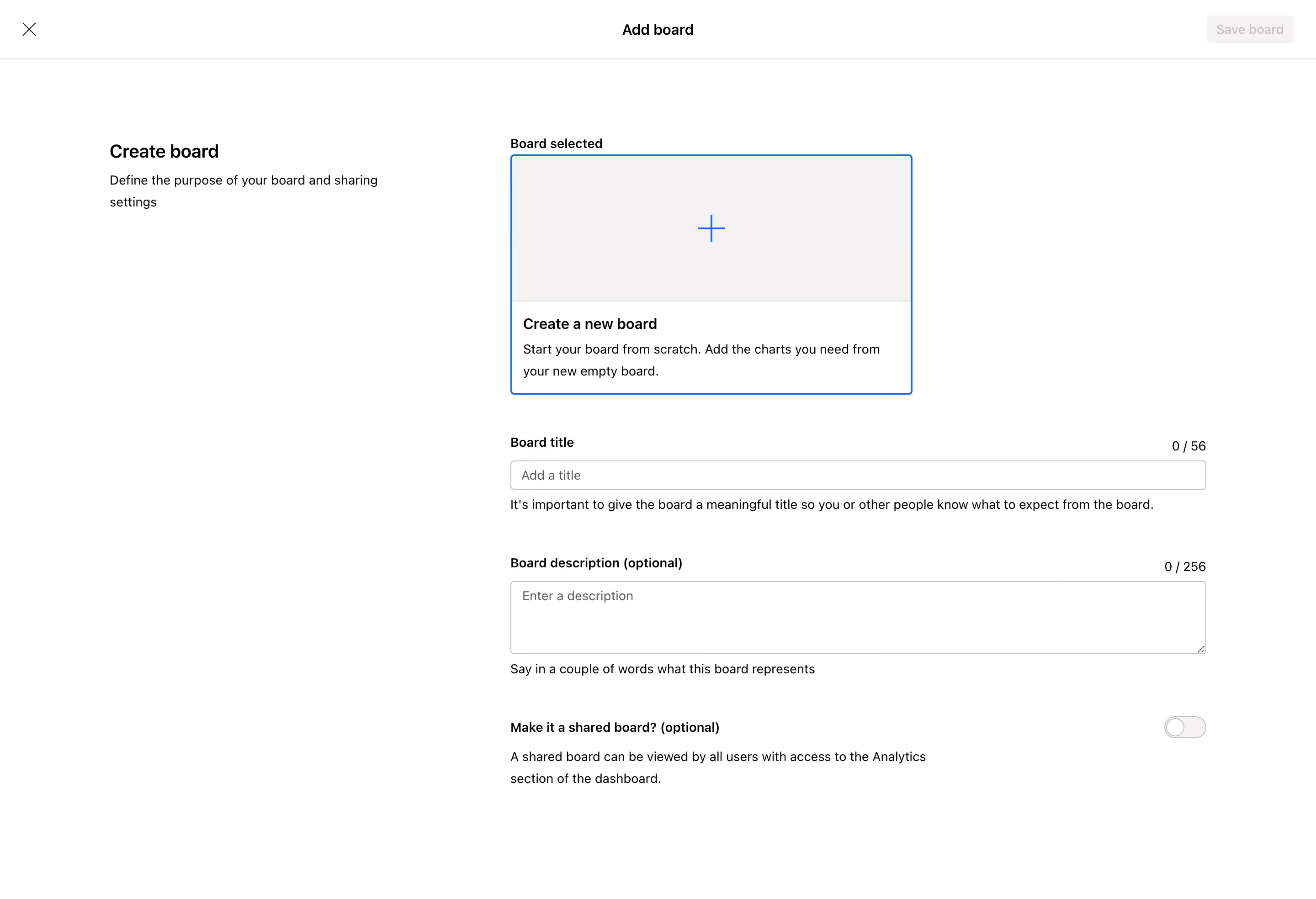
First thing you notice is how much breathing room this page has. The "Add board" modal goes full screen, which is a bold choice that actually works here. It forces focus. No distractions, no sidebar clutter. Just you and the task.
Smart Visual Hierarchy Without Trying Too Hard
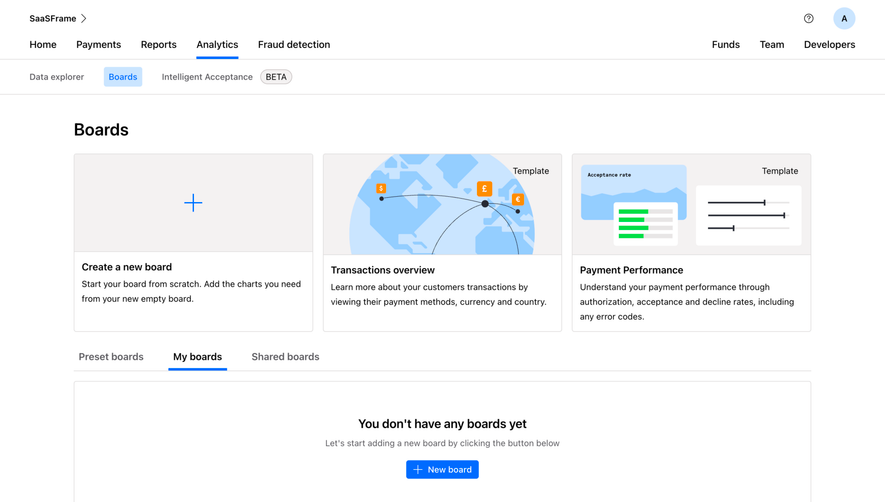
The selected board template sits in a dashed blue outline box with a subtle plus icon. It reads immediately as "start here." Below that, the form fields cascade naturally: title, description, sharing toggle. Each section has helper text underneath in a lighter gray that doesn't compete with the labels. The character counters (0/56 and 0/256) tucked to the right are a thoughtful touch.
Typography Does the Heavy Lifting
Bold section headers like "Board title" and "Board description" use weight contrast instead of color to establish hierarchy. Everything is black and white with that single blue accent on the selected state. The left sidebar text "Create board" with its subtitle grounds you contextually. That sharing toggle at the bottom feels appropriately deemphasized. Nothing here is loud, but everything is findable within seconds.