Design with AI
Generate a new design based on this screen using your own content.
# Design from Reference: ChartMogul Activation Emails
Create an original, high-fidelity visual design inspired by the reference. Prioritize composition, typography, colors, spacing, and component styling over technical implementation.
## Reference
- **Product:** ChartMogul
- **Category:** Activation Emails
- **Screenshot:** https://cdn.prod.website-files.com/5e9dc792e1210c5325f7ebbc/6acb64aae9370e78965af5a9_6acb629d289c14b2c19d6f37_cms-6e907bb9057b85aa68bf2c5e.webp
Analyze the screenshot first. If inaccessible, request it rather than guessing.
## Content
{{content.instructions}}
{{content.data}}
Preserve essential messaging and factual accuracy. Adapt structure and copy length for visual balance; never invent product claims.
## Visual Design
### Overall aesthetic
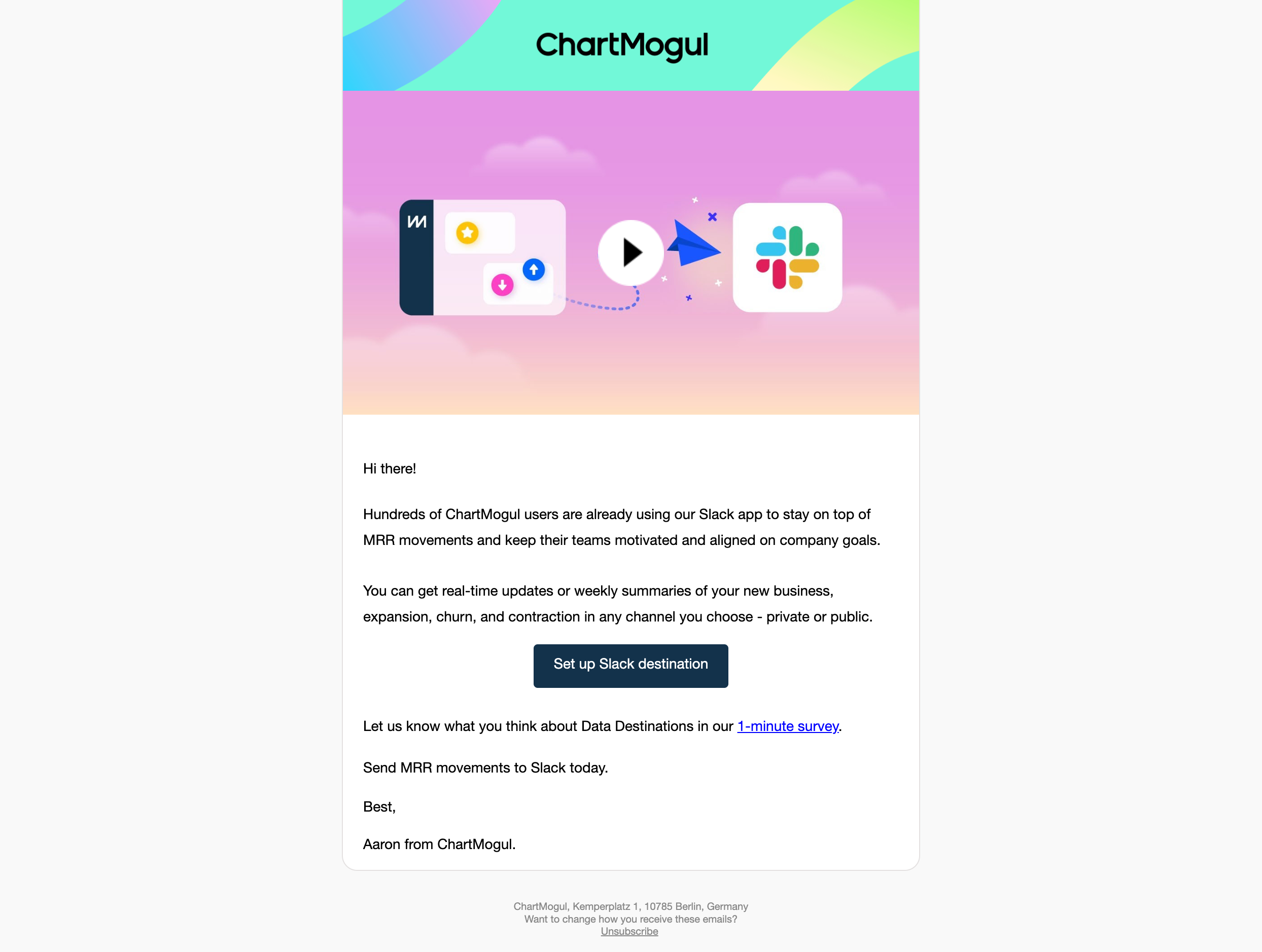
- **Character:** Bright activation email combining a vivid illustrated integration banner with a conventional, readable letter body.
### Page composition
- **Canvas:** 2488 × 1878 screenshot px; email CSS scale is unverified.
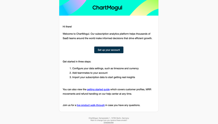
- **Structure:** Centered narrow card on light-gray surround; turquoise branded header; large pink-gradient video thumbnail; greeting and explanatory paragraphs; navy setup button; survey link, sign-off and small legal footer.
### Information hierarchy
- **Priority:** Colorful video graphic attracts attention first, while the centered setup action provides the main conversion route. Survey link is secondary.
### Typography
- **Family:** Familiar sans serif, exact font unverified.
- **Scale:** Suggested CSS adaptation based on relative screenshot proportions: body 16 px, CTA 16 px and footer 11–12 px; logo is a graphic rather than display heading.
### Colors & surfaces
- **Sampled palette:** Outer #F9F9F9; white #FFFFFF; vivid turquoise #00FCD7; banner pink #F38FEA/#F291E9; navy CTA #03334D; black #000000 body.
### Components
- **Banner:** Brand name over sweeping gradient ribbons; video illustration pairs product panel and Slack mark with a central play circle, paper plane and dotted path.
- **Card:** Fine gray outline and approximately 16 CSS px estimated lower corner radius; body has approximately 24 px estimated padding.
- **Action/footer:** Centered dark rectangular button with small radius; underlined survey and unsubscribe links; centered muted address below the card.
### Visual rhythm
- **Spacing:** Large continuous image area contrasts with modest paragraph gaps; CTA breaks the letter near its midpoint.
### Responsive
- **Observed:** Email screenshot only.
- **Adaptation:** Make artwork fluid, retain a readable single column and supply meaningful text for the video/action. Keep the footer separate from the main card.
### Adaptation guidance
- **Preserve:** Vivid branded image band, simple letter structure and one clear integration setup action.
- **Replace:** Use genuine product imagery, verified integration benefits and valid setup/survey destinations.
Use this context to reproduce the reference's visual language: layout, typography, colors, spacing, borders, radii, and distinctive elements. The screenshot takes priority if descriptions conflict.
## Direction
{{preferences.fidelityInstructions}}
## Output
{{output.instructions}}
Deliver a polished, cohesive design with precise alignment, hierarchy, and spacing. Produce the requested visual artifact, not just a description. If unsupported, explain the limitation.