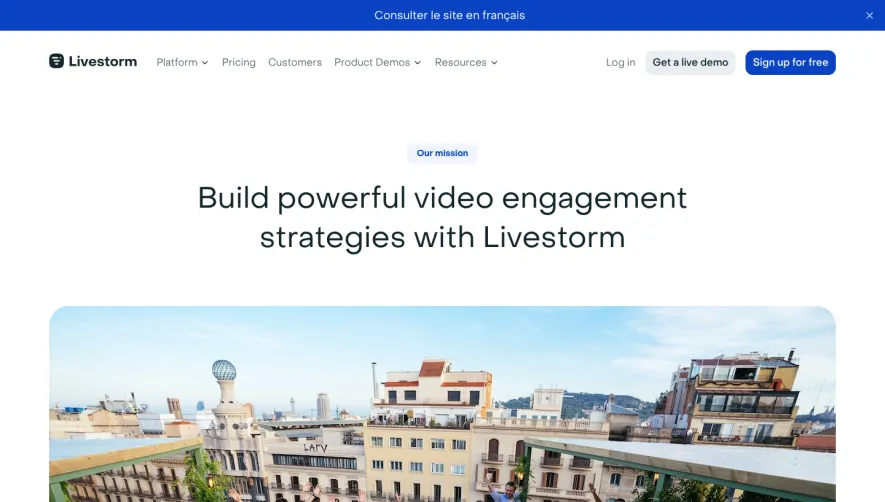
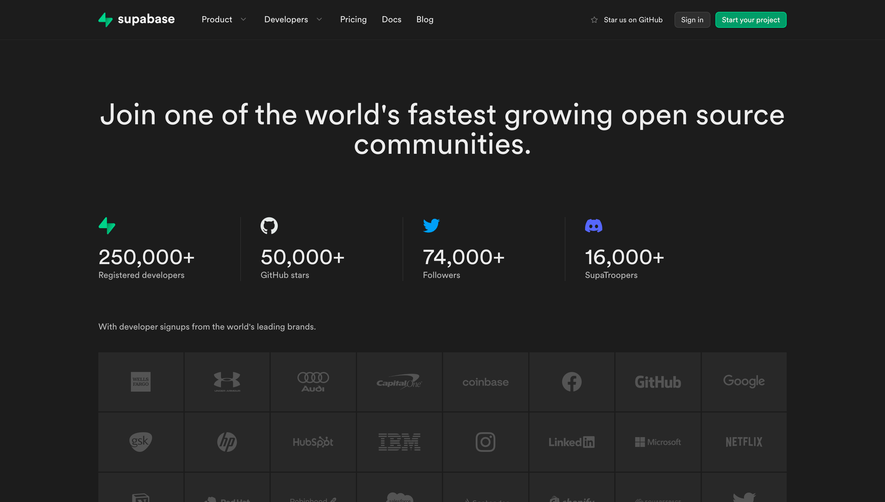
Overall Style and Aesthetic
The ChartMogul company page exemplifies a modern, minimalist aesthetic, radiating clarity and professionalism. A refined color palette, abundant white space, and subtle visual cues create an inviting and focused atmosphere. Every design choice signals competence and trustworthiness, making it perfect inspiration for SaaS founders who value a sleek, approachable look without visual noise. Layout and Structure
The structure unfolds neatly, starting with a concise hero section featuring leadership photos and mission. Below, the page transitions into a grid-based “Meet the Team” layout with consistent spacing, guiding visitors smoothly from executives to broader staff. There are no distracting sidebars; content flows vertically, keeping focus tight and navigation intuitive. Visual Elements
One of the standout features is the use of authentic photography: team headshots are presented in uniform circles against soft backgrounds, letting genuine faces humanize the company. Subtle hover effects and micro-animations imbue a sense of interactivity, while the absence of clichéd illustrations or stock imagery grounds the page in realness. Color Palette and Typography
A sophisticated blend of navy, white, and soft gray forms the page’s backbone, with occasional accent colors highlighting CTAs or role tags. Typography is clean and contemporary—think sans-serif fonts with distinct weight hierarchy for names, roles, and sections, supporting easy scanning and readability. User Experience Patterns & Distinct Choices
Navigation is stripped back, with sticky headers ensuring effortless movement between site sections. Clear calls to action (“Join Us”) anchor the page, and responsive sizing ensures mobile-friendliness. Notably, the focus on real team members—eschewing overused visual clichés—establishes an authentic tone that feels inviting, forward-thinking, and trustworthy.