Overall Style and Aesthetic
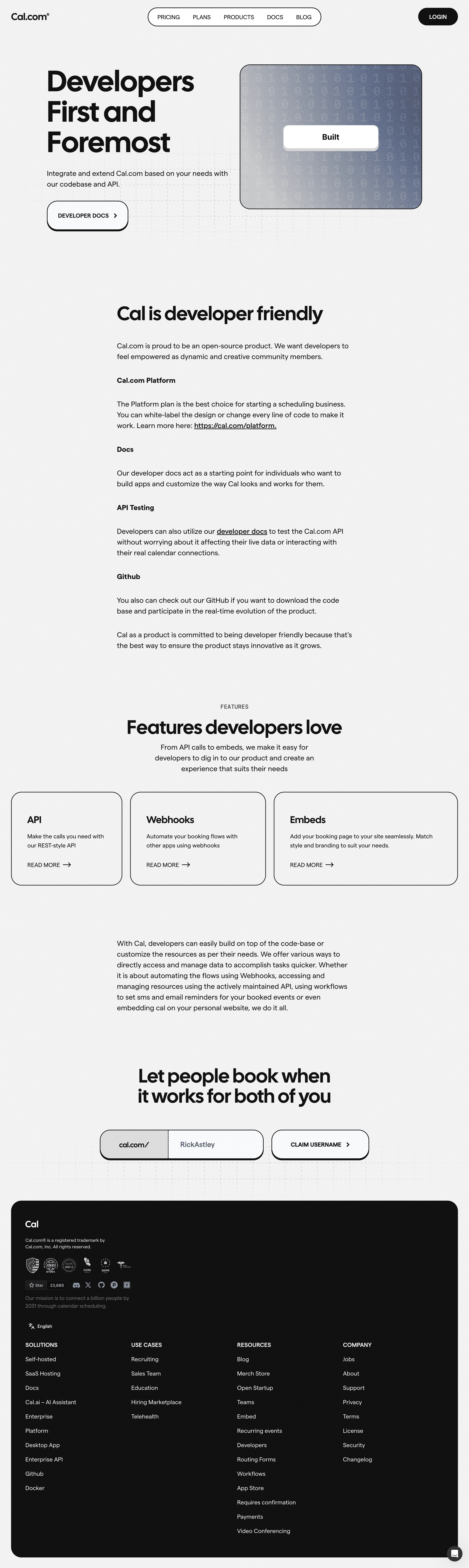
Cal.com’s developer resources page embodies a modern, minimalist aesthetic, relying on whitespace and a restrained color scheme to convey professionalism and focus. The design feels clean, deliberate, and highly approachable—tailored for a technical audience but polished enough for SaaS inspiration boards. The atmosphere leans tech-forward but remains inviting rather than austere. Layout and Structure
The page architecture is intuitive, beginning with a concise hero section that introduces developers to key platform benefits. Content follows a logical, scrollable flow: punchy feature highlights with brief explanations, code snippets, and relevant developer documentation links. There is no clutter—each element is purposeful, supporting efficient content discovery. Visual Elements
Instead of heavy illustrations or photography, the page spotlights slick SVG icons, line art, and subtle micro-animations. Interactive code examples and documentation previews add dynamism without overwhelming the user. The consistent use of custom UI elements (like pill-shaped tags and neat code blocks) reinforces the developer-centric vibe. Color Palette and Typography
A monochrome-heavy palette—with black, white, and muted grays—is punctuated by thoughtful, brand-aligned accent colors (notably a deep violet and teal). Typography is unambiguous, leveraging a geometric sans-serif font for clear hierarchy—large headings, inviting subheaders, and legible, low-contrast body copy. Code samples feature a monospaced font for clarity. User Experience Patterns & Unique Design Choices
Navigation is streamlined via a sticky, minimalistic header and anchor links, while subtle CTAs (like "Get API key" or "Read Docs") blend seamlessly into the flow. Distinctive choices include the liberal use of pill-shaped UI chips, embedded code playgrounds, and animated button hover states, all reinforcing a sense of innovation and reliability. The overall tone is trustworthy and empowering—precisely what SaaS developers seek.