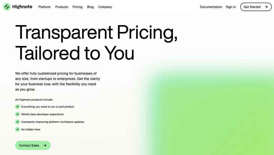
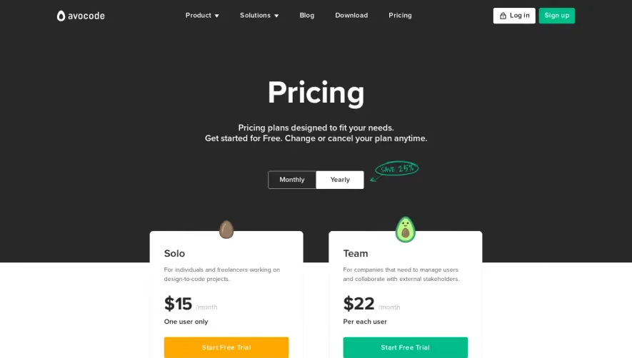
Generate a new design based on this screen using your own content.
Thank you! Your submission has been received!
Oops! Something went wrong while submitting the form.
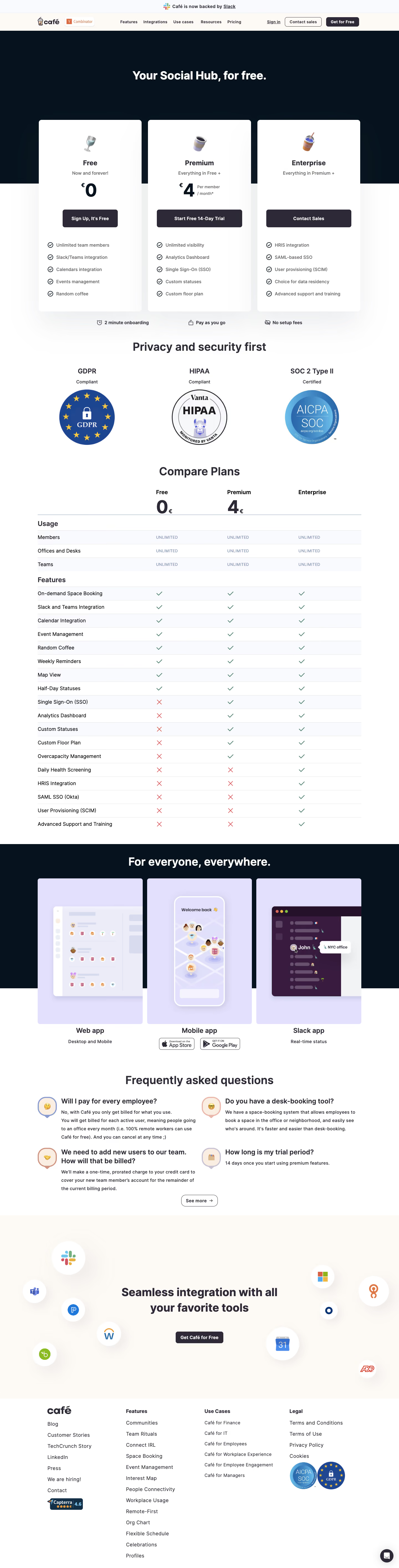
# Design from Reference: Café Pricing Page
Create an original, high-fidelity visual design inspired by the reference. Prioritize composition, typography, colors, spacing, and component styling over technical implementation.
## Reference
- **Product:** Café
- **Category:** Pricing Page
- **Screenshot:** https://cdn.prod.website-files.com/5e9dc792e1210c5325f7ebbc/6acb72b6018523cfee2da127_6acb70350e8221f130848cf9_cms-1d29631d11866586169f22a3.webp
Analyze the screenshot first. If inaccessible, request it rather than guessing.
## Content
{{content.instructions}}
{{content.data}}
Preserve essential messaging and factual accuracy. Adapt structure and copy length for visual balance; never invent product claims.
## Visual Design
Use this context to reproduce the reference's visual language: layout, typography, colors, spacing, borders, radii, and distinctive elements. The screenshot takes priority if descriptions conflict.
## Direction
{{preferences.fidelityInstructions}}
## Output
{{output.instructions}}
Deliver a polished, cohesive design with precise alignment, hierarchy, and spacing. Produce the requested visual artifact, not just a description. If unsupported, explain the limitation.
The AT.Cafe pricing page exemplifies a modern, minimalist approach with a clear tech-forward vibe. White space dominates, allowing core content and CTAs to stand out, while soft accent hues add warmth. The aesthetic feels approachable yet professional—balancing simplicity and elegance for SaaS audiences seeking clarity and trust.
Layout and Structure
Structure follows a familiar but refined flow: a tight header with navigation, followed by a concise hero section introducing the pricing narrative. The central focus is a well-organized pricing table, flanked by comparison points and plan highlights. A discreet FAQ section addresses objections, while a streamlined footer provides essential links without visual clutter.
Visual Elements
Custom monochrome illustrations and playful yet simple icons support text without overwhelming the composition. No heavy photography or video; instead, subtle UI motifs—such as dotted lines and gently animated highlights—add movement and consistency. This illustration-driven visual identity makes the experience feel cohesive and memorable.
Color Palette and Typography
The key color duo is a clean white background with strategic splashes of soft purple and teal. High-contrast elements draw immediate focus to interactive components. Typography is crisp and geometric—likely using a font similar to Inter or SF Pro Display—enhancing legibility and creating a fluid hierarchy from headlines to footnotes.
User Experience Patterns
Navigation is sticky, unobtrusive, and mobile-friendly. CTAs are bold and repeated for accessibility. Interactive plan toggles (monthly/annual) animate smoothly, improving engagement. Forms are terse and clear, with microcopy providing guidance. Scroll is linear but augmented by minor on-scroll effects for a dynamic, interactive feel.
Unique or Notable Design Choices
The site’s standout aspect is its use of low-contrast, playful illustration to soften typical SaaS rigidity, combined with a frictionless pricing selector. The interface feels innovative yet effortless, matching a tone that conveys reliability, user-centric design, and a dash of lighthearted energy—a strong source of inspiration for SaaS brands seeking modernity and trust.