Design with AI
Generate a new design based on this screen using your own content.
# Design from Reference: Audienceful Signup
Create an original, high-fidelity visual design inspired by the reference. Prioritize composition, typography, colors, spacing, and component styling over technical implementation.
## Reference
- **Product:** Audienceful
- **Category:** Signup
- **Screenshot:** https://cdn.prod.website-files.com/5e9dc792e1210c5325f7ebbc/6acad971bd9ce0e960551f64_6acad8f23ce5f4104ebf4575_cms-85b33812f400bb27a60be1aa.webp
Analyze the screenshot first. If inaccessible, request it rather than guessing.
## Content
{{content.instructions}}
{{content.data}}
Preserve essential messaging and factual accuracy. Adapt structure and copy length for visual balance; never invent product claims.
## Visual Design
### Overall aesthetic
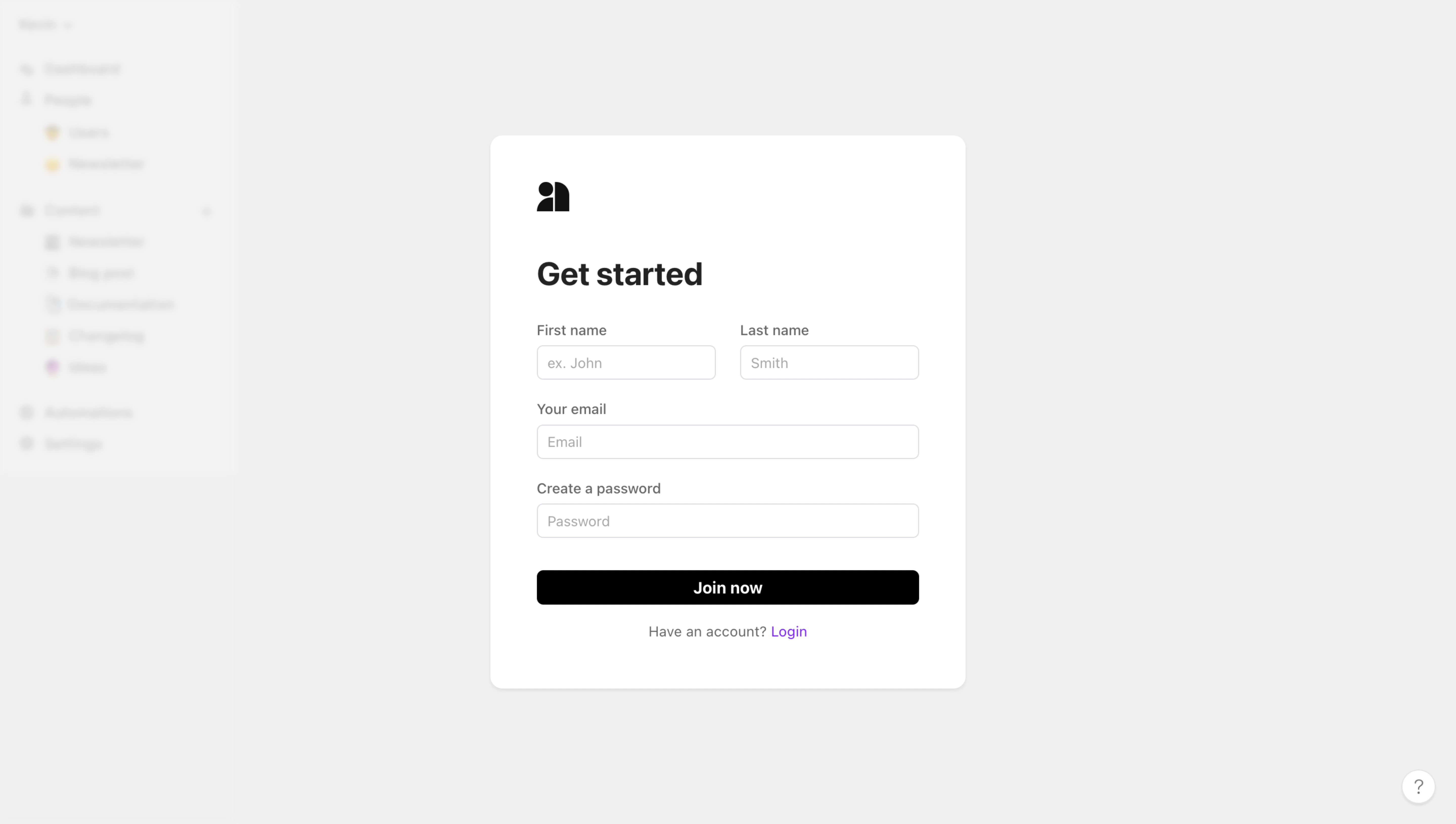
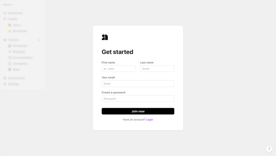
- **Character:** Minimal monochrome signup dialog over a heavily blurred pale application background.
- **Evidence and scale:** Screenshot is 5760 × 3260 image pixels. Sizes estimate a 1440 × 815 CSS viewport at 4× capture scale; actual DPR and font identity are unverified.
### Page composition
- **Background:** A blurred application rail remains faintly visible at left; the rest is subdued gray.
- **Dialog:** Centered white card approximately 470 × 548px CSS contains small black brand symbol, large heading and form.
- **Fields:** First/last name share a row; email and password span full width below.
- **Actions:** Black Join now button precedes a centered existing-account sentence with violet Login link. A small help circle sits lower-right outside the card.
### Information hierarchy
- **Task:** Bold Get started heading dominates the compact dialog.
- **Field sequence:** Name pair leads to email/password, with persistent labels and pale example placeholders.
- **Action:** Full-width black button provides the strongest control.
- **Secondary route:** Violet login link is a small accent beneath the action; background navigation is intentionally illegible.
### Typography
- **Heading:** Approximately 32px CSS bold neutral sans-serif.
- **Labels/fields:** Around 14px, regular-to-medium, with muted placeholders.
- **Action/account:** Around 14px; Join now medium/semibold.
- **Family:** Exact sans-serif identity, weights and tracking remain unverified.
### Colors & surfaces
- **Measured ground:** Gray #F0F0F0 dominates the overlay/background.
- **Measured dialog:** White #FFFFFF with related #F3F3F3/#F2F2F2 boundary/shadow pixels.
- **Measured foreground:** Black #000000 supports brand/action.
- **Measured accent:** Tiny violet #8115FF/#831AFF pixels appear in the login link; the rest is neutral.
### Components
- **Card shell:** Approximately 470 × 548px, radius near 14px, soft lower shadow and about 48px padding.
- **Inputs:** Full-width fields around 378 × 34px; split name fields around 176px each, thin gray outline and 6px radii.
- **Primary button:** Approximately 378 × 34px, black fill, white centered label and 6px radius.
- **Brand:** Compact black geometric person/page symbol above the title.
- **Help:** Small white outlined circular question-mark control with subtle shadow.
### Visual rhythm
- **Form cadence:** Roughly 24px separates field groups; 8px binds labels to inputs.
- **Top spacing:** Brand and heading have a larger gap, establishing a clear start.
- **Dialog isolation:** Broad neutral margins and blurred context concentrate attention on signup.
- **Alignment:** Fields, title and action share one left/right grid; login sentence centers below.
### Responsive
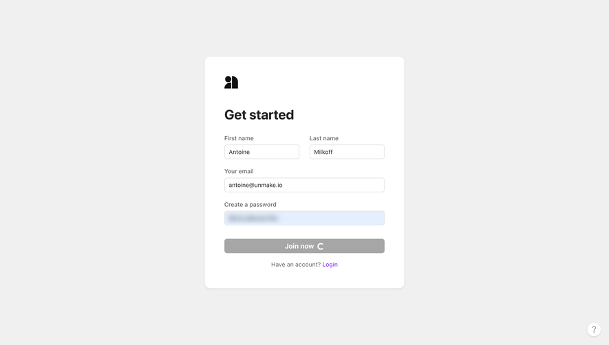
- **Observed limit:** Desktop blank signup only; validation, submission and mobile behavior are unobserved.
- **Recommended sizing:** Use a fluid capped dialog with comfortable viewport margins.
- **Recommended fields:** Stack name fields on narrow screens and preserve labels.
- **Recommended controls:** Increase small input/button touch heights as needed and maintain accessible focus/dialog behavior.
### Adaptation guidance
- **Preserve focus:** Keep signup compact with only essential fields and one primary action.
- **Use restrained color:** Black action and a small violet secondary link are sufficient.
- **Implementation:** Provide correct input semantics, password guidance, accessible validation and focus management. Blurred background details should not be reconstructed from guesses.
Use this context to reproduce the reference's visual language: layout, typography, colors, spacing, borders, radii, and distinctive elements. The screenshot takes priority if descriptions conflict.
## Direction
{{preferences.fidelityInstructions}}
## Output
{{output.instructions}}
Deliver a polished, cohesive design with precise alignment, hierarchy, and spacing. Produce the requested visual artifact, not just a description. If unsupported, explain the limitation.