
Thank you! Your submission has been received!
Oops! Something went wrong while submitting the form.
Get SaaSFrame Pro
Monthly
$18
Quarterly
$48
Yearly
$180
Upgrade to access this feature
Browse all screens & flows
Filter and search screens & flows
Access Figma files
Access mobile versions
Bookmark screens & flows
Join now
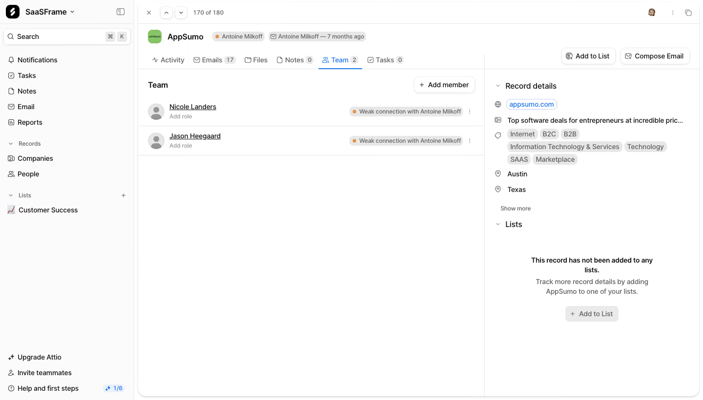
Attio Company Team

Attio
Customer relationship magic
Designed by
No items found.

Bookmark
Bookmark

Design with AI
Thank you! Your submission has been received!
Oops! Something went wrong while submitting the form.
# Design from Reference: Attio Company Team
Create an original, high-fidelity visual design inspired by the reference. Prioritize composition, typography, colors, spacing, and component styling over technical implementation.
## Reference
- **Product:** Attio
- **Category:** Dashboard
- **Screenshot:** https://cdn.prod.website-files.com/5e9dc792e1210c5325f7ebbc/6acbb9f3d37e66e942ffbac4_6acb708403442b22fb64f3e4_cms-a1f0fef6c3863792fe40fecb.webp
Analyze the screenshot first. If inaccessible, request it rather than guessing.
## Content
{{content.instructions}}
{{content.data}}
Preserve essential messaging and factual accuracy. Adapt structure and copy length for visual balance; never invent product claims.
## Visual Design
### Overall aesthetic
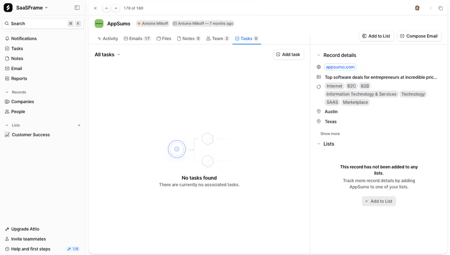
- **Style:** Compact white CRM record-detail workspace with persistent left navigation, a central team list and a right metadata sidebar.
- **Character:** Neutral sans serif, fine gray separators, small outline icons and restrained blue selected-state accents.
- **Surface treatment:** Flat near-white navigation and a large lightly bordered rounded record pane. Small chips and modest buttons carry secondary information.
### Page composition
- **Capture dimensions:** 1440 × 821 image px. CSS reconstruction estimates assume an unverified 1× capture.
- **Left navigation:** Approximately 280 px wide, full height, with workspace selector, search, general tools, record collections, lists and lower upgrade/help routes.
- **Record pane:** Occupies the remaining width with a rounded outer boundary and shallow top record-navigation strip.
- **Identity row:** Company avatar/name sit left, followed by compact relationship/email metadata chips. Utility symbols occupy the upper-right edge.
- **Tab/action row:** Activity, Emails, Files, Notes, Team and Tasks run horizontally; Team is selected with a blue underline. Add to List and Compose Email align right.
- **Central content:** Approximately 710 px wide, with Team heading and Add member action above two member rows.
- **Right sidebar:** Approximately 440 px wide, separated by a vertical rule. Record details include domain, truncated description, tags and location fields; a Lists section below shows an empty-state message and action.
### Information hierarchy
- **Record identity:** Company name is the primary context, while small metadata chips remain secondary.
- **Selected view:** Team and its count are blue, making the active subview explicit.
- **Member rows:** Underlined names lead; small Add role text sits beneath. A muted connection-strength chip and overflow control align right.
- **Metadata hierarchy:** Icon-led values and compact gray tags organize company attributes without a form-like field grid.
- **Empty state:** The Lists section explains absence of list membership and offers Add to List.
- **Evidence limit:** No invitation modal, edited role, email composer or expanded menu is shown.
### Typography
- **Family:** Neutral compact application sans serif; exact identity is unverified.
- **Company name:** Approximately 16–18 px semibold.
- **Section headings:** Approximately 16 px medium/semibold.
- **Navigation and tabs:** Approximately 14 px, regular to medium.
- **Member names:** Approximately 14 px, underlined; supporting role text around 12–13 px.
- **Chips/counts:** Approximately 11–12 px with tight leading.
- **Empty state:** Approximately 14 px, with a semibold first line and regular explanatory text.
- **Measurement limit:** All values are visual CSS estimates under the assumed 1× scale.
### Colors & surfaces
- **Canvas:** Sampled sRGB #FFFFFF fills the record and main content.
- **Navigation:** Sampled #FBFBFB supplies a subtle near-white sidebar reference.
- **Rules and chips:** Sampled #E7E7E7 and #EAEAEA provide pale neutral separator/chip references.
- **Primary text:** Sampled #111111 supplies the strongest dark reference.
- **Secondary text:** Sampled #5E5E5E is a medium-gray reference.
- **Accents:** Blue marks the active tab and linked domain; small orange relationship dots and a green company-avatar tile add localized color. Exact accent values are not established by the dominant-color sample.
### Components
- **Search:** Compact white outlined field with leading magnifier and small keyboard-shortcut keycaps.
- **Record navigation:** Close, previous/next controls and record-position count occupy the top strip.
- **Tabs:** Icon/text labels with small count pills; active Team has a thin blue underline.
- **Member rows:** Two shallow full-width rows separated by rules, with generic circular avatars, names, role prompts and right-aligned relationship chips.
- **Header actions:** Small white bordered buttons with leading icons and subtle shadows.
- **Metadata tags:** Small gray rounded pills wrap across several lines.
- **Domain link:** Blue text inside a small pale outlined rounded label.
- **Lists empty action:** Muted gray rounded button beneath centered explanatory copy.
- **Help progress:** Small blue progress badge appears beside the lower-left help route.
### Visual rhythm
- **Three-zone layout:** Navigation, relational content and metadata maintain distinct vertical regions.
- **Top density:** Identity, tabs and actions concentrate near the top; the sparse member list leaves broad whitespace below.
- **Alignment:** Member identities align left while relationship indicators align right; metadata follows its own consistent inset.
- **Neutral repetition:** Fine rules and small gray chips create structure without a dense card dashboard.
### Responsive
- **Evidence limit:** Only desktop is visible; recommendations below are not observed behavior.
- **Navigation recommendation:** Collapse the left sidebar when space is limited.
- **Metadata recommendation:** Move record details below the team list or into an accessible secondary panel.
- **Tabs recommendation:** Allow horizontal scrolling while preserving the active view label.
- **Rows recommendation:** Stack connection chips beneath member names if required, keeping actions reachable.
- **Accessibility recommendation:** Label icon controls, expose tab state and provide clear keyboard focus; these behaviors are not verified by the capture.
### Adaptation guidance
- **Preserve context:** Keep record identity and active subview visible while displaying related people.
- **Use real data:** Populate member names, roles, relationship strength, tags and list membership from actual target records.
- **Retain restraint:** Use white surfaces, fine rules, compact metadata and one selected-state accent.
- **Adapt actions:** Include list/email/member routes only when supported by the target workflow.
- **Avoid inferred states:** Do not invent role assignments, invitations or relationship details absent from the source data.
Use this context to reproduce the reference's visual language: layout, typography, colors, spacing, borders, radii, and distinctive elements. The screenshot takes priority if descriptions conflict.
## Direction
{{preferences.fidelityInstructions}}
## Output
{{output.instructions}}
Deliver a polished, cohesive design with precise alignment, hierarchy, and spacing. Produce the requested visual artifact, not just a description. If unsupported, explain the limitation.


Category
Patterns
Tech Stack



Added on
March 5, 2023


Similar screens






Upgrade to SaaSFrame Pro now to see similar examples.
Monthly
$18 /month
Billed $18 monthly
Browse all screens & flows
Filter and search screens & flows
Search text in screenshots
Access Figma files
Access mobile versions
Join now
Quarterly
$16 /month
Billed $48 quarterly
Browse all screens & flows
Filter and search screens & flows
Search text in screenshots
Access Figma files
Access mobile versions
Join now
Yearly
$15 /month
Billed $180 yearly
Browse all screens & flows
Filter and search screens & flows
Search text in screenshots
Access Figma files
Access mobile versions
Join now