Design with AI
Generate a new design based on this screen using your own content.
# Design from Reference: Asana New Features Emails
Create an original, high-fidelity visual design inspired by the reference. Prioritize composition, typography, colors, spacing, and component styling over technical implementation.
## Reference
- **Product:** Asana
- **Category:** Product Update Emails
- **Screenshot:** https://cdn.prod.website-files.com/5e9dc792e1210c5325f7ebbc/6acbbf6d4d71070f5fd41375_6acbbe92681d3a08a1ed1224_cms-f607af1fac79111e3542c616.webp
Analyze the screenshot first. If inaccessible, request it rather than guessing.
## Content
{{content.instructions}}
{{content.data}}
Preserve essential messaging and factual accuracy. Adapt structure and copy length for visual balance; never invent product claims.
## Visual Design
### Overall aesthetic
- **Character:** A straightforward feature-announcement email with centered branding, a purple-framed product screenshot and two distinct calls to action.
- **Evidence scale:** Original 1336 × 1828 pixels, inspected across both readable crops. Measurements refer to image pixels; email-client zoom and CSS scale are unverified.
### Page composition
- **Brand:** Large centered Asana wordmark appears above the message.
- **Main module:** An approximately 750 px wide thin-bordered white panel contains a centered heading/subtitle, full-width product image, explanatory prose, three-item bullet list and a purple Learn more button.
- **Secondary module:** A separate matching bordered panel contains a centered live-demo invitation and outlined Register now button.
- **Margins:** Broad white side gutters frame both modules; no unsubscribe or legal block is visible within this image.
### Information hierarchy
- **Opening:** The large feature headline leads, supported by a smaller strategy/execution subtitle.
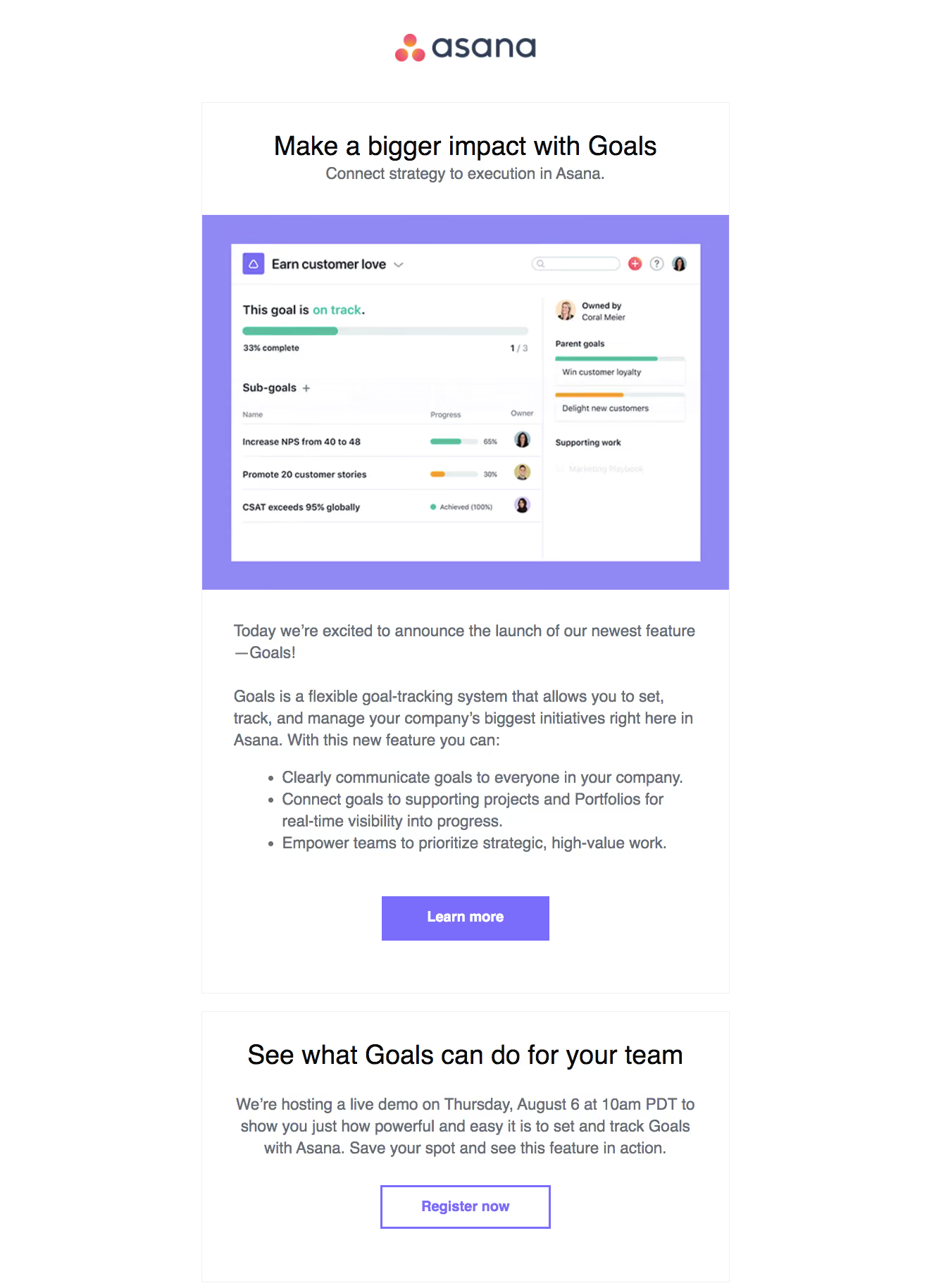
- **Product evidence:** A goal-management interface screenshot shows progress bars, a subgoal table and a parent-goal sidebar.
- **Explanation:** Introductory paragraphs lead into a compact three-benefit bullet list.
- **Actions:** Solid purple Learn more is primary; the later registration action uses a white fill and purple outline.
### Typography
- **Headline:** Unverified sans-serif, approximately 38 px regular with 46 px line height.
- **Subtitle/body:** Approximately 23–24 px regular, 31–32 px line height in medium gray.
- **Secondary heading:** Similar approximately 38 px regular black text.
- **Buttons:** Approximately 20–21 px bold; centered labels.
- **Embedded UI:** Much smaller sans-serif labels, bold goal titles and compact progress metadata belong to the image, not live email controls.
### Colors & surfaces
- **Base:** White #FFFFFF canvas and modules.
- **Image frame:** Measured lavender #9088F3 surrounds the embedded product interface.
- **Actions:** Purple #7A6DFC supplies the filled action and outline family.
- **Text:** Near-black #0A0A0A headings and gray #676D76 supporting copy.
- **Rules:** Pale #EFF0F1 outlines modules; green and orange progress bars appear inside the product screenshot.
### Components
- **Main panel:** Approximately 750 px wide with a hairline border and square corners.
- **Screenshot block:** Roughly 750 × 532 px lavender frame around a white goals dashboard with rounded progress tracks and small circular owner portraits.
- **Body region:** Approximately 44 px horizontal inset; paragraphs and bullets align left.
- **Learn more:** Approximately 238 × 64 px solid purple rectangular button with square corners.
- **Demo module:** Separate bordered white section with generous centered padding.
- **Register action:** Approximately 242 × 62 px white rectangle with a 3 px purple border and bold purple text.
### Visual rhythm
- **Opening space:** Brand and message module have a generous vertical gap.
- **Content cadence:** Roughly 36–44 px padding separates screenshot, prose and action groupings.
- **Bullets:** Tight line spacing and conventional indents distinguish the benefit list from the surrounding paragraphs.
- **Module break:** A small white gap separates the two bordered message sections.
### Responsive
- **Observed limit:** This email rendering only; mobile and client-specific behavior are unverified.
- **Recommendation:** Use a fluid container, proportional screenshot scaling and body text that remains readable without shrinking the whole email.
- **Actions:** Keep buttons wide enough for touch and allow long headings and invitation text to wrap naturally.
### Adaptation guidance
- **Retain:** Pair a feature announcement with a concrete interface image and a short benefit list before the main action.
- **Implement:** Use one purple accent, restrained borders and a visibly secondary outlined follow-up action.
- **Verify:** Confirm email typography, link targets and current event details separately; the captured invitation does not establish a current schedule.
Use this context to reproduce the reference's visual language: layout, typography, colors, spacing, borders, radii, and distinctive elements. The screenshot takes priority if descriptions conflict.
## Direction
{{preferences.fidelityInstructions}}
## Output
{{output.instructions}}
Deliver a polished, cohesive design with precise alignment, hierarchy, and spacing. Produce the requested visual artifact, not just a description. If unsupported, explain the limitation.