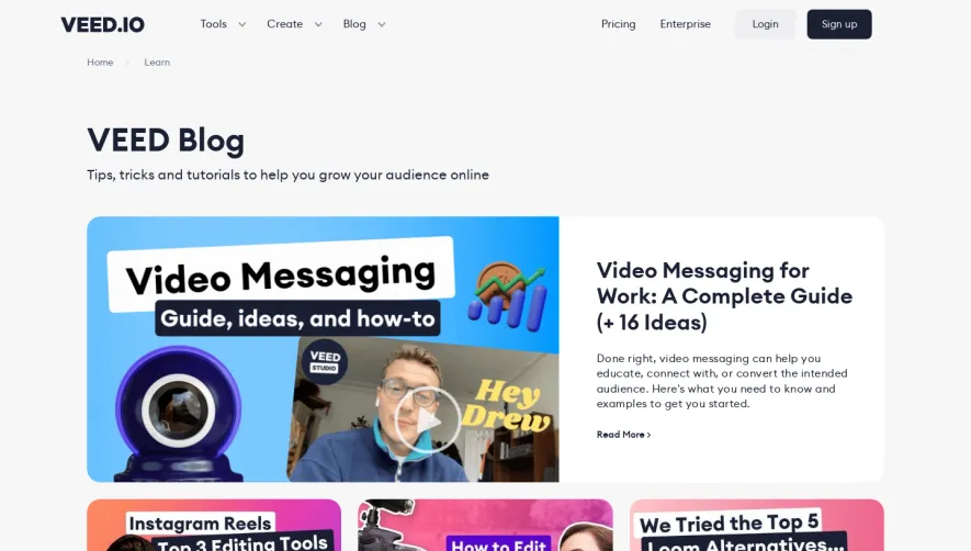
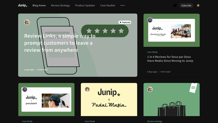
Generate a new design based on this screen using your own content.
Thank you! Your submission has been received!
Oops! Something went wrong while submitting the form.
# Design from Reference: Airtable Blog Feed
Create an original, high-fidelity visual design inspired by the reference. Prioritize composition, typography, colors, spacing, and component styling over technical implementation.
## Reference
- **Product:** Airtable
- **Category:** Blog Feed
- **Screenshot:** https://cdn.prod.website-files.com/5e9dc792e1210c5325f7ebbc/62ec9c8b1d8c6b29362d860d_1659625433847-screenshot-device-2655c587a55d57ebdb70842fc717ff63-1659605671263.webp
Analyze the screenshot first. If inaccessible, request it rather than guessing.
## Content
{{content.instructions}}
{{content.data}}
Preserve essential messaging and factual accuracy. Adapt structure and copy length for visual balance; never invent product claims.
## Visual Design
Use this context to reproduce the reference's visual language: layout, typography, colors, spacing, borders, radii, and distinctive elements. The screenshot takes priority if descriptions conflict.
## Direction
{{preferences.fidelityInstructions}}
## Output
{{output.instructions}}
Deliver a polished, cohesive design with precise alignment, hierarchy, and spacing. Produce the requested visual artifact, not just a description. If unsupported, explain the limitation.
Airtable’s blog page radiates a modern, approachable professionalism. The visual identity is clean yet vibrant, balancing white space with splashes of saturated color. The design is minimalist but far from sterile; playful touches and geometric elements add energy without disrupting the clarity and focus of the content.
Layout and Structure
The layout follows a classic content-first blog structure, with a simple hero section featuring recent and popular stories, followed by categorized collections and editorial highlights. Cards and grid layouts ensure posts are scannable. There’s no clutter—no overwhelming banners or pop-ups—keeping guests immersed in the content with intuitive navigation bars and a sticky menu for accessibility.
Visual Elements
Subtle, abstract illustrations and modernist icons punctuate the page, supporting content without overshadowing it. Thumbnail images for blog posts maintain aesthetic cohesion with soft corners and consistent sizing, while the prominent use of cover images creates visual rhythm. Occasional micro-interactions—like smooth hover states—add a touch of sophistication.
Color Palette and Typography
A lively palette of purples, blues, and soft gradients weaves through the neutral backgrounds, creating visual anchors. Typography is modern and readable: bold sans-serifs for headings establish hierarchy, while lighter weights boost scannability for metadata and body copy. Font choices reinforce clarity and contemporary appeal.
User Experience Patterns
User-centric patterns abound: clear CTAs (“Read more,” category labels), seamless infinite scroll for articles, sticky navigation, and accessible search. Category filters at the top invite exploration without friction, and each article card serves as an inviting gateway to deeper content.
Unique or Notable Design Choices
Standout features include the use of geometric accent shapes that echo Airtable’s branding, a lack of intrusive elements, and a content-driven approach that feels welcoming and authoritative. The overall tone is innovative and trustworthy—ideal for SaaS brands looking to inspire confidence while fostering discovery.