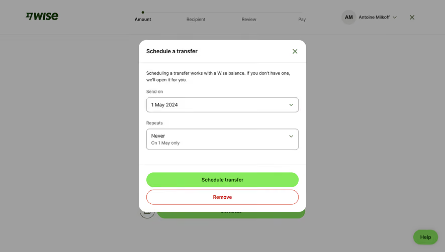
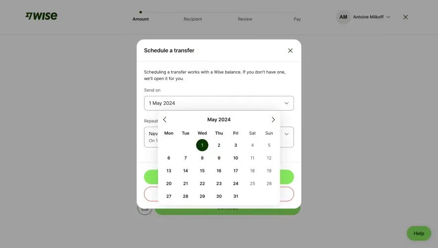
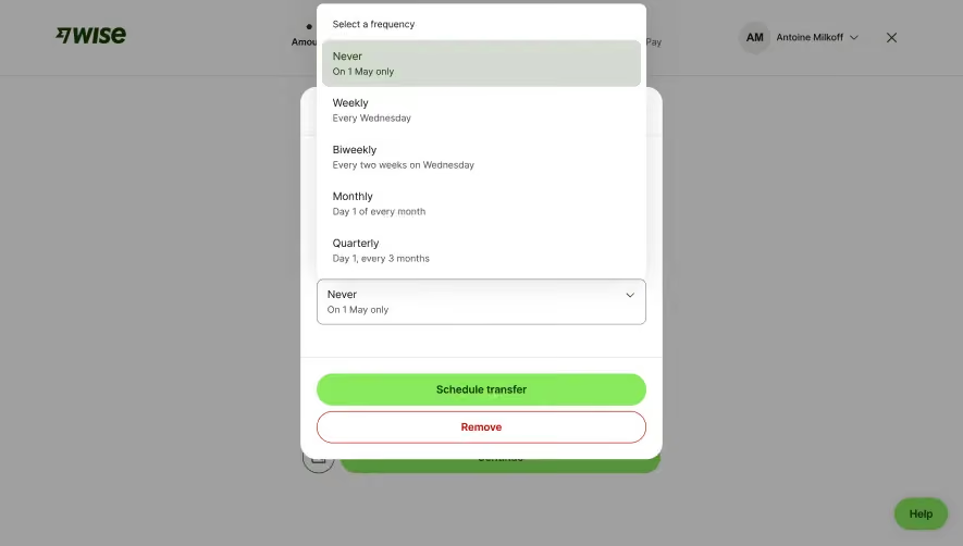
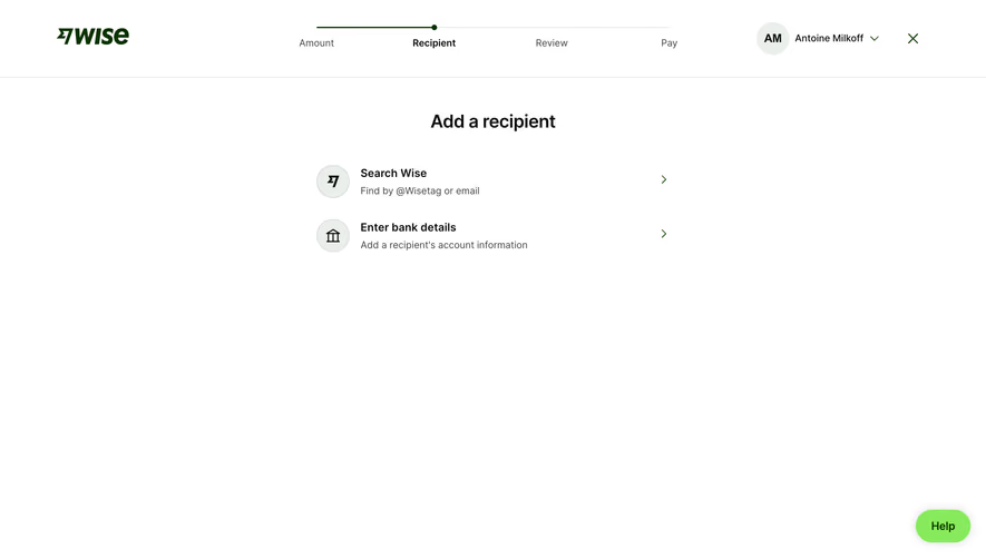
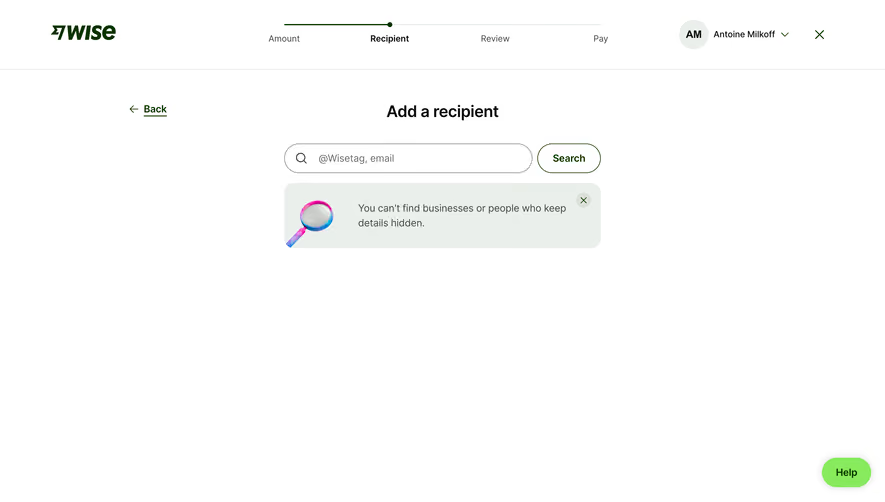
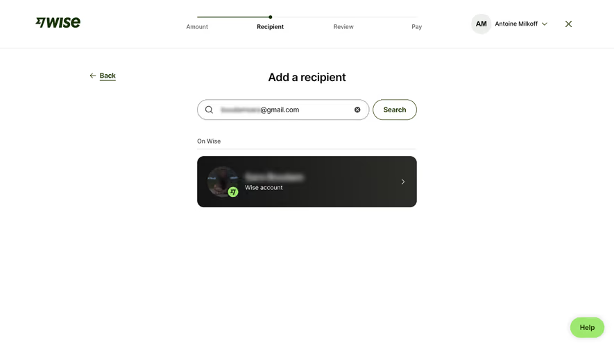
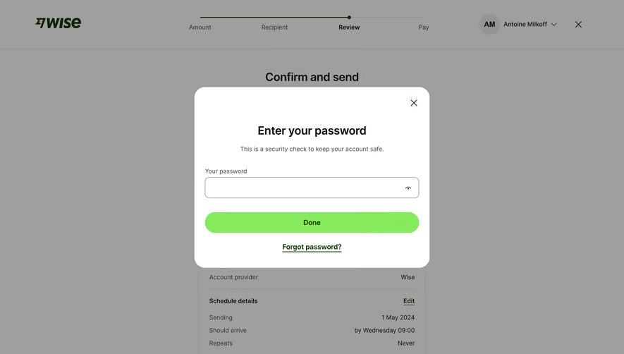
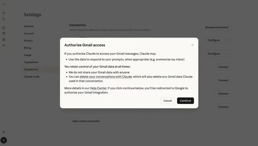
Generate a new design based on this screen using your own content.
Thank you! Your submission has been received!
Oops! Something went wrong while submitting the form.
# Design from Reference: Wise Confirm & Send Money
Create an original, high-fidelity visual design inspired by the reference. Prioritize composition, typography, colors, spacing, and component styling over technical implementation.
## Reference
- **Product:** Wise
- **Category:** Confirmation
- **Screenshot:** https://cdn.prod.website-files.com/5e9dc792e1210c5325f7ebbc/6aca27e7aca7079066e8e7b2_6aca2703003599d1884c5983_cms-167084857a42fe7fb026d763.webp
Analyze the screenshot first. If inaccessible, request it rather than guessing.
## Content
{{content.instructions}}
{{content.data}}
Preserve essential messaging and factual accuracy. Adapt structure and copy length for visual balance; never invent product claims.
## Visual Design
Use this context to reproduce the reference's visual language: layout, typography, colors, spacing, borders, radii, and distinctive elements. The screenshot takes priority if descriptions conflict.
## Direction
{{preferences.fidelityInstructions}}
## Output
{{output.instructions}}
Deliver a polished, cohesive design with precise alignment, hierarchy, and spacing. Produce the requested visual artifact, not just a description. If unsupported, explain the limitation.
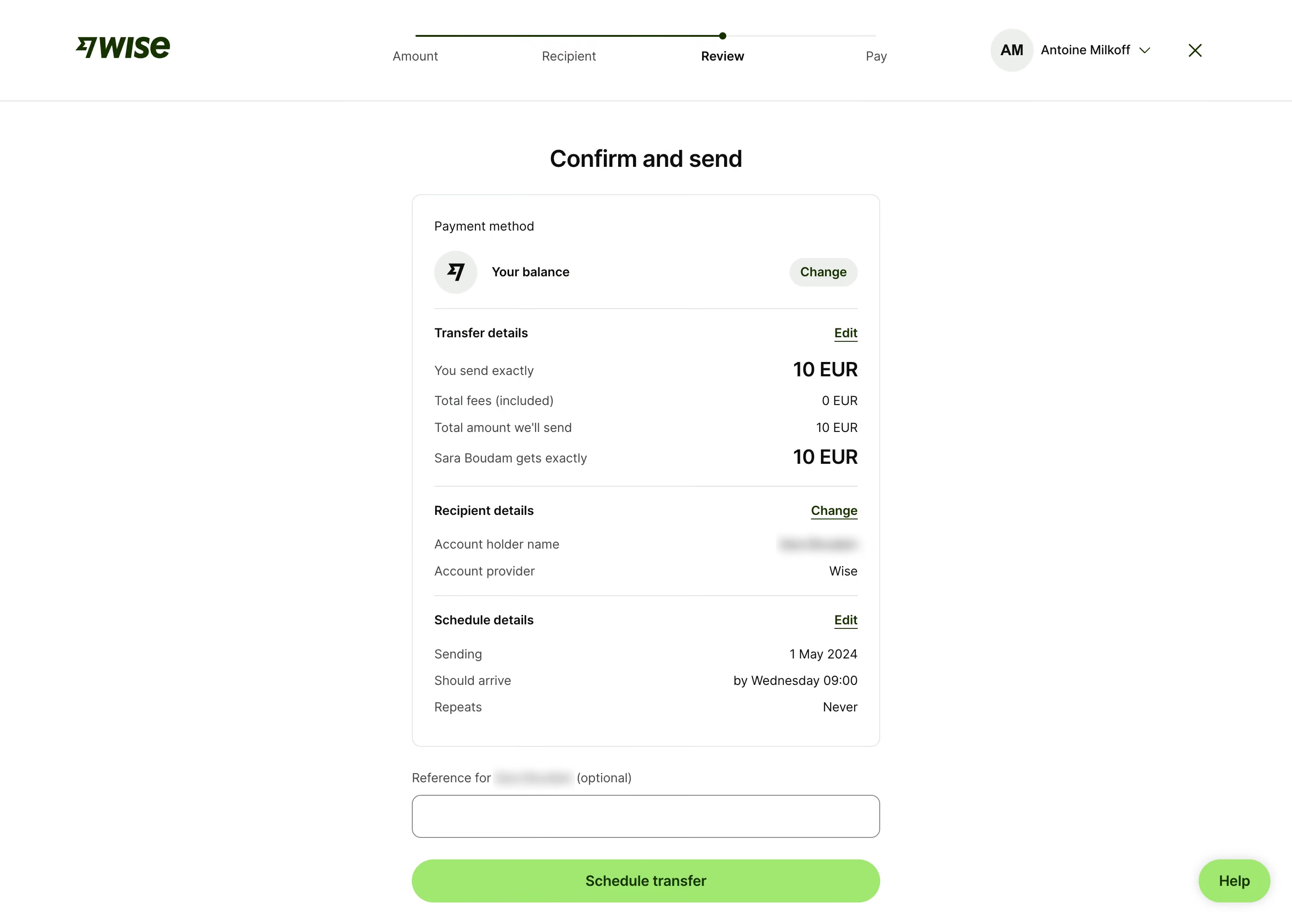
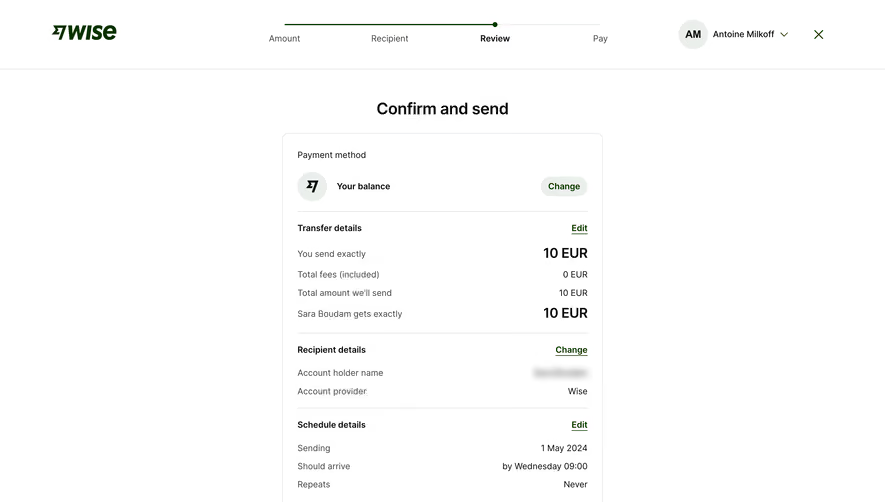
This is Wise's transfer review page and it's a masterclass in clarity. The whole thing is built around one job: making sure you're confident before you hit send. That "Confirm and send" heading sits bold and centered, immediately grounding you. Below it, a single card holds every detail you need, broken into logical chunks with subtle dividers.
Typography Doing the Heavy Lifting
The hierarchy here is sharp. "10 EUR" in bold large type draws your eye exactly where it matters. Section headers like "Transfer details" and "Recipient details" use a heavier weight while supporting data stays light. It's functional typography, not decorative. The font feels neutral and modern without trying too hard.
What Makes It Work
That green "Schedule transfer" button is the only real color pop on the entire page. Everything else is black, white, and gray. It forces your attention down to the action. The inline "Change" and "Edit" links are understated but discoverable. No clutter, no unnecessary icons. The stepped progress bar at top gives just enough context. Wise really understands restraint.