
Thank you! Your submission has been received!
Oops! Something went wrong while submitting the form.
Get SaaSFrame Pro
Monthly
$18
Quarterly
$48
Yearly
$180
Upgrade to access this feature
Browse all screens & flows
Filter and search screens & flows
Access Figma files
Access mobile versions
Bookmark screens & flows
Join now
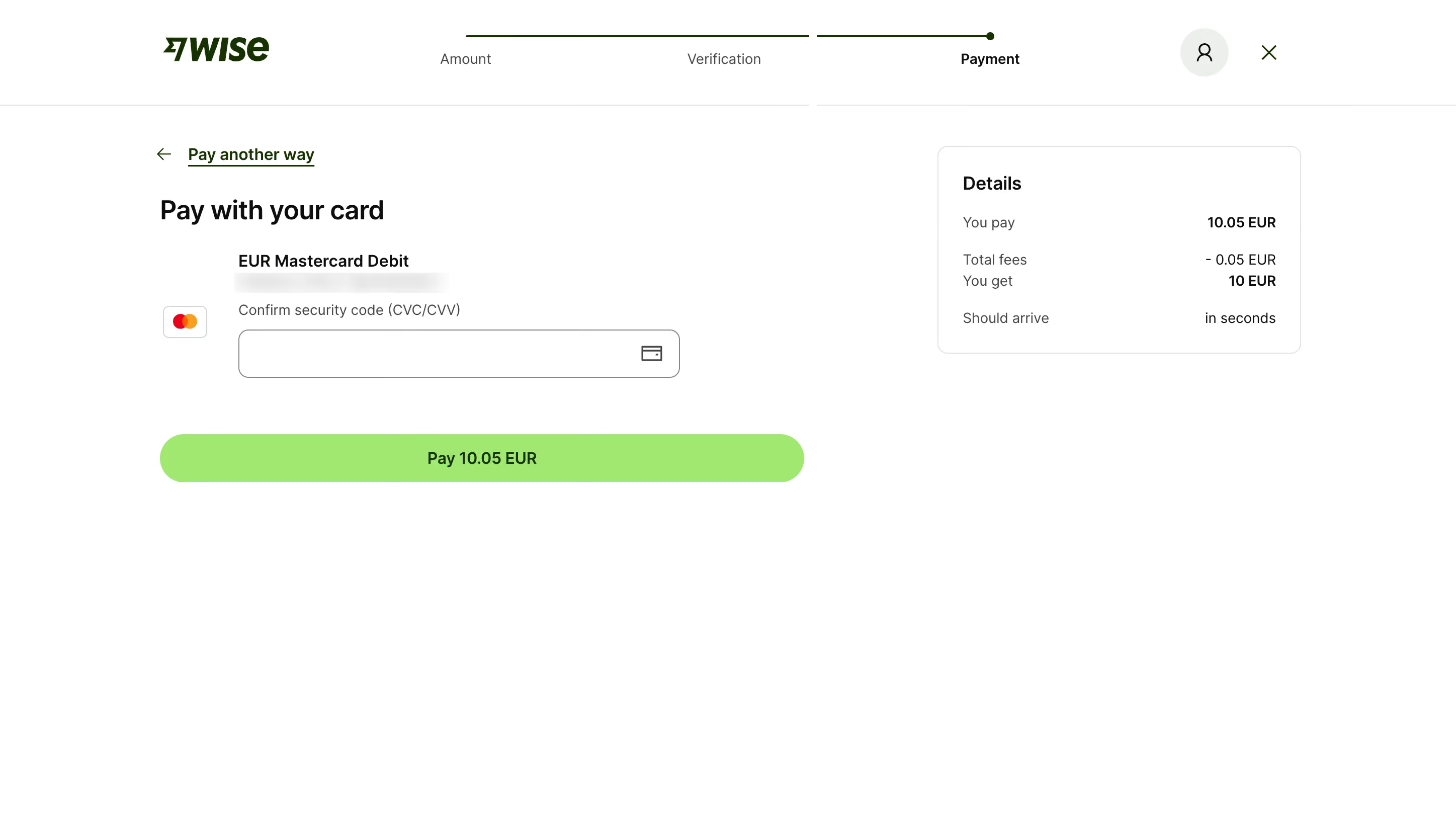

Wise Add Money With Card

Wise
Money for here, there and everywhere.
Designed by
No items found.

Bookmark
Bookmark

Design with AI
Thank you! Your submission has been received!
Oops! Something went wrong while submitting the form.
# Design from Reference: Wise Add Money With Card
Create an original, high-fidelity visual design inspired by the reference. Prioritize composition, typography, colors, spacing, and component styling over technical implementation.
## Reference
- **Product:** Wise
- **Category:** Add & Edit
- **Screenshot:** https://cdn.prod.website-files.com/5e9dc792e1210c5325f7ebbc/6aca27e6aca7079066e8e794_6aca26feaf28b64904207230_cms-23a7a491582159ec928cd23b.webp
Analyze the screenshot first. If inaccessible, request it rather than guessing.
## Content
{{content.instructions}}
{{content.data}}
Preserve essential messaging and factual accuracy. Adapt structure and copy length for visual balance; never invent product claims.
## Visual Design
### Overall aesthetic
- **Character:** A minimal card-payment step with a white canvas, dark green brand elements and a bright lime payment button. Sparse content and a compact summary emphasize the final payment decision.
- **Image basis:** Source dimensions are 2895 × 1630; inspection was at approximately 1400 × 788. Dimensions below are inspection-pixel estimates, plausibly near half the source scale; CSS pixel ratio is unverified.
### Page composition
- **Header:** A roughly 100 px tall horizontal header places the Wise logo left, a three-step progress indicator centrally, and account/close controls right. A thin gray rule separates it from the body.
- **Payment area:** The left content column begins around x154 and is about 620 px wide. It contains a back link, heading, stored-card identification, a security-code field and a broad payment action.
- **Summary:** A roughly 350 × 200 px bordered Details panel occupies the upper right, aligned near the top of the payment content.
- **Whitespace:** Most of the lower screen is empty; no additional footer or secondary content is visible.
### Information hierarchy
- **Progress:** Amount and Verification are visually quieter; Payment is bold and aligned to the final dark-green endpoint.
- **Task:** The payment heading is followed by the card type and a masked identifier. The external security-code label directs the only visible input.
- **Decision:** The lime button includes the payment amount. The Details panel separates amount paid, fees, amount received and estimated arrival into aligned rows.
- **Privacy and state:** The card identifier is blurred in the image and should remain undisclosed. The security-code field is empty; no error or focused state is visible.
### Typography
- **Main heading:** Approximately 26 px bold sans-serif with compact line-height.
- **Form roles:** Card type and primary button use roughly 16 px semibold text. Field labels and progress steps use approximately 14 px regular text, with stronger emphasis on the current step.
- **Summary:** The panel heading is around 18 px semibold; labels and values are around 14 px, with selected totals bold.
- **Font certainty:** The interface uses a clean sans-serif; family identity and exact CSS metrics are unverified.
### Colors & surfaces
- **Measured base:** White #FFFFFF dominates. Light neutrals #E2E2E1 and #EBEFEC appear among borders and pale utility surfaces.
- **Measured brand:** Lime #87EA5C forms the payment action; dark green #083400 appears in brand/action text.
- **Measured text:** Near-black #0E0F0C, dark gray #434745 and muted gray #868685 provide text hierarchy.
- **Surface treatment:** The summary is flat with a fine border and modest radius. There are no heavy shadows or decorative gradients.
### Components
- **Stepper:** Three labeled stages sit beneath a thin green horizontal line, with a small filled endpoint at the final stage.
- **Back action:** A left arrow and underlined dark-green link sit above the heading.
- **Card field:** A small outlined card-brand tile sits to the left of the form. The security-code input is approximately 424 × 46 px, with a thin gray border, roughly 10 px corners and a trailing card icon.
- **Payment button:** A roughly 620 × 47 px lime pill spans the column, with centered dark-green text and fully rounded ends.
- **Summary panel:** Approximately 24 px inner padding and roughly 10 px corners contain left-aligned labels and right-aligned values. A larger vertical gap separates arrival information from the financial rows.
- **Header controls:** The account icon sits in a pale circular background; the close icon is a simple dark-green cross. No tooltip or hover treatment is shown.
### Visual rhythm
- **Alignment:** The heading, back link and button share the main left edge, while card text/input are indented to leave space for the brand tile.
- **Form spacing:** Small gaps join card identification and field label; approximately 54 px separates the field bottom from the primary button.
- **Two-column balance:** The wide payment area and narrower summary are separated by a broad white gutter.
- **Emphasis:** A single large saturated control supplies the main visual focus against the otherwise neutral screen.
### Responsive
- **Evidence limit:** Only the desktop payment view is visible.
- **Recommended flow:** Stack the summary above or below the payment form while preserving a clear total near the payment action.
- **Recommended controls:** Let the input and button fill the available width, retain external labels and maintain usable icon hit areas.
- **Recommended progress:** Condense the stepper on small screens without losing the current-step label. Allow summary labels and values to wrap safely.
### Adaptation guidance
- **Preserve:** Retain the single-field payment focus, explicit payment amount, separate fee summary and restrained use of lime.
- **Build:** Use reusable progress, labeled-input, financial-summary and primary-action components.
- **State design:** Define security-code validation, pending payment and failure states in implementation; they are not present in the screenshot.
- **Validate:** Confirm contrast, keyboard flow and responsive total visibility. Use synthetic masked card data when adapting the screen.
Use this context to reproduce the reference's visual language: layout, typography, colors, spacing, borders, radii, and distinctive elements. The screenshot takes priority if descriptions conflict.
## Direction
{{preferences.fidelityInstructions}}
## Output
{{output.instructions}}
Deliver a polished, cohesive design with precise alignment, hierarchy, and spacing. Produce the requested visual artifact, not just a description. If unsupported, explain the limitation.


Category
Tech Stack

Added on
April 29, 2024
Found in 1 flow
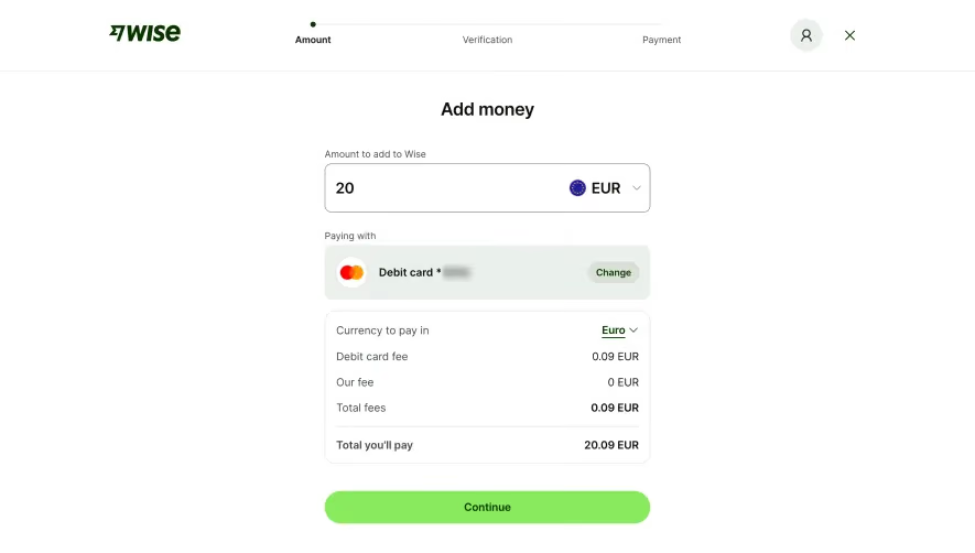
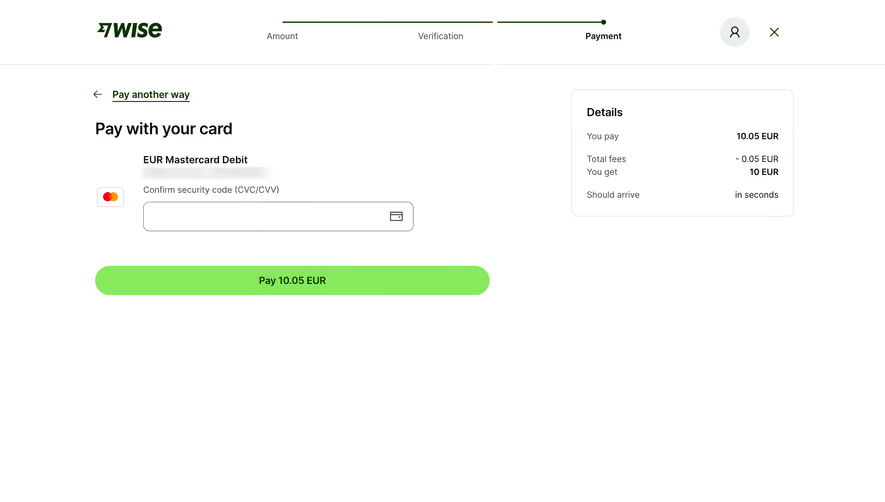
Similar screens



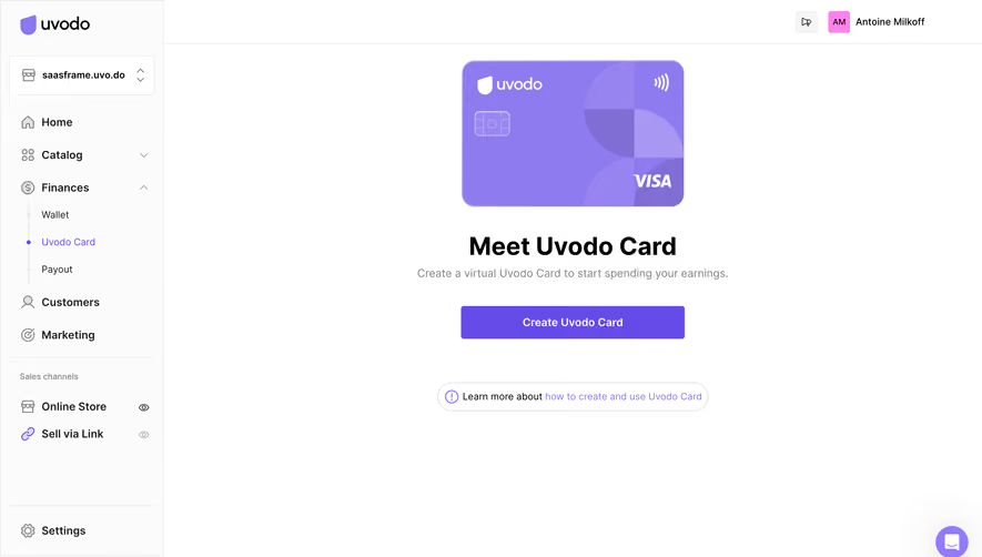


Upgrade to SaaSFrame Pro now to see similar examples.
Monthly
$18 /month
Billed $18 monthly
Browse all screens & flows
Filter and search screens & flows
Search text in screenshots
Access Figma files
Access mobile versions
Join now
Quarterly
$16 /month
Billed $48 quarterly
Browse all screens & flows
Filter and search screens & flows
Search text in screenshots
Access Figma files
Access mobile versions
Join now
Yearly
$15 /month
Billed $180 yearly
Browse all screens & flows
Filter and search screens & flows
Search text in screenshots
Access Figma files
Access mobile versions
Join now