Design with AI
Generate a new design based on this screen using your own content.
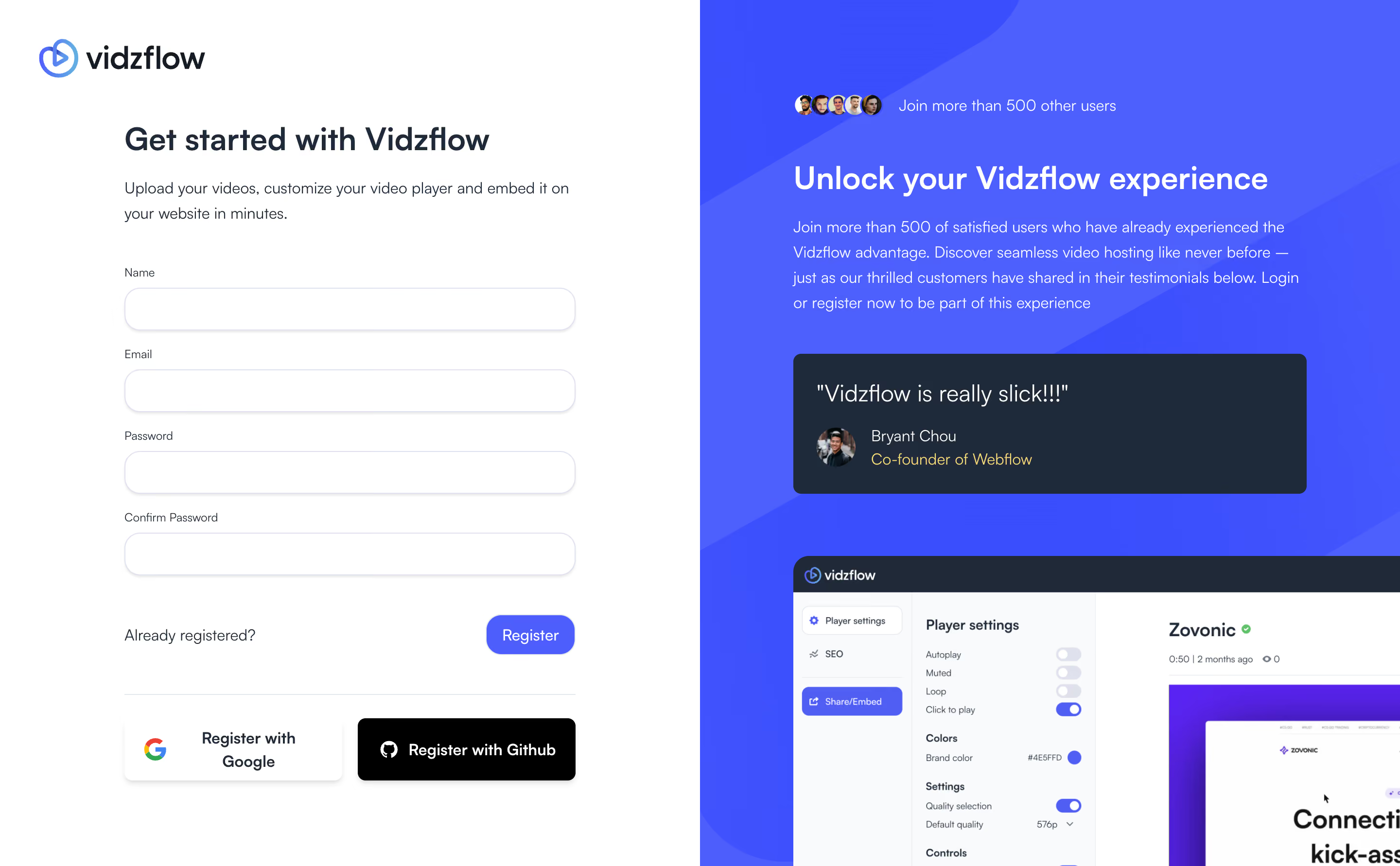
# Design from Reference: Vidzflow Signup
Create an original, high-fidelity visual design inspired by the reference. Prioritize composition, typography, colors, spacing, and component styling over technical implementation.
## Reference
- **Product:** Vidzflow
- **Category:** Signup
- **Screenshot:** https://cdn.prod.website-files.com/5e9dc792e1210c5325f7ebbc/6acad9c0a43009b06fe6bf47_6acad947567bc9a3079be26c_cms-d848dee4c910ffe1a73aff03.webp
Analyze the screenshot first. If inaccessible, request it rather than guessing.
## Content
{{content.instructions}}
{{content.data}}
Preserve essential messaging and factual accuracy. Adapt structure and copy length for visual balance; never invent product claims.
## Visual Design
### Overall aesthetic
- **Style:** Split signup screen with clean white form and saturated blue social-proof panel.
- **Character:** Rounded inputs, navy text, bright-blue action, dark testimonial card, and cropped product preview.
### Page composition
- **Canvas:** 2880 × 1782 image px; CSS estimates assume an unverified 2× capture.
- **Split:** Equal-width white left and blue right panels.
- **Form:** Logo, Get started heading, supporting sentence, four labeled inputs, existing-user link, Register, divider, and two provider actions.
- **Right:** Overlapping avatars, headline, description, testimonial card, and large cropped editor screenshot.
### Information hierarchy
- **Primary:** Signup heading and form.
- **Action:** Blue Register button; provider alternatives below divider.
- **Proof:** Right-side testimonial and product preview reinforce value.
- **Social cue:** Small avatar cluster above right headline.
### Typography
- **Family:** Neutral sans serif; exact family unverified.
- **Headings:** Approximately 32 CSS px, semibold.
- **Body:** Approximately 16px with 26px line-height.
- **Field labels:** Approximately 12px.
- **Controls:** Approximately 14–16px.
- **Quote:** Approximately 24px.
- **Precision:** Font sizes and 2× scale are estimates.
### Colors & surfaces
- **Form:** #FFFFFF.
- **Blue panel:** #4860FF with darker shapes near #364FFF and #3750FF.
- **Testimonial:** #1B293A.
- **Preview dark chrome:** #1E2939.
- **Preview pale surface:** #F9FAFB.
- **Inputs:** White with pale cool-gray border and subtle shadow.
- **Precision:** Flat screenshot samples; panel decor varies.
### Components
- **Inputs:** Approximately 464 × 44 CSS px under assumed 2×, large pill-like radius.
- **Register:** Compact blue rounded button aligned right.
- **Providers:** White Google and black GitHub rectangles side by side.
- **Testimonial:** Dark rounded card with quote, avatar, attribution, and warm role accent.
- **Preview:** Large app image cropped at right/bottom.
- **Backdrop:** Broad diagonal blue shapes.
### Visual rhythm
- **Form rhythm:** Equal-width fields with regular label spacing.
- **Grouping:** Registration action separated from provider buttons by thin rule.
- **Contrast:** Quiet form balances dense right-side marketing.
- **Overflow:** Product preview intentionally extends beyond visible panel.
### Responsive
- **Observed:** Desktop only.
- **Recommendation:** Prioritize form in one column; move proof below or omit decorative preview.
- **Providers:** Stack when needed, maintain readable control sizes.
### Adaptation guidance
- **Preserve:** Clear four-field signup, provider alternatives, social proof, and product context.
- **Content:** Use actual required fields and authorized testimonials.
- **Behavior:** Validation, account creation, and provider login are not demonstrated.
Use this context to reproduce the reference's visual language: layout, typography, colors, spacing, borders, radii, and distinctive elements. The screenshot takes priority if descriptions conflict.
## Direction
{{preferences.fidelityInstructions}}
## Output
{{output.instructions}}
Deliver a polished, cohesive design with precise alignment, hierarchy, and spacing. Produce the requested visual artifact, not just a description. If unsupported, explain the limitation.