Generate a new design based on this screen using your own content.
Thank you! Your submission has been received!
Oops! Something went wrong while submitting the form.
# Design from Reference: Unkey Verification
Create an original, high-fidelity visual design inspired by the reference. Prioritize composition, typography, colors, spacing, and component styling over technical implementation.
## Reference
- **Product:** Unkey
- **Category:** Verification
- **Screenshot:** https://cdn.prod.website-files.com/5e9dc792e1210c5325f7ebbc/697b75d9a3175b576c8a476f_unPQfH8KpT-9lRJ87n-BJUxTwVKVZXlrIgF6DZouX28.avif
Analyze the screenshot first. If inaccessible, request it rather than guessing.
## Content
{{content.instructions}}
{{content.data}}
Preserve essential messaging and factual accuracy. Adapt structure and copy length for visual balance; never invent product claims.
## Visual Design
Use this context to reproduce the reference's visual language: layout, typography, colors, spacing, borders, radii, and distinctive elements. The screenshot takes priority if descriptions conflict.
## Direction
{{preferences.fidelityInstructions}}
## Output
{{output.instructions}}
Deliver a polished, cohesive design with precise alignment, hierarchy, and spacing. Produce the requested visual artifact, not just a description. If unsupported, explain the limitation.
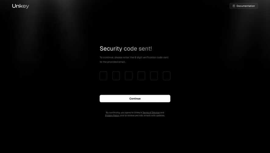
This Unkey verification screen is a masterclass in restraint. The deep black background with a subtle gradient glow at the top creates depth without being dramatic. Six empty input boxes sit centered, perfectly spaced, waiting for that OTP code. They feel tactile somehow.
Typography That Breathes
"Security code sent!" in that large, light gray serif-adjacent heading is gorgeous. It's soft but confident. The supporting copy underneath stays muted, almost whispering the instructions. There's a clear visual hierarchy here: title, description, inputs, button. Your eye flows straight down with zero friction.
The Button Steals the Show
That white "Continue" button pops hard against the dark canvas. It's the only bright element on the entire page, which makes it impossible to miss. Smart move. The terms text below it stays dim and unobtrusive.
What Makes It Distinct
The top-right "Documentation" link with its little icon is a thoughtful touch for a developer-facing product. The whole page feels intentionally minimal. Nothing wasted. Every element earns its place.