Design with AI
Generate a new design based on this screen using your own content.
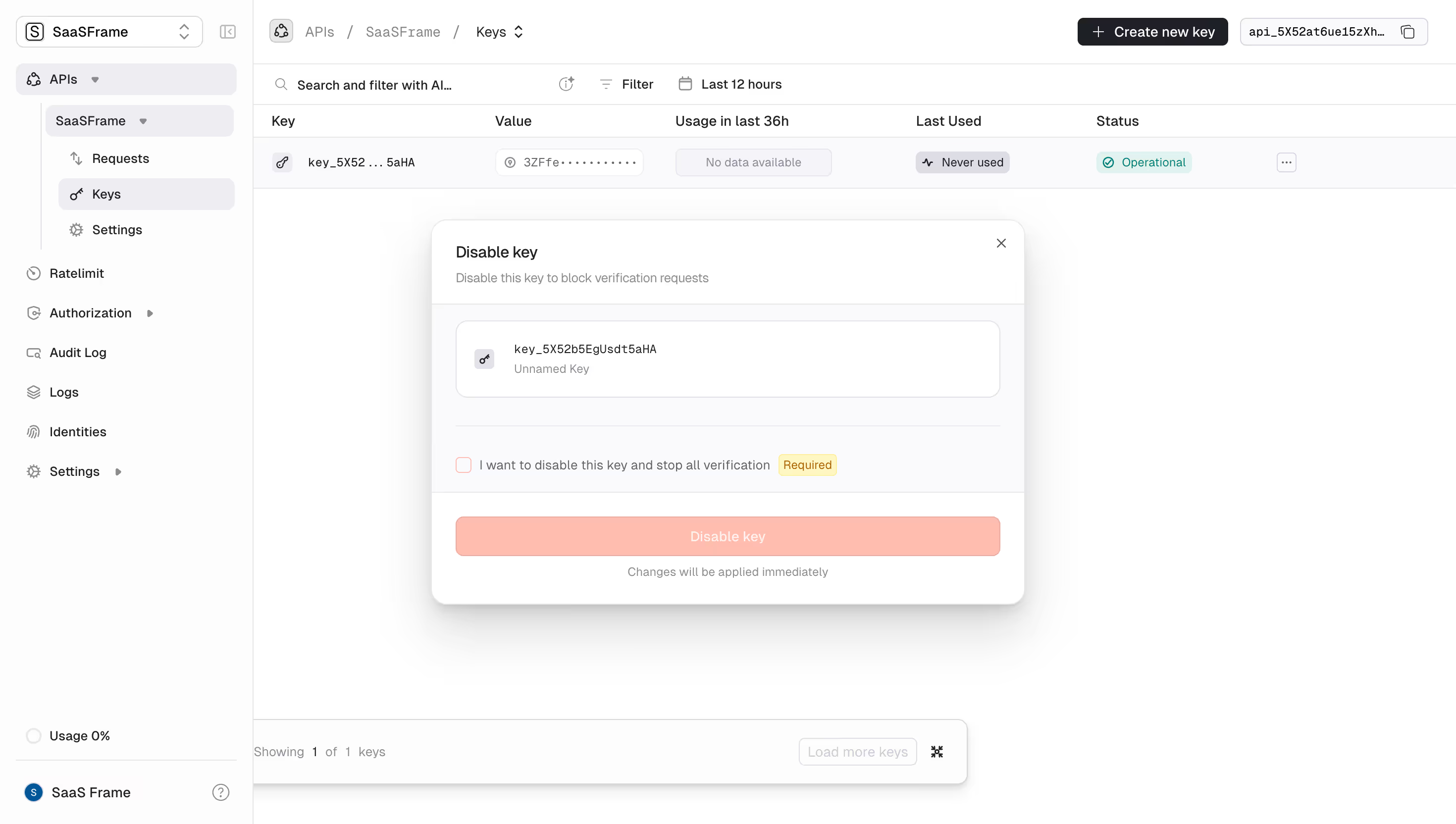
# Design from Reference: Unkey Disable Key
Create an original, high-fidelity visual design inspired by the reference. Prioritize composition, typography, colors, spacing, and component styling over technical implementation.
## Reference
- **Product:** Unkey
- **Category:** Delete
- **Screenshot:** https://cdn.prod.website-files.com/5e9dc792e1210c5325f7ebbc/697b75ffcd83044f1a88eb31_C6hitmMxNz37KbgkvWDltkgrAtxYoswKz7-xTHlsfTY.avif
Analyze the screenshot first. If inaccessible, request it rather than guessing.
## Content
{{content.instructions}}
{{content.data}}
Preserve essential messaging and factual accuracy. Adapt structure and copy length for visual balance; never invent product claims.
## Visual Design
### Overall aesthetic
- **Character:** Minimal API-key dashboard with a centered confirmation dialog, subtle surfaces and a pale coral destructive action.
### Page composition
- **Capture:** 2940 × 1664 screenshot pixels; estimated 2× CSS scale.
- **Structure:** Sidebar and key table remain visible behind a centered Disable key modal. Dialog contains title/help, key summary, required acknowledgment, full-width action and immediate-effect note.
### Information hierarchy
- **Priority:** Dialog title states the action; key identity establishes scope, required checkbox gates confirmation and the coral button completes the sequence.
### Typography
- **Families:** Sans-serif interface with monospace key identifiers; exact families unverified.
- **Estimated CSS sizes:** Dialog title 16px, body/labels 14px, helper 12px and table text 13–14px.
### Colors & surfaces
- **Measured palette:** White #FFFFFF, near-white #FDFDFD/#FEFEFE, panel #FAFAFC, border #EEEEF1 and disabled coral #FEBDAF.
- **Accents:** Teal Operational status and yellow Required badge; dark primary dashboard controls.
### Components
- **Elements:** Rounded key-summary box, key icon, masked table value, acknowledgment checkbox, Required badge, close icon, pale destructive button and soft modal shadow.
- **Estimated geometry:** Dialog approximately 600px wide, 16px outer radius, 24px padding, 40px button height and 12px summary radius.
### Visual rhythm
- **Spacing:** Horizontal separators divide summary, acknowledgment and footer. Large empty dashboard space keeps the dialog dominant without a heavy dark scrim.
### Responsive
- **Suggested adaptation:** Fit dialog within 16–24px viewport gutters, wrap acknowledgment text and keep the confirm action full width. Mobile behavior is not shown.
### Adaptation guidance
- **Transfer:** Preserve explicit key identity and acknowledgment before disabling. Use masked examples and real state-dependent button availability.
Use this context to reproduce the reference's visual language: layout, typography, colors, spacing, borders, radii, and distinctive elements. The screenshot takes priority if descriptions conflict.
## Direction
{{preferences.fidelityInstructions}}
## Output
{{output.instructions}}
Deliver a polished, cohesive design with precise alignment, hierarchy, and spacing. Produce the requested visual artifact, not just a description. If unsupported, explain the limitation.