Design with AI
Generate a new design based on this screen using your own content.
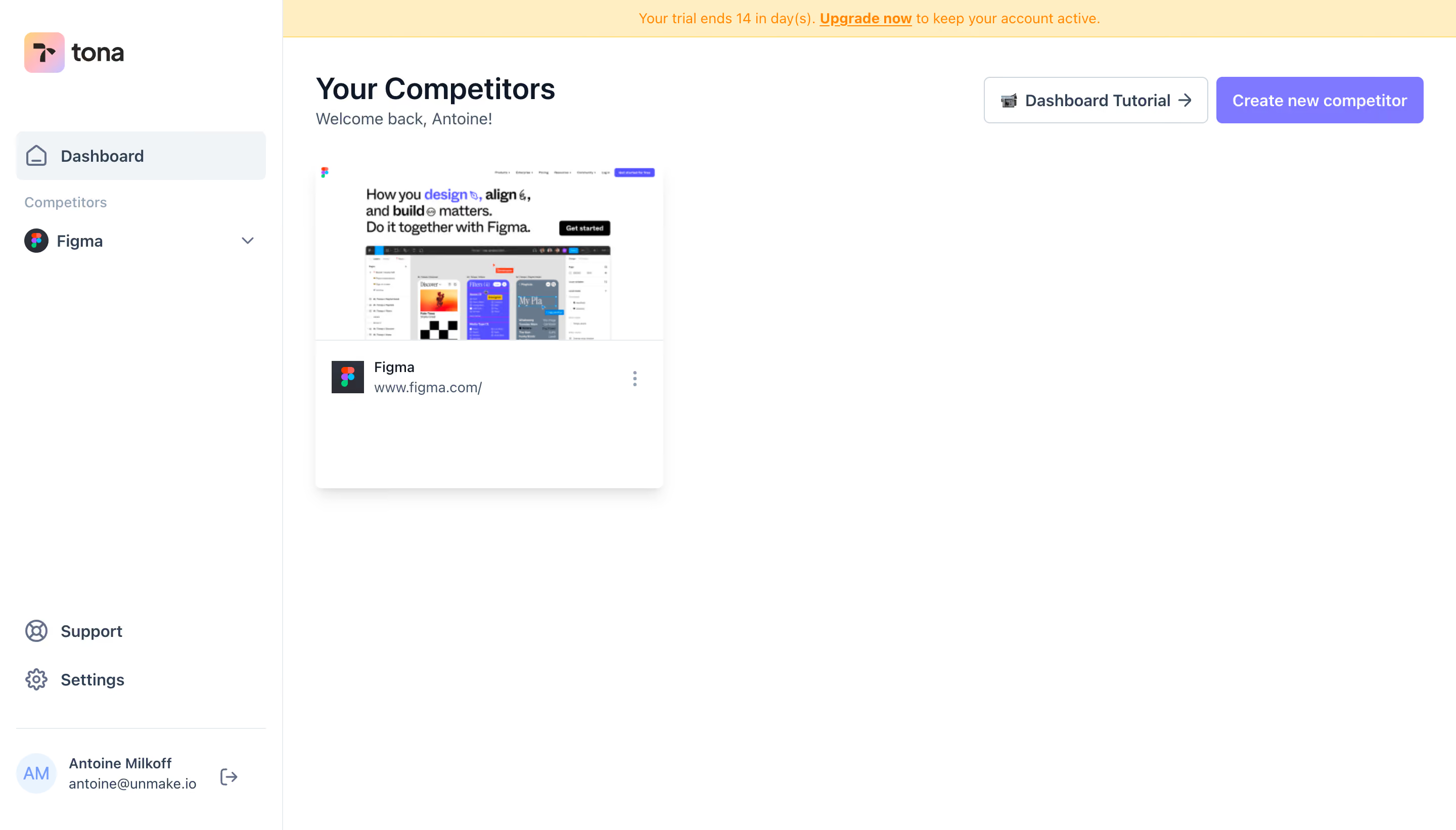
# Design from Reference: Tona New Competitor Created
Create an original, high-fidelity visual design inspired by the reference. Prioritize composition, typography, colors, spacing, and component styling over technical implementation.
## Reference
- **Product:** Tona
- **Category:** Add & Edit
- **Screenshot:** https://cdn.prod.website-files.com/5e9dc792e1210c5325f7ebbc/6acb6347adcf005a3c5c31d8_6acb6292a1e015e44d3c1a7d_cms-4eae16ac6e74bb7c32b55bfc.webp
Analyze the screenshot first. If inaccessible, request it rather than guessing.
## Content
{{content.instructions}}
{{content.data}}
Preserve essential messaging and factual accuracy. Adapt structure and copy length for visual balance; never invent product claims.
## Visual Design
### Overall aesthetic
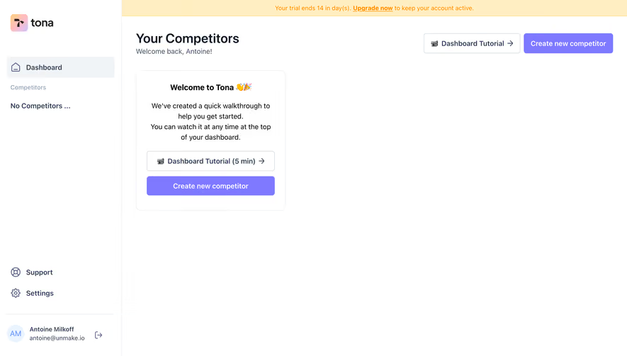
- **Character:** Sparse competitor-monitoring dashboard with a white workspace, pale navigation highlight, violet creation action and a warm trial notice.
- **Evidence and scale:** Screenshot measures 2880 × 1642 image pixels. Sizes estimate a 1440 × 821 CSS capture at 2× scale; actual DPR and font identity remain unverified.
### Page composition
- **Sidebar:** Approximately 280px CSS wide, separated by a thin vertical rule. Brand sits at top, Dashboard and a competitor group below, with support/settings and account controls anchored near the bottom.
- **Notice/header:** A slim pale-yellow trial banner spans the main region. Beneath it, page title and greeting align left; tutorial and creation controls align right.
- **Content:** A single competitor card sits below the heading at the upper-left of the main area. The rest of the workspace remains empty.
- **Card anatomy:** Website thumbnail fills the top; a divided lower area contains a square brand icon, name/URL and vertical overflow menu.
### Information hierarchy
- **Primary action:** The violet Create new competitor button is the strongest control; the outlined tutorial button is secondary.
- **Content identity:** The large page heading introduces the collection; a smaller greeting provides personal context.
- **Trial cue:** Orange text and an underlined upgrade link make the top notice visible without occupying much height.
- **Selection context:** Dashboard has a pale active background; the competitor destination below remains a simple icon/name/chevron row.
### Typography
- **Heading:** Approximately 30px CSS, semibold neutral sans-serif, with compact leading.
- **Navigation and actions:** Around 16px, medium-to-semibold; greeting around 16px regular.
- **Card/utility:** Name and URL around 14px; trial notice and account metadata around 13–14px. Exact family and computed weights remain unverified.
### Colors & surfaces
- **Measured ground:** White #FFFFFF dominates, with pale #F0F4F7 in selected navigation.
- **Measured trial surface:** Warm #FFEEC1 supports the orange notice text.
- **Measured action:** Violet #7F79FF fills the main button; stronger #5450FF appears in accent pixels.
- **Boundaries:** Pale gray #E1E1E1 supports card dividers and shell rules. Dark slate headings and muted blue-gray metadata establish text hierarchy.
### Components
- **Brand:** Compact rounded gradient square beside a dark wordmark near the upper-left.
- **Header actions:** Tutorial control is approximately 222 × 46px CSS, outlined with a small video icon and arrow. Creation control is around 205 × 46px, violet, with a radius near 6px.
- **Competitor card:** Approximately 345 × 320px CSS, white with small rounded corners and a pronounced soft lower shadow. Its thumbnail is around 174px high.
- **Card metadata:** Small 32px square icon sits beside a two-line name/URL stack; a three-dot menu aligns right.
- **Account footer:** A pale circular initials avatar, two-line account text and sign-out icon sit beneath a thin divider. Personal content is incidental to the layout.
### Visual rhythm
- **Main inset:** Approximately 32px separates the content from the sidebar boundary; the same left edge aligns title, greeting and card.
- **Vertical spacing:** Notice, title and content form compact upper-page bands, followed by extensive open whitespace.
- **Sidebar balance:** Primary destinations cluster high, utility actions sit low and the account footer creates a final stable anchor.
### Responsive
- **Observed limit:** Only a desktop one-card dashboard is shown; creation, overflow menus and mobile behavior are unobserved.
- **Recommended navigation:** Collapse the sidebar into a compact rail or drawer and allow the trial notice to wrap.
- **Recommended content:** Stack header actions beneath the heading on narrow screens and let competitor cards fill the available column width.
### Adaptation guidance
- **Preserve focus:** Keep the collection sparse when little data exists and make the creation action easy to find.
- **Reuse card anatomy:** Pair a recognizable site thumbnail with concise identity metadata and a clear overflow action.
- **Implementation:** Provide accessible menu names, keyboard focus and explicit current-navigation state. The trial wording and competitor content are captured examples, not verified current account facts.
Use this context to reproduce the reference's visual language: layout, typography, colors, spacing, borders, radii, and distinctive elements. The screenshot takes priority if descriptions conflict.
## Direction
{{preferences.fidelityInstructions}}
## Output
{{output.instructions}}
Deliver a polished, cohesive design with precise alignment, hierarchy, and spacing. Produce the requested visual artifact, not just a description. If unsupported, explain the limitation.