Overall Style and Aesthetic
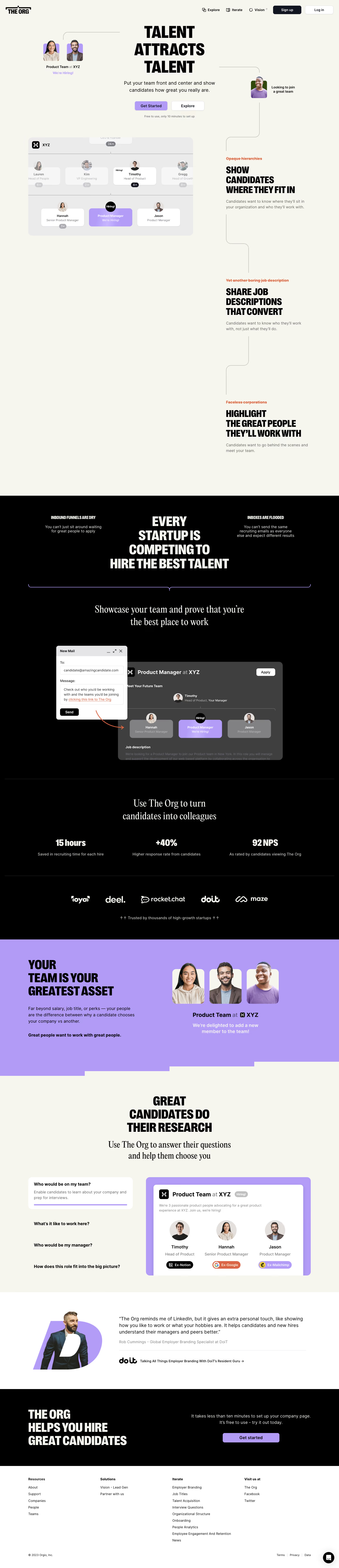
TheOrg.com adopts a clean, modern, and distinctly professional look, blending minimalism with subtle playfulness. Generous white space keeps content focused, while crisp lines and gentle curves invoke both approachability and sophistication. The aesthetic feels current and inclusive—ideal for a SaaS platform aiming to foster transparency within organizations. Layout and Structure
The landing page employs a classic SaaS structure: a compelling hero section anchored by clear messaging and a strong CTA, followed by concise feature highlights using card layouts. Visual interest is maintained with alternating text and visuals. While testimonials and case studies are typically lower in the funnel, this site integrates logos of well-known clients for immediate trust. The footer is robust, featuring navigation, company info, and social links, ensuring comprehensive closure. Visual Elements
Custom illustrations take center stage, balancing friendly human avatars and organizational diagrams. Subtle animations—such as hover effects and gentle motion on scroll—boost engagement without distraction. Iconography is bold yet simple, reinforcing clarity. Occasional team photos humanize the digital experience, aligning visuals with the platform's mission. Color Palette and Typography
The palette, led by energetic blues, accent oranges, and soft grays, radiates both reliability and warmth. Bold, sans-serif headline fonts command attention, while lighter body fonts ensure effortless legibility. Hierarchy is clear: oversized headings, consistent subheads, and digestible body copy guide users naturally through the content. User Experience Patterns
Sticky top navigation ensures persistent, intuitive access to key areas, with a prominent call-to-action always in view. Microinteractions—like subtle button states and card lifts—convey responsiveness. Signup and demo request forms are frictionless, supporting rapid conversion. Section transitions are fluid, optimizing flow and engagement. Unique or Notable Design Choices
The transparent “org chart” concept, visualized as interactive team structures, is truly distinctive, embodying the product’s value prop visually and experientially. This interactive dynamic, paired with strategic use of real company data, makes the platform feel both credible and innovative. Tone and Feel
The overall tone exudes trust, openness, and energy. Every design touchpoint—from color choices to icon styling—reinforces an image of The Org as progressive and user-centered, offering inspiration for any SaaS brand seeking to blend clarity, engagement, and originality.