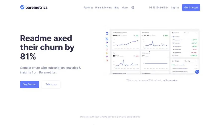
Design with AI
Generate a new design based on this screen using your own content.
# Design from Reference: Tona Landing Page
Create an original, high-fidelity visual design inspired by the reference. Prioritize composition, typography, colors, spacing, and component styling over technical implementation.
## Reference
- **Product:** Tona
- **Category:** Landing Page
- **Screenshot:** https://cdn.prod.website-files.com/5e9dc792e1210c5325f7ebbc/6acb634aadcf005a3c5c3265_6acadcde3ce5f4104ec0dccb_cms-5f4a89f585c69bfd6356e52c.webp
Analyze the screenshot first. If inaccessible, request it rather than guessing.
## Content
{{content.instructions}}
{{content.data}}
Preserve essential messaging and factual accuracy. Adapt structure and copy length for visual balance; never invent product claims.
## Visual Design
### Overall aesthetic
- **Character:** Playful pastel SaaS marketing with glossy product montages, emoji characters and large rounded feature panels.
### Page composition
- **Canvas:** 2880 × 15946 screenshot pixels; CSS estimates assume approximately 2× scale.
- **Sequence:** Gradient hero/product montage; proof logos; problem collage; website/newsletter feature rows; nine benefit cards; upcoming-feature grid; testimonials; gradient CTA and footer.
### Information hierarchy
- **Priority:** Oversized white headline and launch badge lead into screenshots; repeated Get started actions accompany key features.
- **Proof:** Colorful quotes, video portrait and customer logos occupy a lavender band.
### Typography
- **Family:** Heavy rounded sans-serif headings and neutral body; exact font is unverified.
- **Scale:** Estimated CSS hero 76–80px, section titles 40–44px, feature titles 32px, body 16–18px.
### Colors & surfaces
- **Sampled palette:** Pale background #F8FAFB; white #FFFFFF; card gray #F5F5F7; lavender variants #C1BFFF, #C4C2FF and #AEACFF.
- **Accents:** Peach/pink/yellow gradients, dark charcoal actions and violet app controls.
### Components
- **Panels:** Large white/gradient cards with 28–32px radii, thick white image borders and soft shadows.
- **Artwork:** Tilted app windows, floating message chips, 3D emoji heads and newsletter screenshots.
- **Controls:** Small white/dark rounded actions, faded lower benefit rows and Load more.
### Visual rhythm
- **Spacing:** Large 100–160px CSS chapter gaps alternate broad product demonstrations with dense three-column grids.
### Responsive
- **Guidance:** Mobile is not shown. Stack feature rows, simplify floating artwork and retain readable product screenshots.
### Adaptation guidance
- **Transfer:** Preserve pastel depth, rounded modular panels and screenshot-led storytelling. Use verified features and original proof assets.
Use this context to reproduce the reference's visual language: layout, typography, colors, spacing, borders, radii, and distinctive elements. The screenshot takes priority if descriptions conflict.
## Direction
{{preferences.fidelityInstructions}}
## Output
{{output.instructions}}
Deliver a polished, cohesive design with precise alignment, hierarchy, and spacing. Produce the requested visual artifact, not just a description. If unsupported, explain the limitation.