Design with AI
Generate a new design based on this screen using your own content.
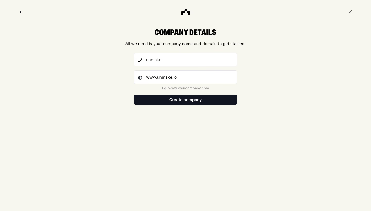
# Design from Reference: The Org Create Company
Create an original, high-fidelity visual design inspired by the reference. Prioritize composition, typography, colors, spacing, and component styling over technical implementation.
## Reference
- **Product:** The Org
- **Category:** Account Setup
- **Screenshot:** https://cdn.prod.website-files.com/5e9dc792e1210c5325f7ebbc/6acbbc716325e7e23e4c967b_6acbbbbe2ee20aade8edd32c_cms-dd2ed1ffaf95d0951ce235fb.webp
Analyze the screenshot first. If inaccessible, request it rather than guessing.
## Content
{{content.instructions}}
{{content.data}}
Preserve essential messaging and factual accuracy. Adapt structure and copy length for visual balance; never invent product claims.
## Visual Design
### Overall aesthetic
- **Style:** A minimal company-creation step on a warm off-white canvas, with a condensed uppercase heading and a narrow centered form.
- **Character:** Focused and understated, using dark ink and one full-width action without a surrounding card or illustration.
### Page composition
- **Capture and scale:** The screenshot measures 1440 × 821 pixels. Approximate dimensions below refer to screenshot pixels; CSS scale is unverified.
- **Header controls:** A small back chevron sits upper left, a black brand symbol is centered, and a close X sits upper right.
- **Form:** A centered approximately 400 px-wide stack begins near the upper quarter: heading, one-line explanation, company-name input, domain input, domain example helper, and Create company action. Most lower space is empty.
### Information hierarchy
- **Task:** The condensed Company Details heading introduces the step; the sentence beneath explains the two required values.
- **Inputs:** Company name and domain are already populated in the capture, each with a small leading line icon.
- **Completion:** The dark full-width button follows the domain helper, creating a clear endpoint.
### Typography
- **Family:** The heading uses a heavy condensed display sans serif. Body and controls use a neutral sans serif; exact families are unverified.
- **Heading:** Approximately 30–32 px, very bold, uppercase, with compact line-height.
- **Body and controls:** Explanatory text and input values are around 16 px. The button label is approximately 16 px semibold; helper text around 14 px in lighter gray.
### Colors & surfaces
- **Foundation:** Sampled sRGB warm off-white #F7F7EF defines the full page, contrasted with #FFFFFF inputs.
- **Action and ink:** Sampled near-black navy #111421 fills the primary action and supports dark interface elements. Black #000000 appears in heading/brand details.
- **Boundaries:** Sampled #E4E4E7 provides the subtle input-border reference. Helper copy uses muted gray.
### Components
- **Inputs:** Two white fields are approximately 400 × 52 px with thin light-gray borders and 6–7 px radii. Pencil and globe icons sit in fixed left insets.
- **Primary action:** A roughly 40 px-high dark button spans the form, with about 7 px rounding and centered white label.
- **Brand and navigation:** Small monochrome back, brand, and close symbols sit directly on the warm canvas, without button boxes or shadows.
- **Helper:** The domain example is centered immediately below its field. No additional form labels or progress indicator are visible.
### Visual rhythm
- **Spacing:** Use roughly 20–24 px from heading to explanation, 26–30 px before the first field, and 16–18 px between fields.
- **Alignment:** All fields and the button share one width and center axis. The explanatory sentence extends slightly wider than the inputs.
- **Negative space:** Keep the lower page largely open; the simple task does not require additional panels.
### Responsive
- **Observed state:** Only desktop is visible.
- **Recommended reflow:** Use a fluid form with 20–24 px mobile gutters, allow the explanatory sentence to wrap, and retain clearly reachable back/close controls.
- **Labels:** For a functional adaptation, ensure fields have accessible names even if the visual design relies on icons and values.
### Adaptation guidance
- **Preserve:** Retain the warm neutral background, condensed heading, compact two-field form, and single dark action.
- **Adapt:** Use actual company/domain values and appropriate validation for the new workflow. Keep the task limited to necessary information.
- **Avoid:** Do not reuse the reference's company data or invent validation/success states absent from the screenshot.
Use this context to reproduce the reference's visual language: layout, typography, colors, spacing, borders, radii, and distinctive elements. The screenshot takes priority if descriptions conflict.
## Direction
{{preferences.fidelityInstructions}}
## Output
{{output.instructions}}
Deliver a polished, cohesive design with precise alignment, hierarchy, and spacing. Produce the requested visual artifact, not just a description. If unsupported, explain the limitation.