Design with AI
Generate a new design based on this screen using your own content.
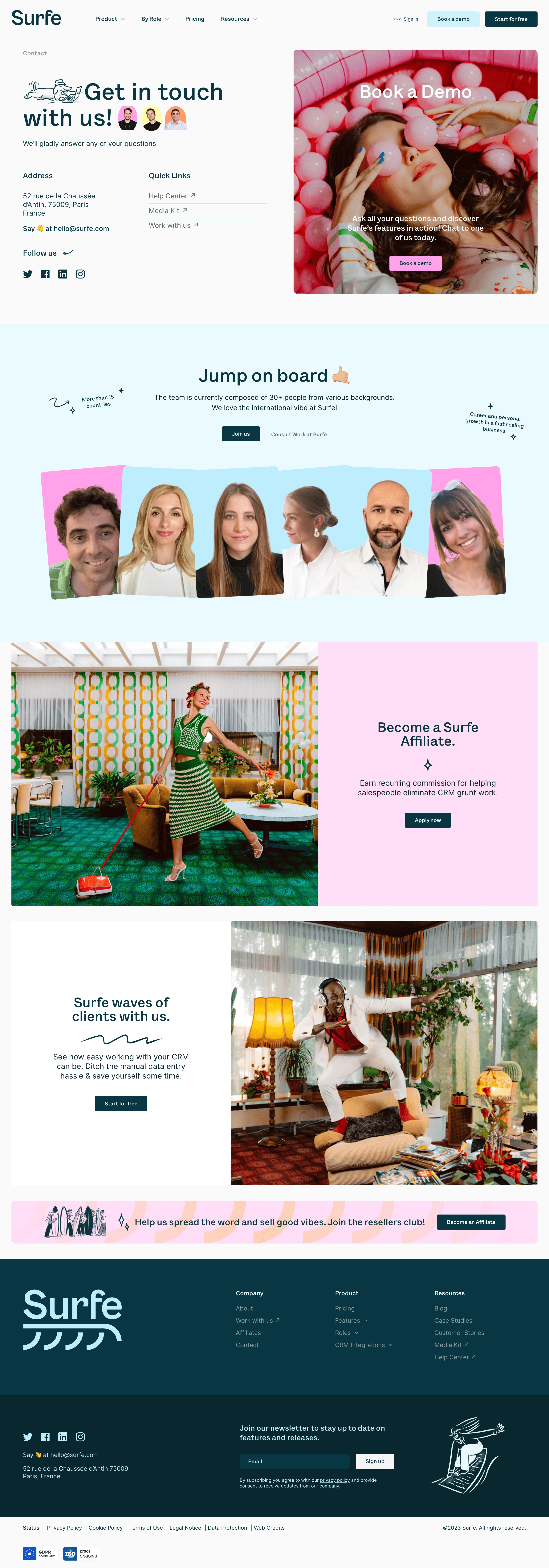
# Design from Reference: Surfe Contact Page
Create an original, high-fidelity visual design inspired by the reference. Prioritize composition, typography, colors, spacing, and component styling over technical implementation.
## Reference
- **Product:** Surfe
- **Category:** Contact Page
- **Screenshot:** https://cdn.prod.website-files.com/5e9dc792e1210c5325f7ebbc/6acb69a55e515b69c7965039_6acb67d9ecc5bd4d9309d9c1_cms-745872f69d68696eacd63a5e.webp
Analyze the screenshot first. If inaccessible, request it rather than guessing.
## Content
{{content.instructions}}
{{content.data}}
Preserve essential messaging and factual accuracy. Adapt structure and copy length for visual balance; never invent product claims.
## Visual Design
### Overall aesthetic
- **Character:** Playful, people-focused contact page with deep teal typography, pastel blocks, editorial photography, and hand-drawn flourishes.
### Page composition
- **Canvas:** 2880 × 8220 screenshot px. Navigation precedes split contact/demo hero, pale-blue recruiting section with overlapping team portraits, alternating photo/CTA rows, affiliate banner, and two-tone dark footer.
### Information hierarchy
- **Priority:** Large contact headline and real contact channels balance a photographic Book a Demo panel. Recruiting, affiliate, and product actions follow as distinct sections.
### Typography
- **Scale:** Estimated CSS at assumed 2× capture: hero 60 px, section headings 44 px, body 20 px, navigation/buttons 14–16 px. Sans serif family unverified.
### Colors & surfaces
- **Palette:** Sampled sRGB #FAFAFA, teal #083742, darker #09272E, pale blue #EBFAFD, pink #FFDEF7, and white #FFFFFF. Photos contribute saturated pink, green, and warm colors.
### Components
- **Details:** Estimated 8 CSS px image corners, compact rectangular teal buttons, pink demo button, social icons, doodled waves/arrows/stars, colored portrait backplates, and newsletter form.
### Visual rhythm
- **Spacing:** Broad split hero columns and large 80–120 CSS px section padding. Wide photo panels alternate direction; compact footer links contrast with oversized brand mark.
### Responsive
- **Adaptation:** Mobile is not shown. Stack contact and demo panels, wrap portrait collage, and convert footer columns into readable groups.
### Adaptation guidance
- **Transfer:** Preserve warm human imagery, teal/pastel contrast, and distinct contact paths. Use authentic team portraits, verified addresses, and actual partnership terms.
Use this context to reproduce the reference's visual language: layout, typography, colors, spacing, borders, radii, and distinctive elements. The screenshot takes priority if descriptions conflict.
## Direction
{{preferences.fidelityInstructions}}
## Output
{{output.instructions}}
Deliver a polished, cohesive design with precise alignment, hierarchy, and spacing. Produce the requested visual artifact, not just a description. If unsupported, explain the limitation.