Generate a new design based on this screen, using your own content.
Preview the prompt
# Design from Reference: Acquire Contact Page

Create an original, high-fidelity visual design inspired by the reference. Prioritize composition, typography, colors, spacing and component styling over technical implementation.

## Reference

- **Product:** Acquire
- **Category:** Contact Page
- **Screenshot:** https://media.saasframe.io/v/9d4a1f85d33aa9711fb1-1600.webp

Analyze the screenshot first. If you can’t access it, ask me for it rather than guessing.

## Content

**Instructions:**

Generate realistic example content that fits the selected design reference.

Create appropriate headlines, descriptions, labels, buttons, and supporting copy based on the type of interface being designed.

If a product or business description is provided, use it to guide the content.

Otherwise, invent a plausible fictional SaaS product appropriate for the reference.

Keep the content concise, coherent, and visually balanced.

Do not present fictional statistics, customer names, or testimonials as verified facts.

Preserve essential messaging and factual accuracy. Adapt structure and copy length for visual balance; never invent product claims.

## Visual design

Use this context to reproduce the reference’s visual language: layout, typography, colors, spacing, borders, radii and distinctive elements. The screenshot takes priority if descriptions conflict.

### Overall aesthetic

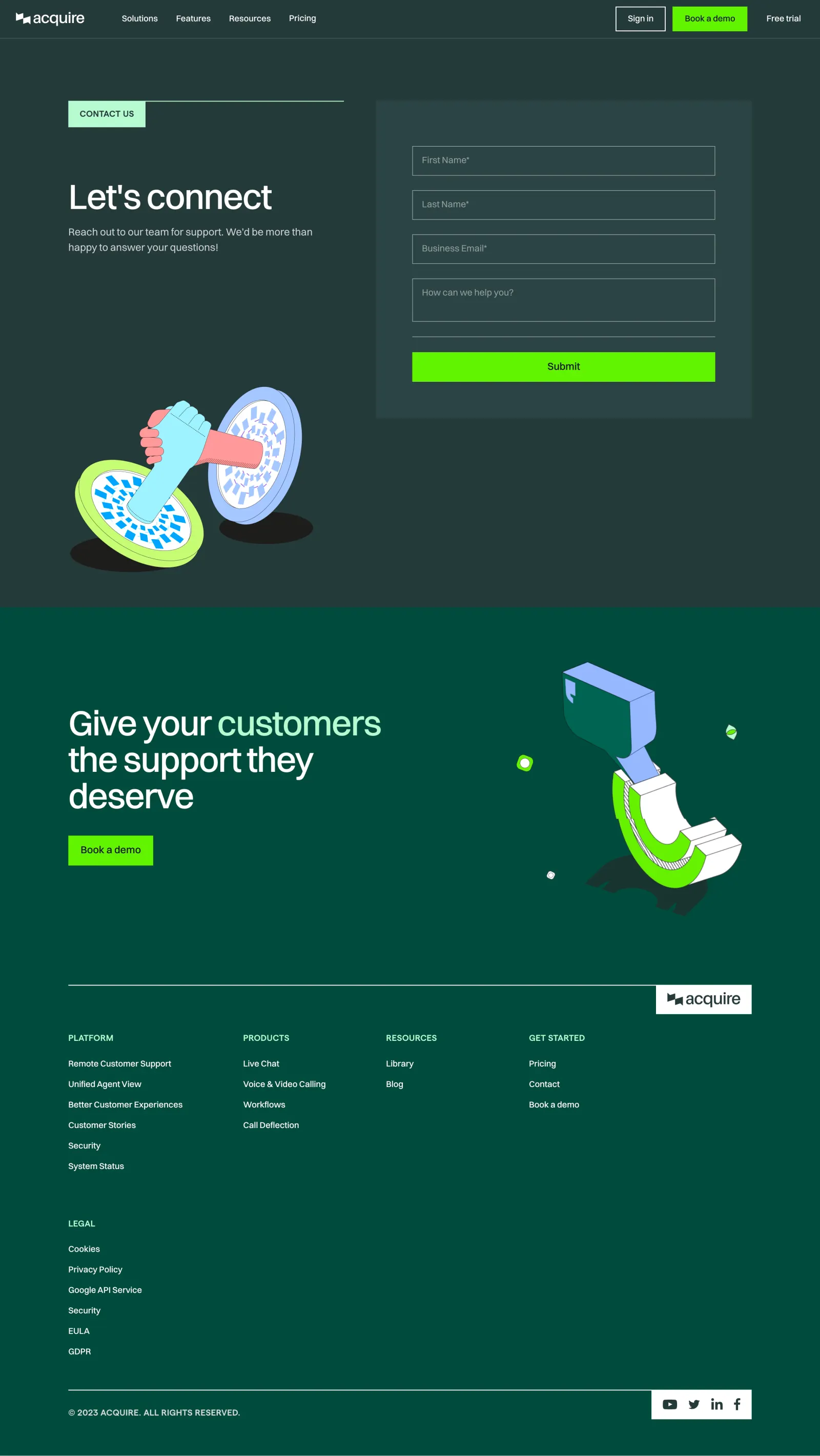
- **Style:** Bold dark contact page using blue-green surfaces, neon lime actions and colorful outlined illustrations.
- **Character:** Sharp rectangular form fields contrast with playful hand/portal and support-themed artwork.
- **Contrast:** White headlines and muted pale copy sit against dark teal, with lime drawing attention to submission/demo actions.

### Page composition

- **Canvas:** Source 2880 × 5114 pixels, inspected throughout in two crops at 1400px width. Measurements use inspection pixels; approximate 2× CSS capture is plausible but unverified.
- **Header:** Full-width logo/navigation row with right-aligned account, lime demo and trial actions.
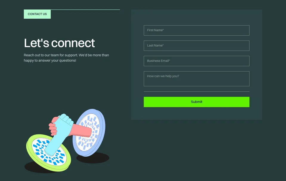
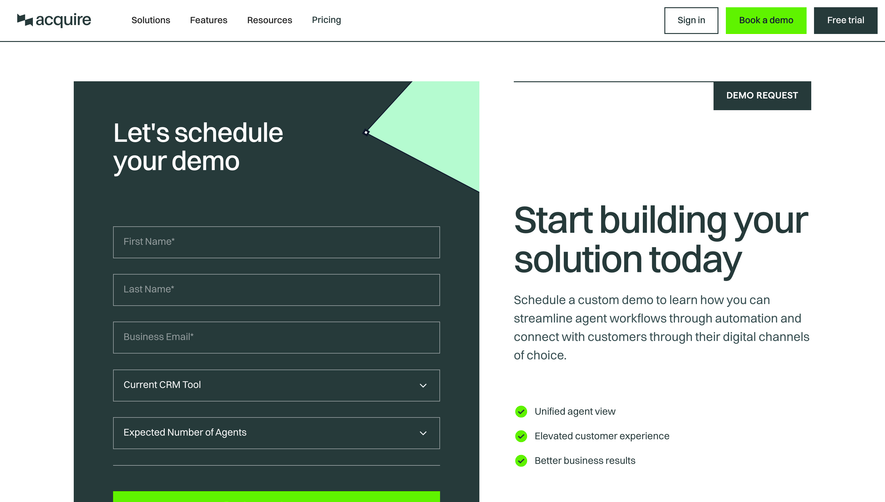
- **Contact region:** Two columns within roughly x116–1284. Left contains a mint label/rule, large heading, short copy and illustration below; right contains a rectangular tinted form panel.
- **Form:** Four stacked fields, separator and full-width lime Submit button.
- **Closing:** A greener full-width region contains a large support statement, lime demo action and right-side illustration.
- **Footer:** Long horizontal rule ending at a white logo tile, four navigation groups, separate legal group, then lower copyright/social row.

### Information hierarchy

- **Contact:** Let’s connect is the primary message, supported by a concise two-line invitation.
- **Form:** First name, last name, business email and help-message fields lead directly to Submit.
- **Conversion:** The lower support statement and demo button offer a second path after the contact section.
- **Footer:** Uppercase pale-mint labels distinguish platform, products, resources, getting-started and legal groups.

### Typography

- **Main/closing headings:** Approximately 58px semibold sans serif, around 62px line height and tight tracking.
- **Supporting copy:** Approximately 18px regular, 27px line height.
- **Fields/buttons:** Around 16px; primary action text uses medium weight.
- **Navigation/footer:** Around 14px medium, with uppercase group labels. Exact family is unverified.

### Colors & surfaces

- **Measured palette:** #263A3A contact canvas, #2C4344 form region, nearby #2C4444 and #004B3D closing/footer surface.
- **Measured action:** #5FF300 neon lime.
- **Measured illustration tones:** #A4C7FF light blue and #9FF3FF cyan; white #FFFFFF supplies strong foreground.
- **Other accents:** Mint label/rule, coral hand and lime/blue portal details add localized color.
- **Depth:** Flat color planes with outlined fields; illustrated black oval shadows provide graphic depth rather than UI elevation.

### Components

- **Contact label:** Mint rectangle around 132 × 45px attached to a long thin mint horizontal rule.
- **Form panel:** Approximately 642 × 542px with about 62px inner horizontal padding and square corners.
- **Inputs:** Approximately 518 × 51px, transparent/dark fill, thin gray border and 16px inset; message field around 74px tall.
- **Submit:** Approximately 518 × 51px, lime fill, dark centered label and square corners.
- **Header controls:** Outlined Sign in and filled lime Book a demo rectangles; trial is plain text.
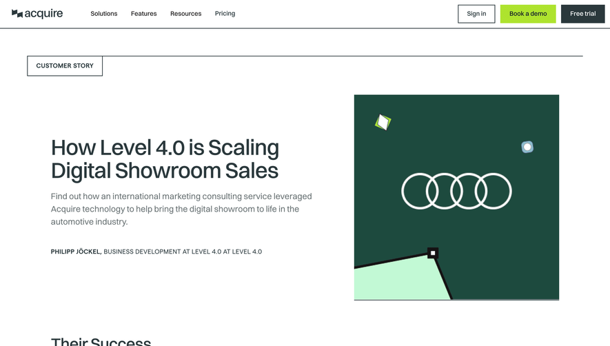
- **Illustrations:** Large outlined hands emerging from paired circular portals and a separate support-themed graphic in the closing area.
- **Footer tiles:** White logo and white social-icon strip interrupt the green background at right.
- **States:** Empty fields only; focus, errors, submission progress and success are not visible.

### Visual rhythm

- **Contact spacing:** Around 100px follows navigation before the content; broad gaps separate label, headline and illustration.
- **Form rhythm:** Approximately 24px separates field boxes, with another 25px before Submit.
- **Closing/footer:** Generous blank space surrounds the lower CTA and precedes the footer rule.
- **Link cadence:** Footer links follow roughly 35px pitch, while legal content occupies a separate lower group.
- **Alignment:** Contact text, closing statement and footer groups share the same left wrapper edge.

### Responsive

- **Observed scope:** Desktop only; narrow-screen behavior is unverified.
- **Recommended layout:** Stack contact intro above form, moving or simplifying the large illustration.
- **Recommended fields:** Use fluid full-width controls with 20–24px gutters and external accessible labels.
- **Recommended closing/footer:** Stack illustration and CTA, then wrap navigation groups; retain contrast and avoid overlaying copy.
- **Recommended sizing:** Reduce large headings while keeping primary actions comfortably tappable.

### Adaptation guidance

- **Preserve:** Dark teal/lime contrast, clear contact form, mint label/rule and distinctive outlined illustration language.
- **Content:** Use supplied support copy and required-field rules; no hidden validation requirements should be inferred.
- **Interaction:** Define validation, progress and confirmation states explicitly.
- **Accessibility:** Ensure placeholder-style labels also have programmatic names and provide visible keyboard focus.

## Direction

**Instructions:**

Use the reference screenshot as the main source of visual inspiration rather than a strict layout template.

Preserve its most distinctive design characteristics, such as typography, visual rhythm, color relationships, component treatments, and overall aesthetic.

Feel free to modify section arrangements, proportions, spacing, and individual components to better suit my content.

Introduce original design decisions where they improve usability, composition, or brand consistency.

The result should clearly reflect the reference's visual language without looking like a direct reproduction.

## Output

**Instructions:**

Generate a high-fidelity visual mockup of the requested interface.

Present the design as a polished, realistic website or product UI screenshot.

Prioritize visual composition, typography, spacing, colors, alignment, and component details.

Use the available image-generation or visual-design capabilities.

Do not replace the mockup with source code, a written design specification, or a textual description.

If direct visual generation is unavailable, clearly explain the limitation.

Deliver a polished, cohesive design with precise alignment, hierarchy and spacing. Produce the requested visual artifact, not just a description. If unsupported, explain the limitation.
 SaaSFrame