Design with AI
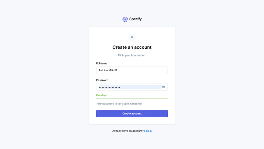
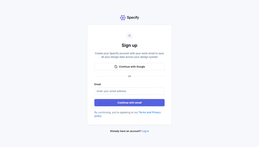
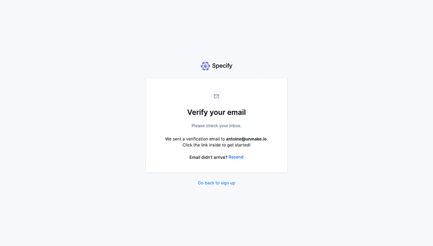
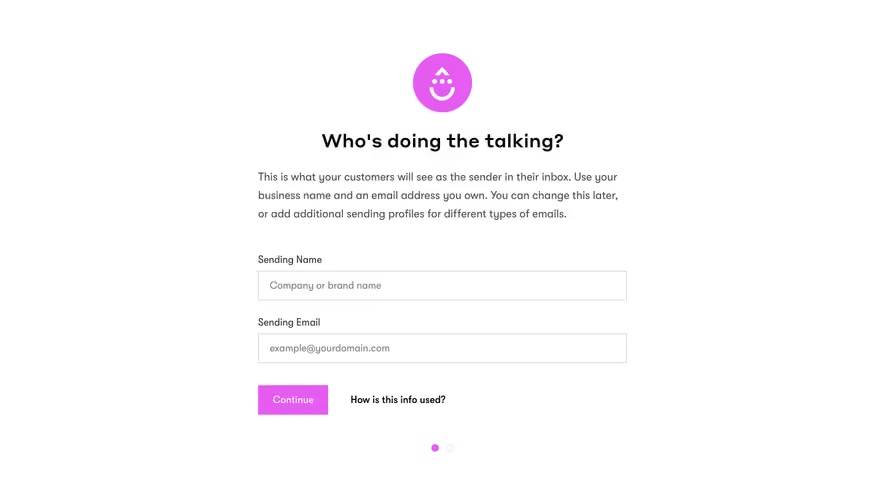
Generate a new design based on this screen using your own content.
# Design from Reference: Specify Account Setup
Create an original, high-fidelity visual design inspired by the reference. Prioritize composition, typography, colors, spacing, and component styling over technical implementation.
## Reference
- **Product:** Specify
- **Category:** Account Setup
- **Screenshot:** https://cdn.prod.website-files.com/5e9dc792e1210c5325f7ebbc/6acbba01d37e66e942ffbc8d_6acb70b9f56587432a47e1cf_cms-c0b0663c9e008250a50a7f0d.webp
Analyze the screenshot first. If inaccessible, request it rather than guessing.
## Content
{{content.instructions}}
{{content.data}}
Preserve essential messaging and factual accuracy. Adapt structure and copy length for visual balance; never invent product claims.
## Visual Design
### Overall aesthetic
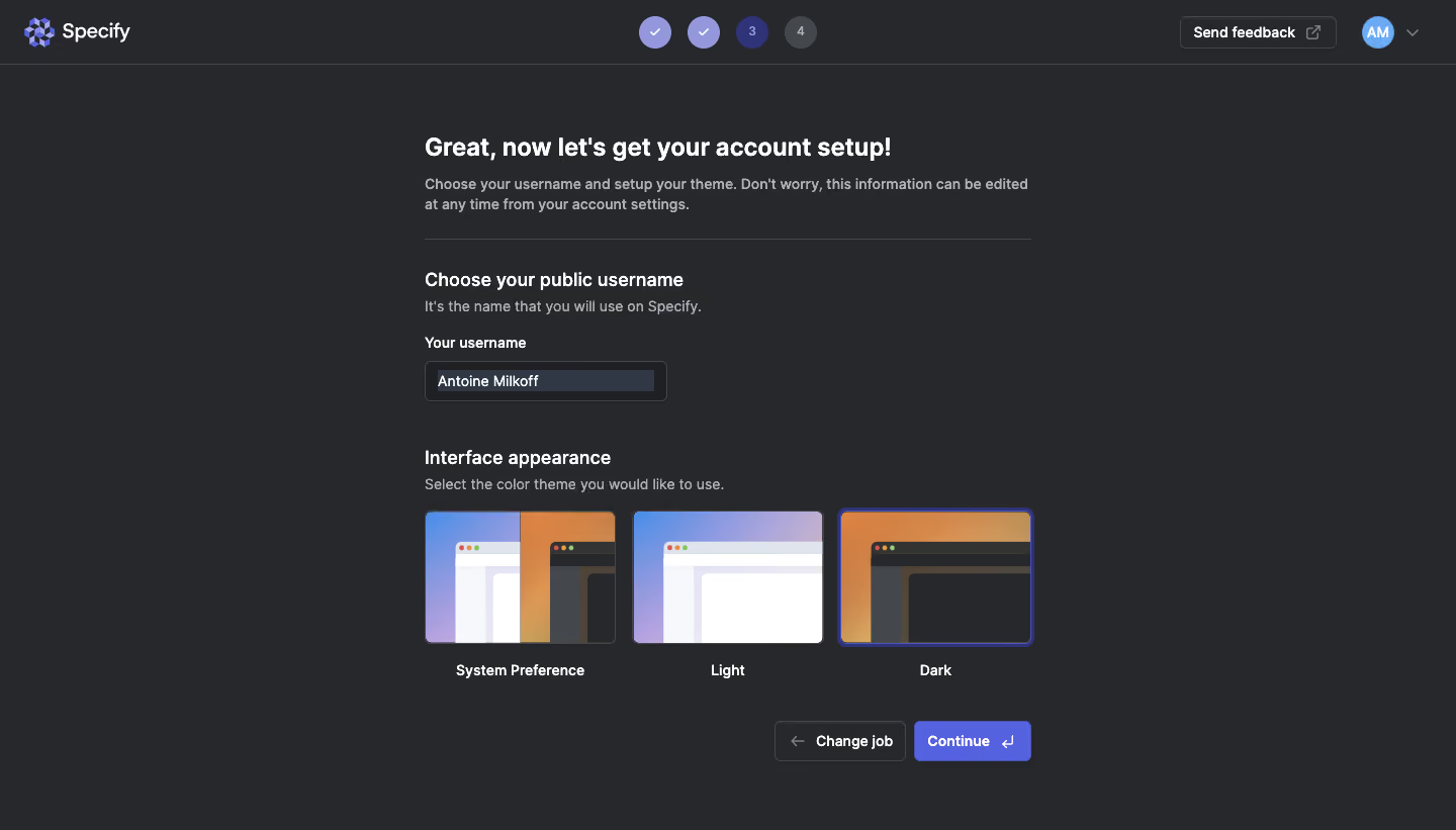
- **Character:** A focused dark onboarding step for username and appearance preferences.
- **Visual language:** Charcoal surfaces, white headings and purple progress/action accents frame three illustrated theme choices.
### Page composition
- **Capture:** The source is 1440 × 821 image pixels. A 1× CSS scale is plausible but unverified.
- **Header:** The Specify brand sits left, four progress circles center, and feedback/avatar utilities right above a thin divider.
- **Form column:** A roughly 600-pixel-wide content area is centered beneath the header.
- **Sequence:** Introductory title and description precede a rule, username section, appearance section with three equal tiles and a lower-right action pair.
### Information hierarchy
- **Step:** The main heading announces account setup; smaller copy explains that preferences can later be changed.
- **Identity:** A public-username heading and helper sentence lead to a labeled, prefilled input. The visible personal value need not be reproduced.
- **Appearance:** System Preference, Light and Dark options have image previews and centered labels; Dark is visibly selected with a purple outline.
- **Progression:** Two completed header circles precede the active third step and a muted fourth. Change job is secondary; Continue is filled purple.
### Typography
- **Family:** A clean sans serif is visible; exact identity is unverified.
- **Main heading:** Approximately 24 image pixels, bold, with a 30-pixel line height.
- **Section headings:** Around 18 pixels, semibold; body/helper text is approximately 14 pixels with 20-pixel line height.
- **Labels/actions:** Approximately 14 pixels, medium to semibold, with white primary labels and muted gray supporting text.
### Colors & surfaces
- **Measured palette:** ICC-aware sRGB sampling yields background #27282B, border/control gray #44474B, darker field #1F2023 and light foreground #F6F8FB.
- **Accent samples:** Purple-blue #5562E0 appears in the action/progress family, while #303846 marks the selected text region.
- **Preview colors:** Lavender/blue and orange gradients distinguish light and dark theme thumbnails.
- **Surface treatment:** The form sits directly on the background without an enclosing card; thin gray borders define input and secondary action.
### Components
- **Progress circles:** Four compact circular nodes use two checkmarks, a purple numbered current step and gray future step.
- **Username field:** A roughly 240 × 40-pixel dark input has a fine border and small corners.
- **Theme tiles:** Three approximately 188 × 132-pixel preview images show stylized browser windows, with labels beneath. The selected tile has a thicker purple ring.
- **Action pair:** An outlined Change job button with left arrow precedes a purple Continue button with return-key symbol, both around 40 pixels high.
- **Header utilities:** A thin outlined feedback button includes an external-link icon; a circular avatar and chevron sit beside it.
### Visual rhythm
- **Spacing:** Clear 32–40-pixel vertical intervals separate identity and appearance groups.
- **Alignment:** Headings, helper text and input share a left edge; theme tiles span the full content width.
- **Action anchoring:** Both lower actions align right, leaving whitespace beneath the form's left side.
### Responsive
- **Recommendation:** Wrap theme choices into a vertical list or compact grid when three previews no longer fit.
- **Recommendation:** Reduce outer margins, allow the heading to wrap and keep progress/action controls legible. No mobile rendering is captured.
### Adaptation guidance
- **Preserve:** Retain the identity-then-appearance sequence, visual theme previews and explicit selected border.
- **Implement:** Use accessible radio-group semantics for appearance and associate username guidance with the input.
- **Privacy:** Use generic sample values in reusable demonstrations rather than copying the captured personal username.
Use this context to reproduce the reference's visual language: layout, typography, colors, spacing, borders, radii, and distinctive elements. The screenshot takes priority if descriptions conflict.
## Direction
{{preferences.fidelityInstructions}}
## Output
{{output.instructions}}
Deliver a polished, cohesive design with precise alignment, hierarchy, and spacing. Produce the requested visual artifact, not just a description. If unsupported, explain the limitation.